Event Branding for Associations: Stop Letting Your Annual Event Look Like a Slide Template



Picture the closing panel of your annual conference. Two MEPs, a Commission official, your president moderating. The room holds two hundred people: member companies, working group chairs, a handful of national delegates. Phones come up because everyone wants to snap a picture.
Now look at what's behind the panel in every single one of those photos.
If your association is like most, it's a logo on a template backdrop, flanked by a pop-up banner that has served since 2019. And those photos are about to become your brand for the next twelve months. They'll run across LinkedIn every time a member posts, illustrate the annual report, and sit at the top of next year's invitation.
The annual event is the most photographed, most shared expression of your brand all year. It is not MWC Barcelona, which pulls 100,000 people every March, and that's exactly the point. At a member-event scale you might only have a dozen branded assets in total, which makes them even more important.
Most associations treat the look as an afterthought, something sorted quickly in the final weeks by whoever had time. A proper event identity is a strategic asset, and it should be built like one.
What is event branding for an association's annual event?
Event branding is a distinct visual and verbal identity for your event, sitting under your association's brand and applied across every touchpoint, from the save-the-date to the badge to the last slide of the closing panel and social media templates.
It's a system, not only a logo.
For an annual event or conference, the system covers the name and its conventions (the acronym-plus-year pattern that makes an event instantly legible to its sector), an annual theme, the logo with the association's mark, colour and type that work on a phone screen and on the room's LED screen or backdrop, motion graphics for openers and lower-thirds in videos, direction for the stage and signage, badges, presentation templates, the registration touchpoints, a social media kit, photography direction, and the rules for how member and partner logos are allowed to behave.
At the extreme end of the scale, GSMA publishes an entire public brand toolkit for MWC Barcelona, down to signage tiers and a hashtag typeset in the brand font.
Your event is not MWC, and it doesn't need to be.
However, the logic is identical and it scales down further than you'd think: decide the system once, and every speaker, supplier and member producing anything for the event must stay on-brand.
Which brings us to the point secretariats tiptoe around, so let's say it plainly: this is your event. Members pay to belong to the association, and the association decides how the association looks. Serving your members absolutely means the narrative stays in line with their priorities. It does not mean the look is decided one strong opinion at a time. An identity negotiated individually with thirty member companies becomes a collection of individual designs with no logic behind it.
In practice this means two things. First, your internal process includes real approval rounds, so the identity is signed off once, by the people mandated to sign it off, and defended after that. Second, anything that goes out wearing the event's identity, including what members post about it on their own channels, comes from the kit you provide rather than from improvisation. That isn't control for its own sake. Give members good assets and they'll use them; it's the improvised ones that make a serious event look homemade.
None of which means members aren't consulted. They should be, early and properly, in the diagnosis rather than in the design review, exactly the sequencing we've argued for in our previous article.
Ask members what the event needs to achieve for them, and mean it. How that translates into an identity is a call the secretariat makes once, with the right people.
Should your annual event have its own logo or use the association's brand?
It should have its own identity, visibly connected to yours. Not a standalone brand, and not just your logo with the year underneath.
Brand strategists call this the endorsed or sub-brand model, and for associations it's almost always the right call. The event borrows the association's authority, which is precisely what brings members and speakers into the room, while having enough personality of its own to feel like an occasion rather than an extended board meeting. And the equity flows both ways: every good edition makes the association's brand stronger.
A fully standalone event brand makes sense only when the event has genuinely outgrown its parent. CES is the example: everyone in tech knows the show, almost nobody can name the Consumer Technology Association that owns it. At the member-event scale that's essentially never. Cutting the visual link to the association means funding recognition from zero and confusing the members.
There's a quiet bonus to getting this right. When the association itself rebrands, and if you've read our piece on outgrowing your brand you know that day comes, a properly locked-up event identity follows automatically. An orphaned event brand becomes a second rebrand project you didn't budget for.
What should stay the same every year, and what should change?
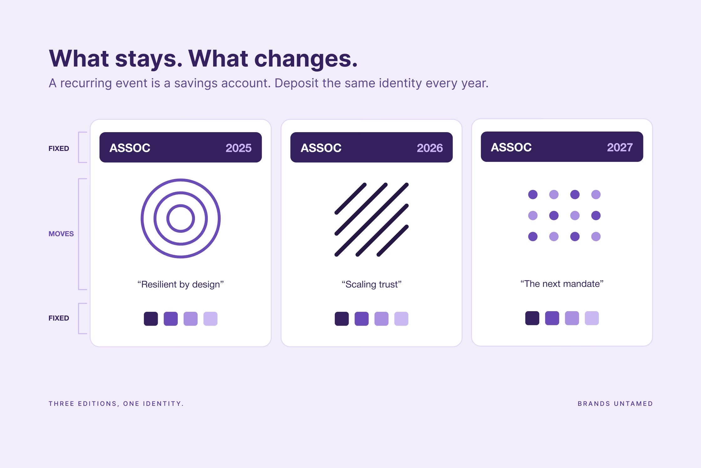
Fix the name, the logomark, the core colours and the typography.
Let only the theme change.
This is the single most valuable structural decision in event branding, and it's the one associations get wrong most often.
A recurring event is like a savings account: every edition where members see the same name, the same mark, the same visual DNA is a deposit into brand recognition. Reinvent the look each year and you empty the account every time, then wonder why the event “doesn't have a profile”.
The annual theme is where the freshness lives.
A new tagline, a new set of supporting graphics, a new hook for that edition's programme, all running under the permanent identity.
London Design Festival has done this masterfully for nearly two decades, and it holds less fixed than you'd expect. The typography is rebuilt every single year. What never moves is the red. One rigid element, everything else free. Most associations manage the exact inverse: they change the red and keep the template.
Your members should recognise next year's invitation in their inbox before they've read a word of it. That only happens if something is allowed to stay still long enough to be remembered.
When should you start branding your annual event?
At the start of planning, whatever that start looks like for you. Some associations begin right after the previous event, eleven months out, plenty just begin six months before. The rule survives both: the identity is briefed in the first weeks of planning, not the final ones, because the design isn't the constraint. The calendar is.
One honest caveat if this is your first time branding the event properly: the first-weeks rule assumes a governance process that already knows how to say yes. If yours doesn't, if you're looking at ten-plus review rounds and members who've never been asked to approve an event identity before, a six-month cycle won't hold it. In that case the start date isn't the start of planning. It's the end of the previous event. The week everyone's still talking about what worked is the week to open the file on the next one.
The identity has one hard deadline hiding in the planning cycle: the first branded thing your members see. Usually that's the save-the-date, followed by registration opening.
Both perform visibly better wearing the new identity than promising it, and every touchpoint that ships before the brand exists is a branded opportunity spent unbranded. If your whole cycle is six months, that deadline lands fast, which is an argument for briefing the identity in week one.
Then there's governance, which anyone who has rebranded an association will recognise. The event identity typically needs the board and often the Secretary General, and if your event rotates between member countries, a host committee with views of its own.
Each layer is reasonable. But stack them together and it will be a slow process. The fix is the same one we recommend for rebrands: a small task force with real ownership and a strong brief, with the other bodies approving against that brief at mapped milestones rather than redesigning by committee.
Rotating events deserve one specific rule: the host country is a layer, never the brand. A location element in that edition's materials, absolutely. A new identity per host, never. The brand has to travel intact or it fragments into a series of one-offs.
Why does the stage matter more for the camera than for the room?
Because the room holds two hundred people for a day, and the photos hold the rest of your sector, plus every policymaker's assistant scrolling LinkedIn, for a few months after the event.
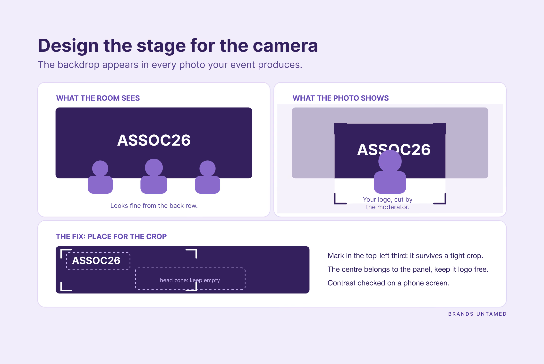
The stage backdrop is the largest branded surface you will produce, and it appears in nearly every photograph the event generates, including the one that matters most: the MEP panel photo that all members, speakers and the MEPs' own comms teams will all post.
Yet most association stages are designed for the room: an enormous logo, right behind the moderator, guaranteed to be cropped out of every close shot. Low contrast that turns to mud on a phone camera. No thought given to where a tight frame around a panel actually falls.
Designing the stage for the camera means safe zones for the logomark, placement that survives a crop from every angle, enough contrast to read well on a mobile screen and content built for the display it will actually play on. It's a design decision, made months earlier, and it's the highest-leverage one of the entire event. Get it right and every member posting a photo becomes a distribution channel wearing your identity. Which, incidentally, is where the event starts feeding your content for the rest of the year, a subject we've covered extensively.
What are the most common event branding mistakes?
The honest list, from years of watching them happen:
- The PowerPoint-template look: the event branded to a slide master, not a system.
- A new random theme and look every year with no permanent brand, so nothing accrues.
- Logo soup on the mainstage backdrop.
- Signage inconsistency across rooms and suppliers.
- The event looking nothing like the association brand.
- A last-minute production rush because branding started too late in the planning cycle.
- The intern-with-Canva problem: no creative direction, so quality is a lottery.
- Print-first design that fails on social, on screen and on the backdrop.
- Stage design that photographs badly: the highest-leverage error of them all.
Logo soup deserves a paragraph of its own, because at member events it arrives without a single sponsor in sight. It's the member logo wall. The "supporting organisations" slide. The backdrop that tries to honour every member company at once, and ends up honouring none of them, least of all you.
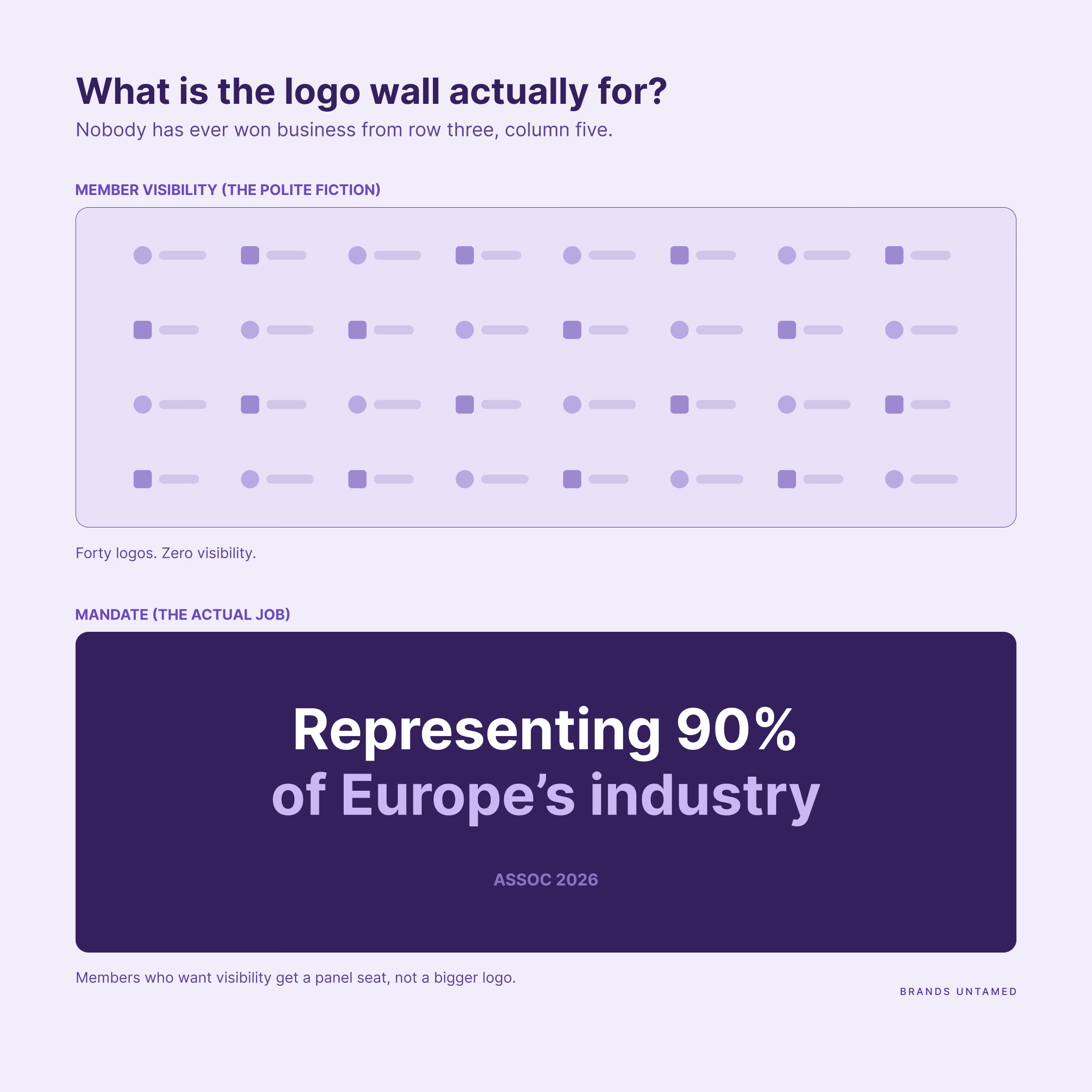
Before designing that wall, ask the question almost nobody asks: what is it actually for? The official answer is “member visibility” but let’s be honest, nobody has ever won business because their logo hung third row, fifth column at an event attended mostly by their own peers. The members in the room already know each other. As a visibility vehicle, the wall is worth absolutely nothing.
Its real value is something else: mandate. When an MEP or a Commission official walks into that room, forty recognisable names on one wall says "we speak for this industry" more convincingly than any statistic on a slide. That's not member visibility. That's the association proving its representativeness, and it's a legitimate advocacy asset.
That distinction rewrites the design brief. If the wall is the mandate proof, individual prominence is beside the point and the fight over logo sizes dissolves: what matters is collective mass, order, and looking like a sector. Sometimes the strongest version has no logos at all. "Representing 90% of Europe's [ABC industry]" in large type does the mandate job harder than forty marks nobody reads, and it has never once started an argument about placement.
And the members who genuinely want visibility? They were never going to get it from a wall. They get it from a speaking slot, a panel seat, a case study in the programme, being the member quoted in the post-event coverage. Offer that trade and you'll find the logo conversation ends itself.
Does your general assembly need the same treatment as the annual conference?
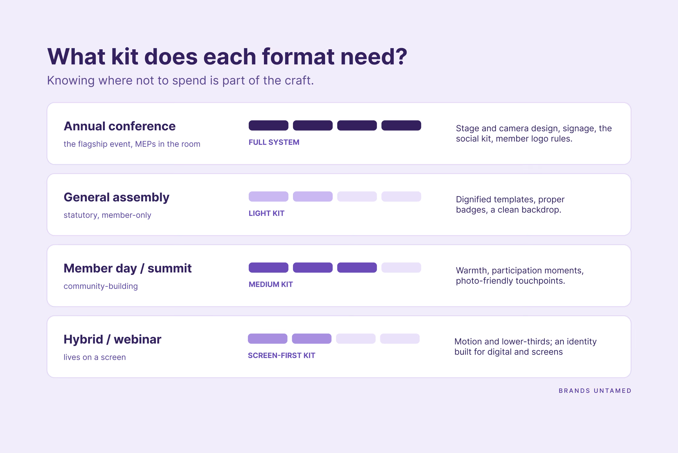
No, and knowing where not to spend is part of the craft. Each format is a brand decision made on purpose, sized to what the moment does for the association, instead of one template stretched across all of them.
At a glance:
- Annual event or conference: the full system. Invest in stage and camera design, signage, the social kit, and the member and partner logo rules.
- General assembly or AGM: statutory and member-only. A lighter, governance-appropriate kit: dignified templates, proper name badges, a clean backdrop. Continuity over spectacle.
- Member day or working group summit: community-building. Warmth, participation moments, photo-friendly touchpoints. A medium kit.
- Hybrid or webinar: an identity engineered for the screen and the thumbnail. Motion and lower-thirds (the bottom 30% space of a video where typically subtitles go) matter more than anything printed.
FAQ
What is event branding for an association's annual event?
A distinct visual and verbal identity for the event, sitting under the association's brand and applied across every touchpoint, from the save-the-date to the badge to the last slide of the closing panel.
What's included in an event brand system?
The name and its acronym-plus-year convention, an annual theme, logo lockups with the association's mark, colour and type, motion graphics, stage and signage direction, badges, presentation templates, registration touchpoints, a social media kit, photography direction and the rules for member and partner logos.
Event branding vs event theme: what's the difference?
The brand is permanent: name, mark, colours, type. The theme is the annual layer that changes with each edition. Theming without a permanent brand underneath is why some events never build a profile no matter how good each year looks.
Should our annual event have its own logo or use the association's brand?
Its own identity, visibly locked to the association's brand. A fully standalone event brand only makes sense once an event has outgrown its parent, which at member-event scale is essentially never.
When should we start branding the event?
In the first weeks of planning, whether your cycle starts twelve months out or six. The hard deadline is the save-the-date: everything that ships before the identity exists is a branded opportunity spent unbranded.
How much does event branding cost?
A modest share of the event budget, and there's no honest fixed number: scope, the formats covered and your approval structure set the price. What's genuinely expensive is not having it: reprints, template chaos, and a rushed look at your most visible moment of the year.
Who should design it: an agency, a freelancer, or in-house?
In-house works if you have senior creative direction, which most secretariats don't. A freelancer gives you hands without direction; a big agency gives you direction with overhead. A senior studio that knows association governance sits deliberately between the two.
How do we handle member and partner logos without wrecking the look?
Dedicated, designed zones, with sizes set by hierarchy, and never mixed into the event identity itself.
How do we keep the brand consistent when the event rotates between countries?
Fix the core identity and treat the host country as a layer: a location element in that edition's materials that never replaces the mark. The brand travels; the host visits.
How is the annual conference different from the general assembly for branding?
The conference justifies the full system. The general assembly needs a dignified light kit that signals continuity and authority; spectacle would be the wrong message for a statutory, member-only meeting.
What are the most common event branding mistakes?
Starting too late, reinventing the look every year, the member logo wall descending into soup, and a stage designed for the room instead of the camera.
Your next annual event is closer than it looks
If your next event has a date, the branding window is open right now, and it closes the day the save-the-date ships. The starting point isn't a design brief. It's a diagnosis: what the event needs to do for the association, how its identity should relate to your brand, and what your governance will realistically allow at what pace.
If any part of this post felt like a description of your last event, you already know. Get in touch and let's make the next one the version members post about for the right reasons.