Rebranding: What It Really Takes to Get It Right
Let’s start with the uncomfortable truth: a lot of rebrands fail.
When they do, it’s rarely because of bad graphic design. It’s almost always because the core reason for the rebrand was misunderstood from the very beginning. Without a strategic anchor, design becomes entirely subjective.
We’ve seen it happen more than once. A team decides they need a rebrand. There’s sudden energy, a fresh budget, and pressure from the top to modernize. Everyone wants progress, but without clear objectives, the process inevitably gets messy. The project falls victim to "design by committee." Feedback becomes vague (like asking to "make it pop") and you end up redesigning a logo five times just to appease different personal tastes.
In the end, the brand might look completely different, but nothing structurally important has actually improved. You've just put a new coat of paint over the same cracks.
First things first: rebrand vs. refresh
Before getting into the weeds of strategy or visual systems, we need to clear up the terminology. From a designer's perspective, words matter because they dictate the scope of the work.
Not everything is a rebrand.
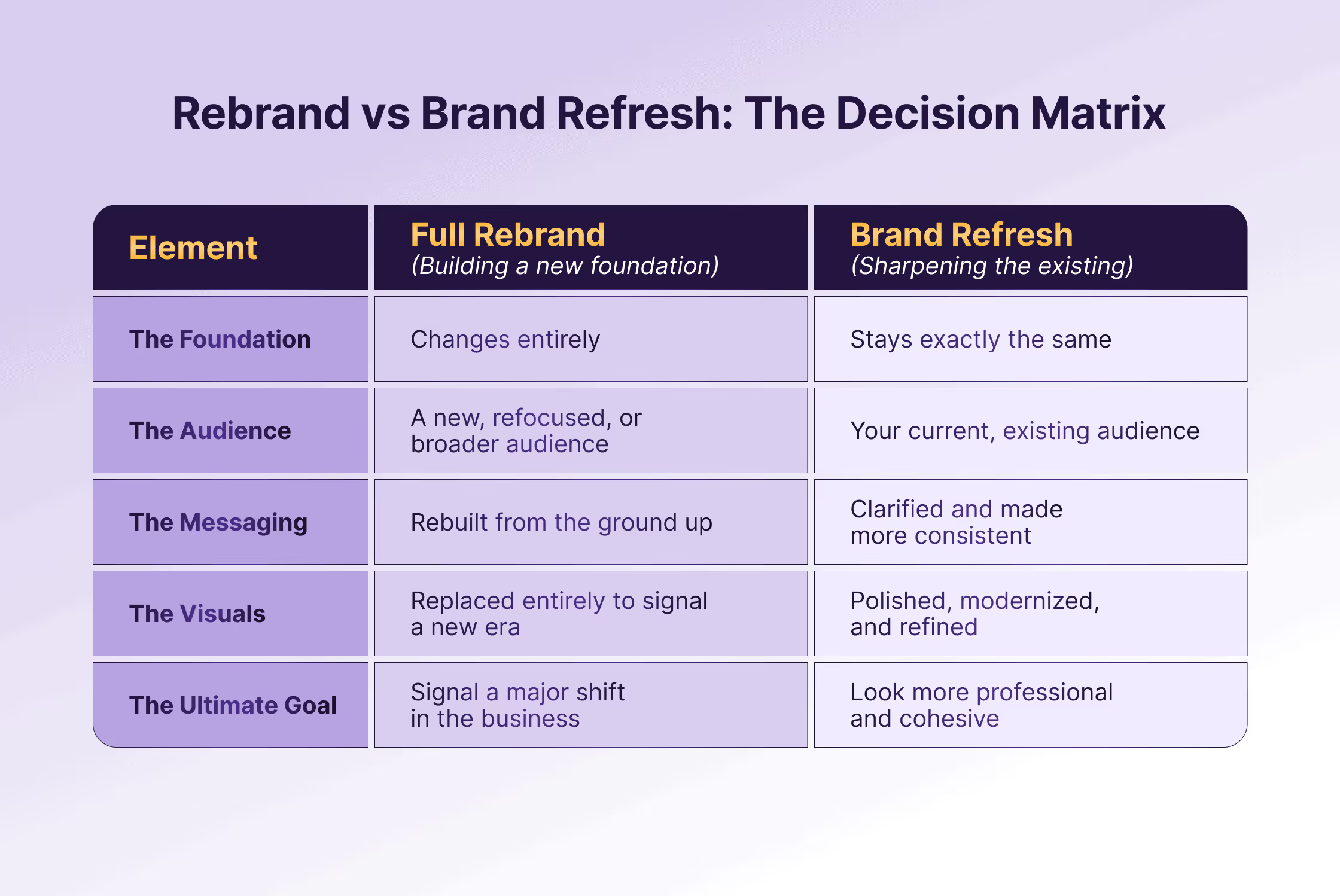
What is a true rebrand?
A rebrand means the actual foundations of the company are changing. This is a fundamental pivot. It involves overhauling your positioning, your core messaging, your target audience, or how you define your space in the market.
Because the business DNA is changing, the visual identity must be torn down and rebuilt to reflect this new reality. It’s a deep, structural shift in how the organization presents itself to the world.
What is a brand refresh?
A brand refresh is an evolution, not a revolution. The foundation of the business remains the same, but the way the brand looks, feels, and sounds gets modernized and sharpened.
Maybe the current logo doesn't scale well on digital platforms, the typography feels dated, or the colour palette lacks the contrast needed for web accessibility. Perhaps the tone of voice is inconsistent across departments, and the content feels scattered. The core brand equity is kept intact, but the visual language is upgraded to be more cohesive and functional.
Why the distinction matters
This distinction is critical because it entirely changes the way an agency approaches the project. If your underlying business strategy isn’t changing, calling the project a "rebrand" creates the wrong expectations from day one, leading to unnecessary teardowns of good brand equity.
We’ve worked with plenty of teams who came in asking for a “full company rebrand,” when what they really needed was a strict design system, consistency, and art direction. Knowing the difference upfront saves a massive amount of time, stress, and budget.
What a rebrand actually involves
This is where most articles go into neat “5-step frameworks”. In reality, it’s usually a bit messier than that. And much more human.
A proper rebrand isn’t just a design project. It’s a business decision that happens to result in design. As designers, we can make your company look incredible, but if we don't have a solid foundation to build on, those visuals are just an empty shell.
Here’s what a solid, functional rebrand actually involves behind the scenes.
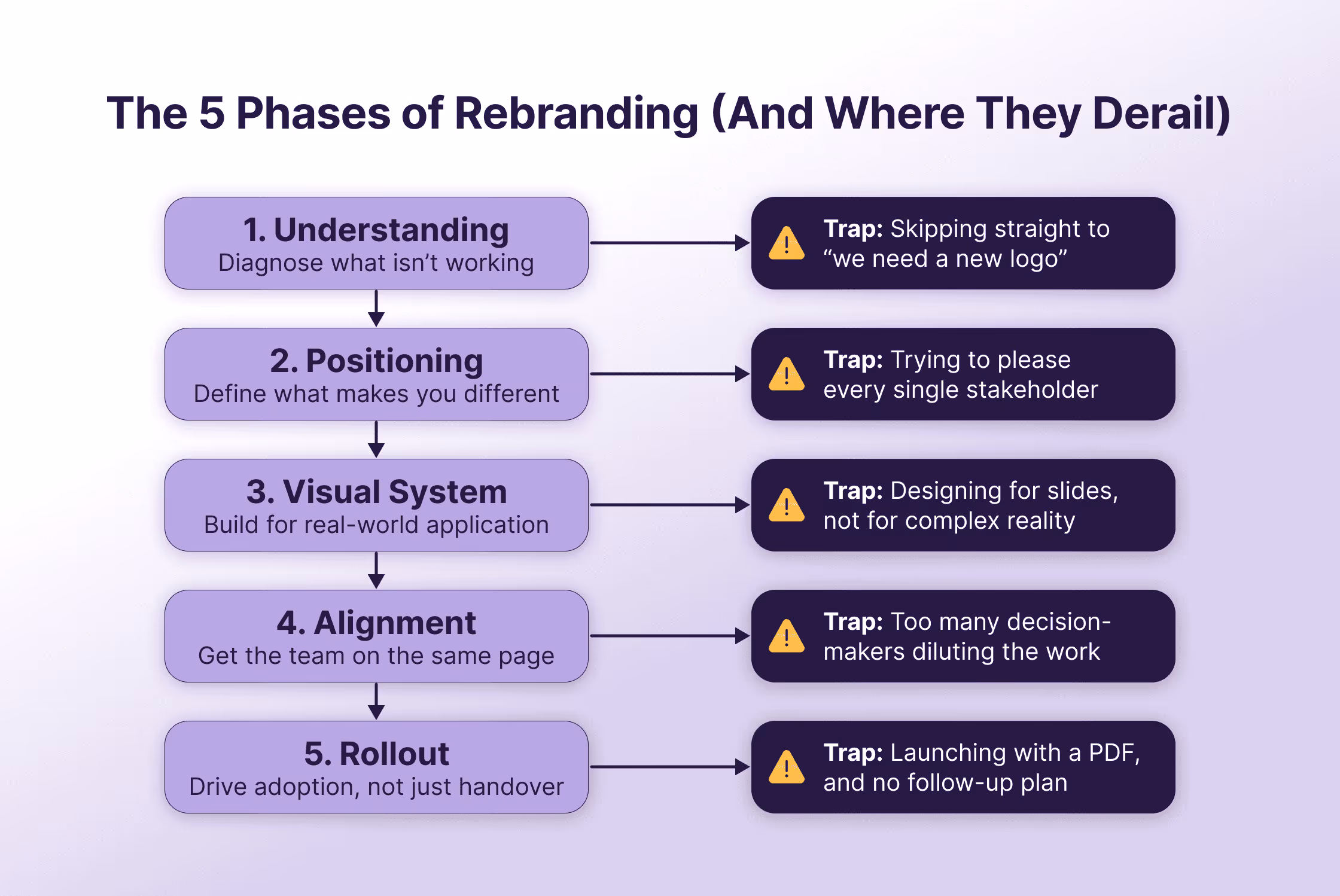
1. Understanding what isn’t working
We don’t start with “what feels outdated” or what the CEO is tired of looking at. We dig into what’s actively failing your business.
Are your clients confused about your service offering? Is your visual language attracting a budget audience when you offer a premium service? Has the organisation changed while the brand has stayed stuck in an older version of the story?
This phase is a thorough audit of your current visual equity and communication friction. If you skip this step, every design choice that follows becomes pure guesswork. And guessing is an expensive way to run a business.
2. Positioning and messaging
This is the part people often want to rush past to get to the "fun" visual stuff. But it’s also the exact point where rebrands either become meaningful or stay entirely surface-level.
You need absolute clarity on what you stand for, your core differentiators, your target audience, and how to articulate all of that simply. We’ve had projects where this strategic alignment alone changed how a team talks about their work overnight, before we even opened Illustrator. Focus on better thinking first.
Without a clear message, graphic design ends up trying to compensate for a confusing narrative. We need your words to give our visuals a clear job to do.
3. A visual identity system (not just a logo)
Yes, the visual side matters, but rarely in the way most people think. A rebrand is not a quest to find a single logo design that everyone in the boardroom happens to love.
Instead, rebranding means building a cohesive, flexible visual system that works in the wild. This includes a distinct typographic hierarchy, a functional colour palette with clear contrast rules, and a recognizable layout logic. Your brand has to hold up across websites, dense annual reports, pitch decks, social media templates, and event booths.
This is especially crucial in organizations where multiple people generate content under tight deadlines. If your design system is too rigid or too complex to handle daily demands, it will inevitably fall apart.
4. Internal alignment
You can have a brilliant strategy and an award-winning visual identity, but if your own team doesn’t get it, it won’t survive.
People need to understand the story behind the change, why the new design choices were made, and how to actually apply the new branding to their specific roles. Brand guidelines shouldn't be a locked PDF that only designers understand; they need to be a practical tool for the whole company.
Without proper internal alignment, old habits come back fast. Different departments will start creating their own versions of your materials, and within six months, you’ll be right back where you started.
5. Rollout and adoption
A rebrand doesn’t simply “launch” and magically fix everything. It gets adopted, or not.
Real adoption requires a few critical elements:
- Practical guidance and accessible brand portals
- Clear "do and don't" visual examples
- Highly usable templates for everyday software
- Ongoing follow-up and design support, not just a zipped folder handover
The absolute best rebrands make day-to-day work easier. They give your team the tools to communicate clearly, produce materials faster, and make confident visual decisions without having to reinvent the wheel every single time.

Why rebrands go wrong
It’s rarely because the design itself is bad. Instead, the process usually gets derailed in very predictable ways.
“We just need a new logo”
This one comes up constantly because a logo feels like a quick, tangible fix. It’s a highly visible asset and a concept every non-designer understands. However, a logo is just the signature at the end of your brand's story.
If your underlying problem is muddled positioning, confusing messaging, or a disjointed visual system, drawing a new icon won’t solve anything. It might create a short burst of excitement, but once the novelty wears off, the exact same structural problems return.
What to do instead: Start with a brand audit before opening any design software. Identify your actual pain points by asking if your current messaging aligns with your target audience, or if your visual assets look disconnected across platforms. Fix the strategic foundation first, and let the new logo be the natural result of that.
Too many decision-makers
Rebrands naturally attract opinions, and wanting everyone to feel heard is completely normal. But when a project lacks a clear owner, "design by committee" takes over and decisions become diluted. Feedback contradicts itself, the creative direction constantly shifts, and nothing ever feels quite right. Eventually, exhaustion sets in, and the safest option wins. In branding, the safest option is almost never the strongest one.
What to do instead: Appoint a small, decisive steering committee of no more than three people with branding experience. It’s entirely fine to gather feedback from the wider team, but all final decisions must be filtered through this core group. Evaluate the design against your strategic goals, not personal preferences.
Trying to please everyone
This usually comes from a good place because you want internal buy-in and a sense of inclusion. But a rebrand that tries to satisfy every stakeholder ends up being painfully generic. Strong brands have to make choices. They know exactly who they are for, what they want to be known for, and most importantly, who they’re not for.
What to do instead: Define your ideal customer persona rigorously and make them the ultimate judge. When evaluating a new colour palette, tone of voice, or typography choice, stop asking "Does everyone in the office like this?" and start asking "Will this fit our target audience?"
No real rollout plan
Sometimes all the creative energy goes into the design phase, leaving nothing in the tank for the actual launch. Teams forget to plan out how the assets will be used, who will manage them, and what happens the day after the reveal. The brand officially exists, but it doesn't actually live. The beautiful new assets just sit on a server because they were never embedded into the team's daily workflow.
What to do instead: Treat the launch as day one, not the finish line. Build practical, easy-to-use templates in tools your team actually uses daily, like Canva, Figma, or Office. Host a brand training session to explain the new guidelines, and appoint a "brand owner" internally who can answer questions and keep applications consistent.
Treating it like a design project
Even though we love the designing at Brands Untamed, this is the biggest trap of all. If a rebrand is treated strictly as "something the design team handles," it becomes completely disconnected from the wider business strategy. It stays on the surface level as a purely cosmetic update. Your company might look a bit better, but the rebrand won't actually change your market position or drive growth.
What to do instead: Treat your rebrand as a business transformation that happens to have a visual component. Bring in leadership from sales, marketing, and product early in the process. Ensure that every design choice directly supports your company's three-to-five-year growth objectives.
Why high-profile rebrands sometimes get misunderstood
Whenever a major corporate rebrand hits the news, the public conversation goes straight to the logo.
People dissect the font choice, debate the new colours, and inevitably ask: Did they ruin it? Was the old one better? Could I have drawn this myself?
Fair enough. The logo is the most visible, tangible asset. It’s the face of the company, so it’s naturally what people react to first. But judging a comprehensive rebrand by its logo is like judging an entire house by its front door.
What the public doesn’t see is the massive strategic iceberg sitting below the surface. They aren't in the boardrooms where the real problems are discussed. They don't see the fragmented brand architecture that was confusing customers, the digital scaling issues of the old identity, the recent company acquisitions that needed to be visually unified, or the complete shift in business direction to reach a younger demographic.
Don’t get me wrong - not every major rebrand is a success. Our industry has certainly seen its share of expensive, over-designed missteps. But critiquing a massive organizational shift based solely on a standalone logo completely misses the point of what branding actually does. A successful rebrand is a strategic business solution anchored by design, not just a beauty contest.
How to know if you actually need a rebrand
Not every brand problem requires a scorched-earth approach. As strategists and designers, we often have to talk clients out of a full reset because a smart, targeted refresh will achieve far more than a rushed, expensive rebrand. Knowing which path to take comes down to diagnosing the actual root cause of your friction.
You might need a rebrand if:
- Your positioning no longer reflects what you actually do, meaning your products or services have evolved but your brand is stuck in the past.
- Your target audience has shifted significantly, requiring a completely new visual language and tone of voice to reach them effectively.
- Your messaging feels completely disconnected from your value proposition, even if the current logo and colours still look aesthetically pleasing.
- There’s a massive, undeniable gap between how you see yourselves internally and how the market actually perceives you.
- Your organization has gone through a merger, acquisition, or major pivot that created a fractured identity needing complete unification.
You probably don’t need one if:
- You're simply bored of looking at your own brand, forgetting that your audience only sees it a fraction of the time you do.
- A competitor just launched a trendy new look, giving your leadership team a sudden, reactive case of "shiny object syndrome."
- The root of your frustration is chaotic visual inconsistency across departments rather than a fundamentally flawed core identity.
- Your brand foundations still make perfect sense, but the daily execution by your team has become sloppy and unmanaged.
- The bulk of your communication problems could be solved instantly with better templates, clearer guidelines, and stricter internal governance.
That last one comes up a lot in our agency work. Teams frequently assume their brand is broken when, in reality, they simply don’t have the right tools, rules, or alignment to use it properly. Fixing that execution gap is almost always where the work should start.
Final thought
Ultimately, a successful rebrand doesn’t just make a company look better. It aligns your external appearance with your internal business reality. It gives your organization a clearer narrative, a more compelling way of expressing its value and, crucially, a visual toolkit that your team can actually use without daily frustration.
But that level of functional beauty only happens when the work goes much deeper than surface-level graphic design.
If your leadership team is starting to have conversations about a rebrand, the first step is absolutely not opening Figma or Illustrator to sketch out new concepts. The first step is sitting down and asking the hard, uncomfortable questions about what’s genuinely broken and what actually needs to change to drive the business forward.
When the strategic thinking is firmly locked in, the design finally has something real to build on. And that’s when a brand truly becomes a business asset rather than just an art project.


Let’s start with the uncomfortable truth: a lot of rebrands fail.
When they do, it’s rarely because of bad graphic design. It’s almost always because the core reason for the rebrand was misunderstood from the very beginning. Without a strategic anchor, design becomes entirely subjective.
We’ve seen it happen more than once. A team decides they need a rebrand. There’s sudden energy, a fresh budget, and pressure from the top to modernize. Everyone wants progress, but without clear objectives, the process inevitably gets messy. The project falls victim to "design by committee." Feedback becomes vague (like asking to "make it pop") and you end up redesigning a logo five times just to appease different personal tastes.
In the end, the brand might look completely different, but nothing structurally important has actually improved. You've just put a new coat of paint over the same cracks.
First things first: rebrand vs. refresh
Before getting into the weeds of strategy or visual systems, we need to clear up the terminology. From a designer's perspective, words matter because they dictate the scope of the work.
Not everything is a rebrand.
What is a true rebrand?
A rebrand means the actual foundations of the company are changing. This is a fundamental pivot. It involves overhauling your positioning, your core messaging, your target audience, or how you define your space in the market.
Because the business DNA is changing, the visual identity must be torn down and rebuilt to reflect this new reality. It’s a deep, structural shift in how the organization presents itself to the world.
What is a brand refresh?
A brand refresh is an evolution, not a revolution. The foundation of the business remains the same, but the way the brand looks, feels, and sounds gets modernized and sharpened.
Maybe the current logo doesn't scale well on digital platforms, the typography feels dated, or the colour palette lacks the contrast needed for web accessibility. Perhaps the tone of voice is inconsistent across departments, and the content feels scattered. The core brand equity is kept intact, but the visual language is upgraded to be more cohesive and functional.
Why the distinction matters
This distinction is critical because it entirely changes the way an agency approaches the project. If your underlying business strategy isn’t changing, calling the project a "rebrand" creates the wrong expectations from day one, leading to unnecessary teardowns of good brand equity.
We’ve worked with plenty of teams who came in asking for a “full company rebrand,” when what they really needed was a strict design system, consistency, and art direction. Knowing the difference upfront saves a massive amount of time, stress, and budget.
What a rebrand actually involves
This is where most articles go into neat “5-step frameworks”. In reality, it’s usually a bit messier than that. And much more human.
A proper rebrand isn’t just a design project. It’s a business decision that happens to result in design. As designers, we can make your company look incredible, but if we don't have a solid foundation to build on, those visuals are just an empty shell.
Here’s what a solid, functional rebrand actually involves behind the scenes.
1. Understanding what isn’t working
We don’t start with “what feels outdated” or what the CEO is tired of looking at. We dig into what’s actively failing your business.
Are your clients confused about your service offering? Is your visual language attracting a budget audience when you offer a premium service? Has the organisation changed while the brand has stayed stuck in an older version of the story?
This phase is a thorough audit of your current visual equity and communication friction. If you skip this step, every design choice that follows becomes pure guesswork. And guessing is an expensive way to run a business.
2. Positioning and messaging
This is the part people often want to rush past to get to the "fun" visual stuff. But it’s also the exact point where rebrands either become meaningful or stay entirely surface-level.
You need absolute clarity on what you stand for, your core differentiators, your target audience, and how to articulate all of that simply. We’ve had projects where this strategic alignment alone changed how a team talks about their work overnight, before we even opened Illustrator. Focus on better thinking first.
Without a clear message, graphic design ends up trying to compensate for a confusing narrative. We need your words to give our visuals a clear job to do.
3. A visual identity system (not just a logo)
Yes, the visual side matters, but rarely in the way most people think. A rebrand is not a quest to find a single logo design that everyone in the boardroom happens to love.
Instead, rebranding means building a cohesive, flexible visual system that works in the wild. This includes a distinct typographic hierarchy, a functional colour palette with clear contrast rules, and a recognizable layout logic. Your brand has to hold up across websites, dense annual reports, pitch decks, social media templates, and event booths.
This is especially crucial in organizations where multiple people generate content under tight deadlines. If your design system is too rigid or too complex to handle daily demands, it will inevitably fall apart.
4. Internal alignment
You can have a brilliant strategy and an award-winning visual identity, but if your own team doesn’t get it, it won’t survive.
People need to understand the story behind the change, why the new design choices were made, and how to actually apply the new branding to their specific roles. Brand guidelines shouldn't be a locked PDF that only designers understand; they need to be a practical tool for the whole company.
Without proper internal alignment, old habits come back fast. Different departments will start creating their own versions of your materials, and within six months, you’ll be right back where you started.
5. Rollout and adoption
A rebrand doesn’t simply “launch” and magically fix everything. It gets adopted, or not.
Real adoption requires a few critical elements:
- Practical guidance and accessible brand portals
- Clear "do and don't" visual examples
- Highly usable templates for everyday software
- Ongoing follow-up and design support, not just a zipped folder handover
The absolute best rebrands make day-to-day work easier. They give your team the tools to communicate clearly, produce materials faster, and make confident visual decisions without having to reinvent the wheel every single time.
Why rebrands go wrong
It’s rarely because the design itself is bad. Instead, the process usually gets derailed in very predictable ways.
“We just need a new logo”
This one comes up constantly because a logo feels like a quick, tangible fix. It’s a highly visible asset and a concept every non-designer understands. However, a logo is just the signature at the end of your brand's story.
If your underlying problem is muddled positioning, confusing messaging, or a disjointed visual system, drawing a new icon won’t solve anything. It might create a short burst of excitement, but once the novelty wears off, the exact same structural problems return.
What to do instead: Start with a brand audit before opening any design software. Identify your actual pain points by asking if your current messaging aligns with your target audience, or if your visual assets look disconnected across platforms. Fix the strategic foundation first, and let the new logo be the natural result of that.
Too many decision-makers
Rebrands naturally attract opinions, and wanting everyone to feel heard is completely normal. But when a project lacks a clear owner, "design by committee" takes over and decisions become diluted. Feedback contradicts itself, the creative direction constantly shifts, and nothing ever feels quite right. Eventually, exhaustion sets in, and the safest option wins. In branding, the safest option is almost never the strongest one.
What to do instead: Appoint a small, decisive steering committee of no more than three people with branding experience. It’s entirely fine to gather feedback from the wider team, but all final decisions must be filtered through this core group. Evaluate the design against your strategic goals, not personal preferences.
Trying to please everyone
This usually comes from a good place because you want internal buy-in and a sense of inclusion. But a rebrand that tries to satisfy every stakeholder ends up being painfully generic. Strong brands have to make choices. They know exactly who they are for, what they want to be known for, and most importantly, who they’re not for.
What to do instead: Define your ideal customer persona rigorously and make them the ultimate judge. When evaluating a new colour palette, tone of voice, or typography choice, stop asking "Does everyone in the office like this?" and start asking "Will this fit our target audience?"
No real rollout plan
Sometimes all the creative energy goes into the design phase, leaving nothing in the tank for the actual launch. Teams forget to plan out how the assets will be used, who will manage them, and what happens the day after the reveal. The brand officially exists, but it doesn't actually live. The beautiful new assets just sit on a server because they were never embedded into the team's daily workflow.
What to do instead: Treat the launch as day one, not the finish line. Build practical, easy-to-use templates in tools your team actually uses daily, like Canva, Figma, or Office. Host a brand training session to explain the new guidelines, and appoint a "brand owner" internally who can answer questions and keep applications consistent.
Treating it like a design project
Even though we love the designing at Brands Untamed, this is the biggest trap of all. If a rebrand is treated strictly as "something the design team handles," it becomes completely disconnected from the wider business strategy. It stays on the surface level as a purely cosmetic update. Your company might look a bit better, but the rebrand won't actually change your market position or drive growth.
What to do instead: Treat your rebrand as a business transformation that happens to have a visual component. Bring in leadership from sales, marketing, and product early in the process. Ensure that every design choice directly supports your company's three-to-five-year growth objectives.
Why high-profile rebrands sometimes get misunderstood
Whenever a major corporate rebrand hits the news, the public conversation goes straight to the logo.
People dissect the font choice, debate the new colours, and inevitably ask: Did they ruin it? Was the old one better? Could I have drawn this myself?
Fair enough. The logo is the most visible, tangible asset. It’s the face of the company, so it’s naturally what people react to first. But judging a comprehensive rebrand by its logo is like judging an entire house by its front door.
What the public doesn’t see is the massive strategic iceberg sitting below the surface. They aren't in the boardrooms where the real problems are discussed. They don't see the fragmented brand architecture that was confusing customers, the digital scaling issues of the old identity, the recent company acquisitions that needed to be visually unified, or the complete shift in business direction to reach a younger demographic.
Don’t get me wrong - not every major rebrand is a success. Our industry has certainly seen its share of expensive, over-designed missteps. But critiquing a massive organizational shift based solely on a standalone logo completely misses the point of what branding actually does. A successful rebrand is a strategic business solution anchored by design, not just a beauty contest.
How to know if you actually need a rebrand
Not every brand problem requires a scorched-earth approach. As strategists and designers, we often have to talk clients out of a full reset because a smart, targeted refresh will achieve far more than a rushed, expensive rebrand. Knowing which path to take comes down to diagnosing the actual root cause of your friction.
You might need a rebrand if:
- Your positioning no longer reflects what you actually do, meaning your products or services have evolved but your brand is stuck in the past.
- Your target audience has shifted significantly, requiring a completely new visual language and tone of voice to reach them effectively.
- Your messaging feels completely disconnected from your value proposition, even if the current logo and colours still look aesthetically pleasing.
- There’s a massive, undeniable gap between how you see yourselves internally and how the market actually perceives you.
- Your organization has gone through a merger, acquisition, or major pivot that created a fractured identity needing complete unification.
You probably don’t need one if:
- You're simply bored of looking at your own brand, forgetting that your audience only sees it a fraction of the time you do.
- A competitor just launched a trendy new look, giving your leadership team a sudden, reactive case of "shiny object syndrome."
- The root of your frustration is chaotic visual inconsistency across departments rather than a fundamentally flawed core identity.
- Your brand foundations still make perfect sense, but the daily execution by your team has become sloppy and unmanaged.
- The bulk of your communication problems could be solved instantly with better templates, clearer guidelines, and stricter internal governance.
That last one comes up a lot in our agency work. Teams frequently assume their brand is broken when, in reality, they simply don’t have the right tools, rules, or alignment to use it properly. Fixing that execution gap is almost always where the work should start.
Final thought
Ultimately, a successful rebrand doesn’t just make a company look better. It aligns your external appearance with your internal business reality. It gives your organization a clearer narrative, a more compelling way of expressing its value and, crucially, a visual toolkit that your team can actually use without daily frustration.
But that level of functional beauty only happens when the work goes much deeper than surface-level graphic design.
If your leadership team is starting to have conversations about a rebrand, the first step is absolutely not opening Figma or Illustrator to sketch out new concepts. The first step is sitting down and asking the hard, uncomfortable questions about what’s genuinely broken and what actually needs to change to drive the business forward.
When the strategic thinking is firmly locked in, the design finally has something real to build on. And that’s when a brand truly becomes a business asset rather than just an art project.