What Associations Get Wrong about Visual Identity in Policy Communication
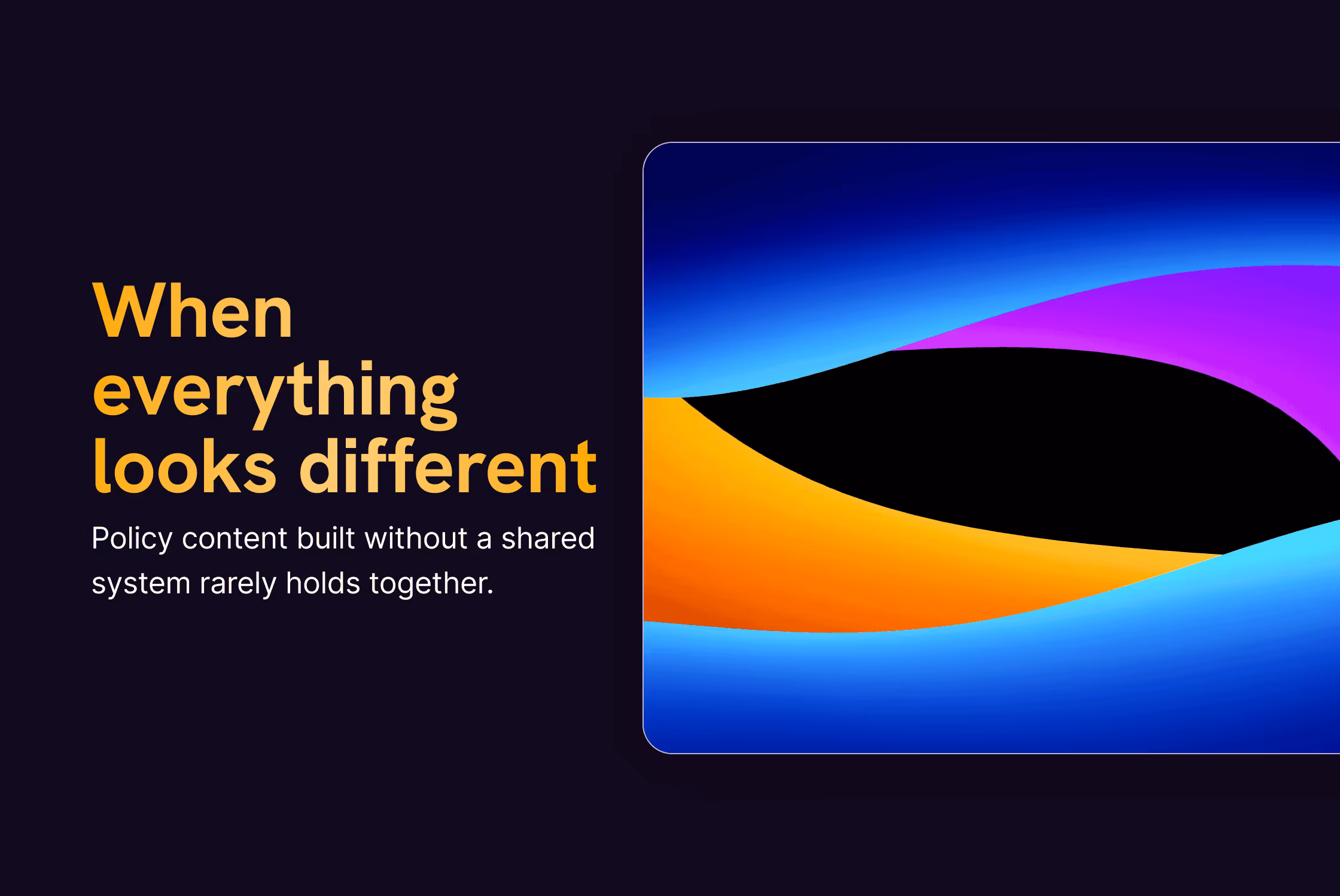
Most associations think they have a visual identity problem.
In reality, they usually have a content and decision problem, and design gets pulled in to clean it up at the end.
This comes up a lot in policy work. Visual identity only becomes a topic when something feels off. Not when systems are built. By the time design is involved, the message has already been edited by too many people, weighed down by good intentions, and turned into something that is hard to work with.
After a while, the same issues start to repeat themselves. Different topics, different organisations, very similar patterns.
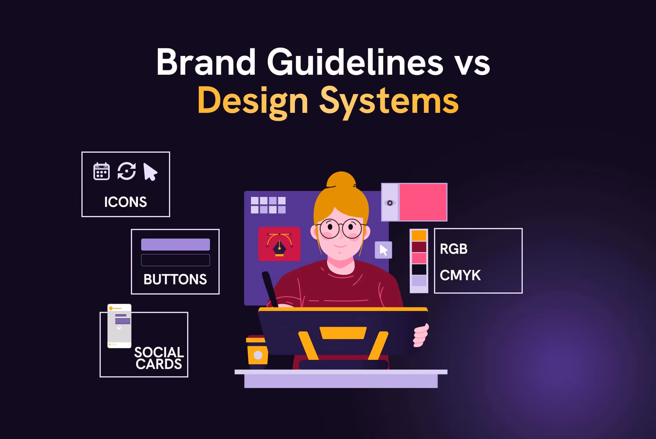
Treating visual identity as a logo exercise
The pattern usually starts with a logo project.
There is a brief. There are discussions about colours and symbolism. There are long conversations about whether it looks “institutional enough”.
Once it is approved, everyone moves on.
What rarely gets decided is how that logo is supposed to live inside actual policy content.
Charts.
Factsheets.
Slide decks.
Social visuals.
So people improvise.
We worked with a Brussels-based association where every policy brief looked like it came from a different organisation. Not because anyone was careless, but because everyone solved the same problem in their own way.
Sometimes a comms officer put something together quickly.
Sometimes an external designer stepped in.
Sometimes the answer was “let’s just use PowerPoint and keep it simple”.
Same logo. Completely different results.
At a certain point, stakeholders genuinely started asking whether these documents belonged together.
We did not touch the logo.
We focused on the parts no one had defined. How headings behave. How much space is normal. How data is shown. What a page is allowed to look like.
Once those rules existed, people stopped redesigning everything from scratch. They stopped asking for design help for every new document.
And quietly, the logo stopped being a problem.
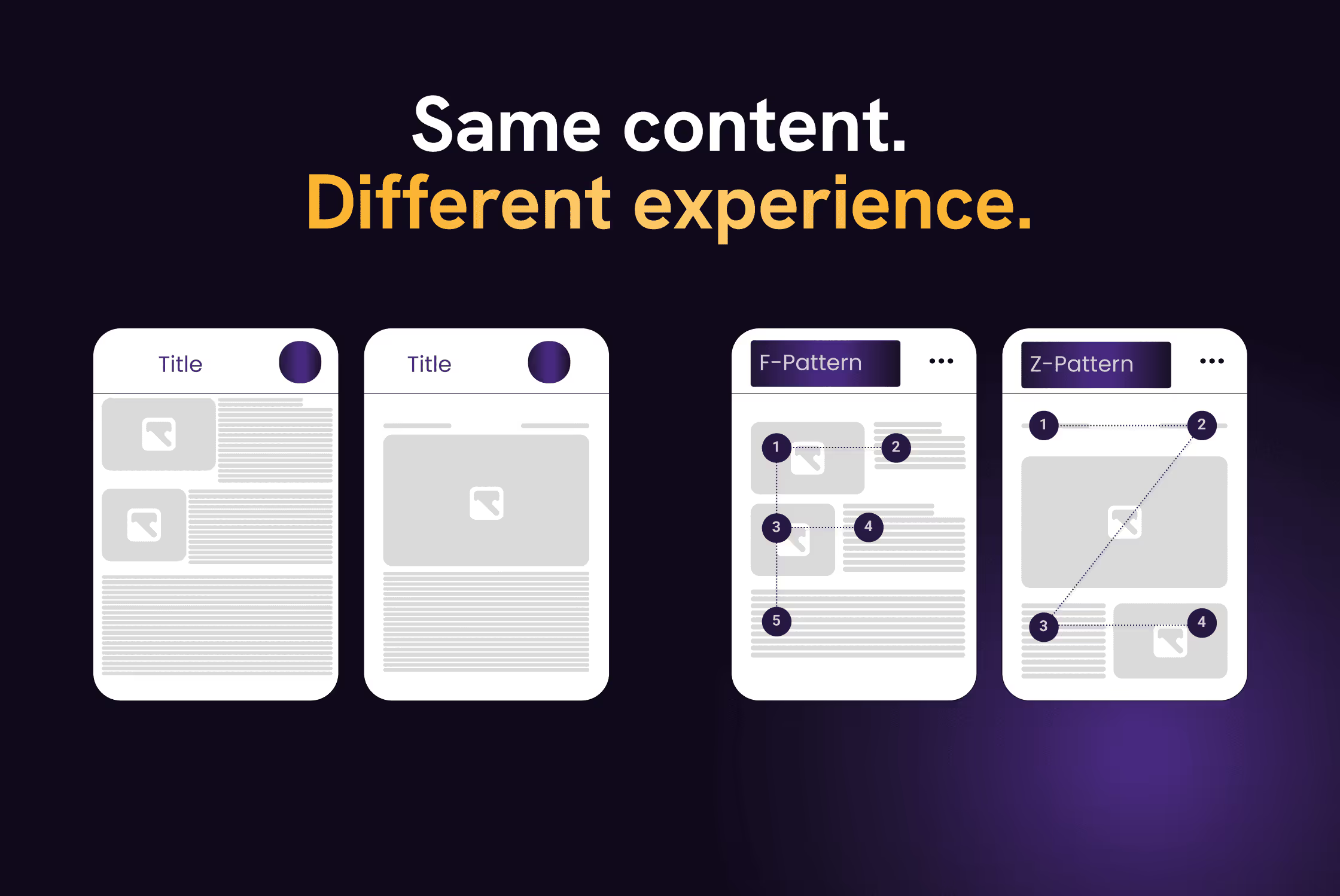
Designing for internal reassurance, not external readers
Many visual decisions in policy communication are made to reassure the people inside the organisation.
Does it feel institutional enough?
Does it look “Brussels” enough?
Will anyone object to this?
Readability often comes later.
We have seen factsheets approved because they felt safe, even though they were tiring to read. Dense layouts, small text, too many visual elements competing for attention.
In one case, we redesigned a policy factsheet and stripped it back quite a bit. More space. Clear structure. Fewer colours doing fewer things.
The first reaction was hesitation.
It felt empty.
Too light.
Not serious enough.
Instead of debating taste, we reused the same structure elsewhere. First in a presentation. Then in a set of social visuals pulling out the same arguments.
Once people saw the content working in different places, the discomfort faded. Not because opinions changed, but because the layout proved useful.
Confusing expertise with density
This one comes up in almost every policy project.
There is an unspoken belief that policy content needs to look heavy to be credible. The more text, the more logos, the more footnotes, the more significant it must be.
So everything stays in.
We were asked to “make a slide deck clearer” that opened with fourteen logos on the first slide and full paragraphs on every page. The information itself was correct. It was just exhausting to get through (and nobody ever did).
We reduced what was visible to what someone could actually scan while listening. We used visuals to guide the eye instead of filling every corner.
Same content. Much lighter.
The reaction was predictable.
“This is much clearer. But can we add some of the text back in, just in case?”
That hesitation rarely disappears completely. Policy work is cautious by nature. So the detail did not disappear. It moved. Into speaker notes and backup slides, where it could support the conversation instead of blocking it.
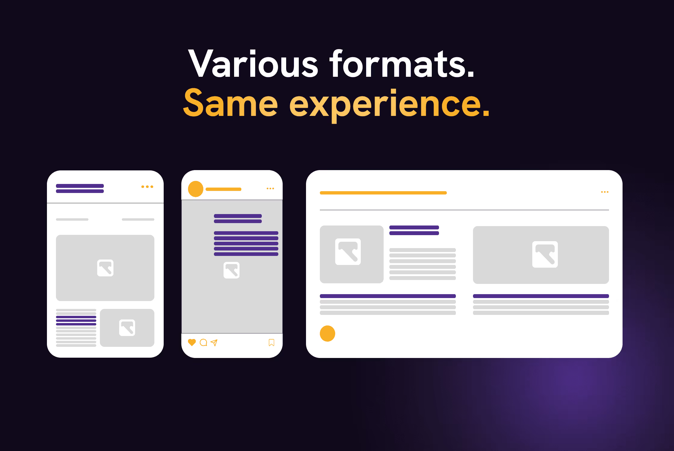
Forgetting that policy content never lives in one format
Visual identity is often designed for the main output.
The report.
The study.
The website.
But policy content rarely only stays there.
It gets reused, forwarded, presented, posted. It ends up on LinkedIn, in slides, in one-pagers, often without context.
We have seen associations with strong, well-designed reports and completely disconnected social visuals. Different colours, typography, tone.
It felt like two organisations talking about the same topic.
Instead of starting from the biggest deliverable, we worked backwards from the smallest ones. A single slide. A chart. A simple visual pulled out of context.
Once those were clear, everything else became easier. The report stopped being the starting point and became just one output amongst many.
Expecting design to fix unresolved content decisions
This is the most uncomfortable pattern to write about.
Design is often asked to “make things clearer” when the content itself has never really been decided.
Too many contributors.
No clear owner.
Everything marked as important.
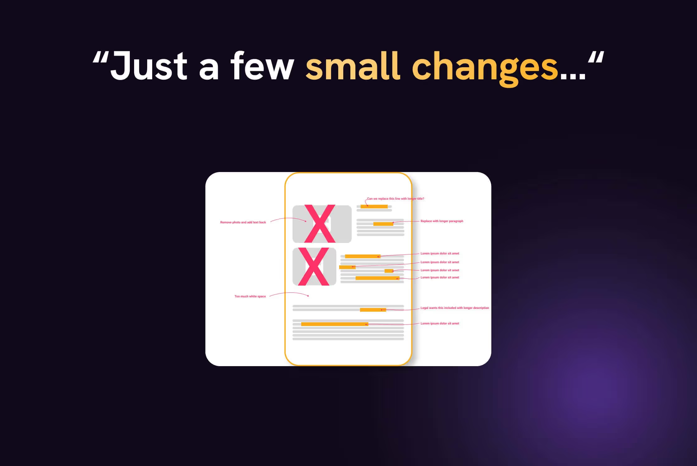
We were asked to redesign a policy document that had been edited by eight people. Every paragraph was the result of compromise. Nothing could be removed.
At that point, design can only rearrange the confusion.
So we stopped.
We paused the design and pushed back with a few basic questions.
What is this actually for?
Who needs to understand it?
What can disappear without breaking the message?
Once those decisions were made, the design work became straightforward.
Conclusion
Most associations do not need to look more serious.
They need to make it easier for people to work with their content.
That means fewer one-off design decisions, fewer taste debates, and fewer moments where someone asks, “Can you quickly redesign this?”
When a visual identity is built to survive real use, not just approval rounds, things change.
People reuse what already exists.
Content moves faster.
Design stops being a bottleneck.
That's usually when associations realise they never really had a visual identity problem in the first place. They simply had no clear way to use it.


Most associations think they have a visual identity problem.
In reality, they usually have a content and decision problem, and design gets pulled in to clean it up at the end.
This comes up a lot in policy work. Visual identity only becomes a topic when something feels off. Not when systems are built. By the time design is involved, the message has already been edited by too many people, weighed down by good intentions, and turned into something that is hard to work with.
After a while, the same issues start to repeat themselves. Different topics, different organisations, very similar patterns.
Treating visual identity as a logo exercise
The pattern usually starts with a logo project.
There is a brief. There are discussions about colours and symbolism. There are long conversations about whether it looks “institutional enough”.
Once it is approved, everyone moves on.
What rarely gets decided is how that logo is supposed to live inside actual policy content.
Charts.
Factsheets.
Slide decks.
Social visuals.
So people improvise.
We worked with a Brussels-based association where every policy brief looked like it came from a different organisation. Not because anyone was careless, but because everyone solved the same problem in their own way.
Sometimes a comms officer put something together quickly.
Sometimes an external designer stepped in.
Sometimes the answer was “let’s just use PowerPoint and keep it simple”.
Same logo. Completely different results.
At a certain point, stakeholders genuinely started asking whether these documents belonged together.
We did not touch the logo.
We focused on the parts no one had defined. How headings behave. How much space is normal. How data is shown. What a page is allowed to look like.
Once those rules existed, people stopped redesigning everything from scratch. They stopped asking for design help for every new document.
And quietly, the logo stopped being a problem.
Designing for internal reassurance, not external readers
Many visual decisions in policy communication are made to reassure the people inside the organisation.
Does it feel institutional enough?
Does it look “Brussels” enough?
Will anyone object to this?
Readability often comes later.
We have seen factsheets approved because they felt safe, even though they were tiring to read. Dense layouts, small text, too many visual elements competing for attention.
In one case, we redesigned a policy factsheet and stripped it back quite a bit. More space. Clear structure. Fewer colours doing fewer things.
The first reaction was hesitation.
It felt empty.
Too light.
Not serious enough.
Instead of debating taste, we reused the same structure elsewhere. First in a presentation. Then in a set of social visuals pulling out the same arguments.
Once people saw the content working in different places, the discomfort faded. Not because opinions changed, but because the layout proved useful.
Confusing expertise with density
This one comes up in almost every policy project.
There is an unspoken belief that policy content needs to look heavy to be credible. The more text, the more logos, the more footnotes, the more significant it must be.
So everything stays in.
We were asked to “make a slide deck clearer” that opened with fourteen logos on the first slide and full paragraphs on every page. The information itself was correct. It was just exhausting to get through (and nobody ever did).
We reduced what was visible to what someone could actually scan while listening. We used visuals to guide the eye instead of filling every corner.
Same content. Much lighter.
The reaction was predictable.
“This is much clearer. But can we add some of the text back in, just in case?”
That hesitation rarely disappears completely. Policy work is cautious by nature. So the detail did not disappear. It moved. Into speaker notes and backup slides, where it could support the conversation instead of blocking it.
Forgetting that policy content never lives in one format
Visual identity is often designed for the main output.
The report.
The study.
The website.
But policy content rarely only stays there.
It gets reused, forwarded, presented, posted. It ends up on LinkedIn, in slides, in one-pagers, often without context.
We have seen associations with strong, well-designed reports and completely disconnected social visuals. Different colours, typography, tone.
It felt like two organisations talking about the same topic.
Instead of starting from the biggest deliverable, we worked backwards from the smallest ones. A single slide. A chart. A simple visual pulled out of context.
Once those were clear, everything else became easier. The report stopped being the starting point and became just one output amongst many.
Expecting design to fix unresolved content decisions
This is the most uncomfortable pattern to write about.
Design is often asked to “make things clearer” when the content itself has never really been decided.
Too many contributors.
No clear owner.
Everything marked as important.
We were asked to redesign a policy document that had been edited by eight people. Every paragraph was the result of compromise. Nothing could be removed.
At that point, design can only rearrange the confusion.
So we stopped.
We paused the design and pushed back with a few basic questions.
What is this actually for?
Who needs to understand it?
What can disappear without breaking the message?
Once those decisions were made, the design work became straightforward.
Conclusion
Most associations do not need to look more serious.
They need to make it easier for people to work with their content.
That means fewer one-off design decisions, fewer taste debates, and fewer moments where someone asks, “Can you quickly redesign this?”
When a visual identity is built to survive real use, not just approval rounds, things change.
People reuse what already exists.
Content moves faster.
Design stops being a bottleneck.
That's usually when associations realise they never really had a visual identity problem in the first place. They simply had no clear way to use it.