What Makes a Good Report, and Why Are Most of Them So Hard to Read
Reports are everywhere.
Annual reports. Policy reports. Research reports. Impact reports. Strategy reports.
They take months to produce. They involve a lot of people. And by the time they’re finished, everyone is already tired of them.
Most teams know this feeling. Weeks of collecting input, aligning internally, reviewing drafts, adjusting language, and fixing layout details. And repeat. The result is usually a document that looks serious and complete.
But if we’re honest, it’s also a document that few people will read from start to finish.
That doesn’t make reports useless. Far from it. They’re still an important way to document information, show progress, and create a shared reference point.
But making a report that actually works is harder than it looks. And for many teams, it keeps getting harder every year.
Why reports often go wrong before design starts
When a report doesn’t work, design is often the first thing that gets blamed.
The layout feels busy. The document is too long. The visuals don’t help.
Sometimes that’s true. But in most of the projects we see, most reports run into trouble much earlier.
Before anyone opens a design file, there’s often uncertainty about what the report is supposed to do.
Is it meant to tell a story or serve as a reference? Is it for external audiences, internal teams, or both? Is it something people should read, or mainly scan and come back to later?
When those questions stay open, everything gets harder downstream.
Content keeps growing because no one wants to cut. Different audiences get mixed together, and feedback becomes contradictory because people are reacting from different expectations.
By the time design gets involved, it’s often being asked to “fix” decisions that were never made.
That’s a lot to ask from layout alone.
What a strong report is supposed to do
One reason reports are so hard to get right is that expectations are often unrealistic.
Many are written as if someone will sit down, start at page one, and read all the way through. Carefully and in order. Ideally with a cup of coffee and no distractions.
That does happen sometimes. But it’s not the norm.
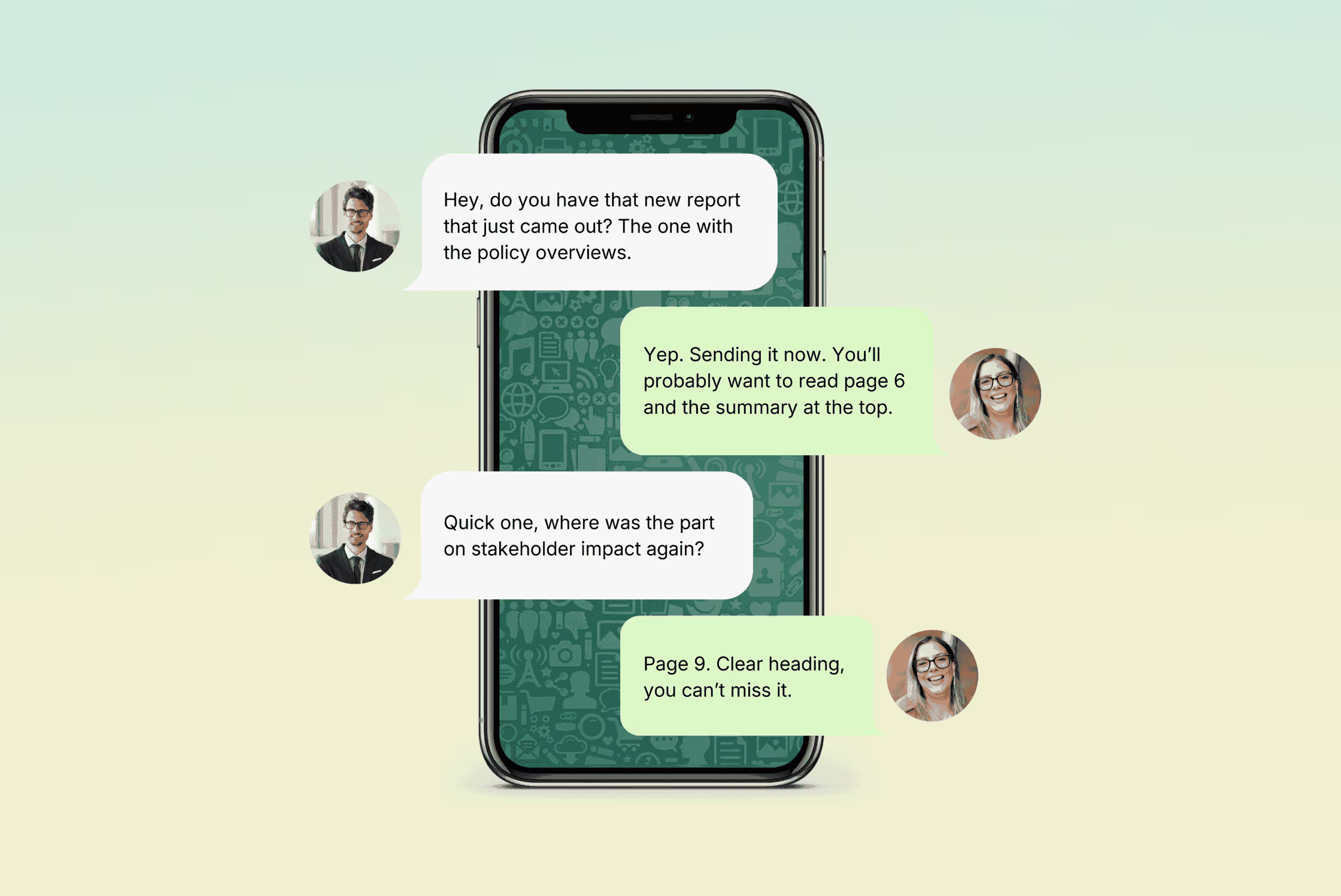
In practice, reports are skimmed, searched, and reopened months later for one specific thing. A chart. A quote. A page someone was told to look at.
People jump in where they need to, often under time pressure.
Reports that work take that behaviour seriously. They don’t assume a linear reading experience. They help readers understand where they are, what matters, and where to go next.
That’s why many teams feel stuck between being complete and being usable. Wanting to include everything, but also not wanting to overwhelm the reader.
The way out isn’t choosing one over the other. Just be honest about what the report is there for.

Content decisions that shape everything
Not every report needs to do everything.
Some are there to explain a point of view.
Some document work that’s already been done.
Some support decisions or provide transparency.
Problems usually start when a report is quietly trying to do all of those things at once.
Once the main job of the report is clear the next challenge shows up pretty quickly: content.
Not writing quality or tone of voice.
Decisions.
Most reports struggle because no one feels comfortable deciding what matters more than something else. Everything gets included, and cutting anything feels risky.
So the document grows.
This is usually where teams get stuck, because prioritising content means making choices that can feel political. Saying yes to one thing often means saying no to something else. Or at least saying “not here”.
A good report forces a few clear choices early on. What’s essential for the main audience, and what’s supporting context? What belongs in the report, and what doesn’t need to be there at all?
That also means accepting that not every reader needs the same level of detail, at the same time. Clear signposting, summaries, and layered information let people engage at different depths, without forcing everything into one long narrative.
When these questions are answered upfront, everything becomes easier. Structure becomes clearer, design choices become more obvious, feedback becomes more focused.
This doesn’t make the report less complete. It usually makes it more readable.
Structure as the quiet enabler
Once content decisions are made, structure does most of the heavy lifting.
Not in a flashy way. Most of the time, good structure goes unnoticed. But when it’s missing, you feel it immediately. Long sections with no clear hierarchy, pages that feel dense (even when the content itself is solid), readers who lose their place and give up.
A solid structure gives people orientation. It tells them where they are, what matters most, and how the information is organised. That matters whether someone is reading carefully or just dipping in to find one specific thing.
It’s also where reports stop feeling like one-off documents and start behaving more like systems. A clear structure can carry new content without falling apart. It gives teams something stable to work with, while still leaving room to refresh the look, adjust emphasis, or highlight new priorities from year to year.
Structure might not make a report exciting, but it makes it usable. Readers find what they need faster, and teams spend less time fixing the same problems.
What design does in a good report
Design should play a very specific role in a report: to make decisions visible. It turns hierarchy into something people can see. It shows what matters most, what supports it, and what can wait.
When design is treated as an after thought, it's asked to carry too much.
Busy layouts, too many visual styles, and an urge to make everything “stand out” often come from content that hasn’t been prioritised clearly.
When design is treated as support, something else happens.
It slows things down where needed, and speeds them up where possible. It creates rhythm in long documents. It helps readers scan without feeling lost, and read without feeling overwhelmed.
This is also where consistency becomes important. Not because everything needs to look the same, but because familiarity helps readers focus on the content instead of relearning to “read” the document on every page.
A strong underlying structure also leaves room to evolve. Reports don’t need to look identical year after year to be consistent. When the system is sound, you can easily update the visual expression, highlight new priorities, or shift emphasis, without starting from scratch.
How reports are used once they’re published
Once a report is published, it stops belonging to the team that created it.
It gets downloaded, forwarded, bookmarked, skimmed, and sometimes opened months later for one specific thing. People jump in where they need to, often under time pressure.
Strong reports are designed for that reality. They help readers jump in and out, they give enough context on any page to understand what you’re looking at, without forcing you to read everything that came before.
That’s why summaries, clear section openings, and consistent cues matter so much. They respect how reports are actually used.
The reality nobody puts in the brief
In an ideal world, reports would have endless time, clear ownership, and calm decision-making.
In reality, they don’t.
They have deadlines that don’t move. Multiple stakeholders with different priorities. Last-minute changes. Content that arrives late. Budgets that are already stretched by the time design starts.
That’s why clear priorities matter so much. They help teams make faster decisions when time is tight. A solid structure can take late changes without falling apart. And a flexible design system allows updates without redoing everything.
Trying to make a report perfect under real-world conditions often backfires. Trying to make it clear, usable, and well-considered tends to work much better.
What actually makes a report work
There’s no single formula for a good report. What works for one organisation, audience, or moment won’t automatically work for another.
But after working on a lot of them, the same patterns keep coming back.
Reports that work:
- are clear about what they’re trying to do
- make deliberate content choices
- rely on structure to guide the reader
- use design to make decisions visible, not hide uncertainty
- accept the reality of how reports are produced and used
If there’s one thing worth doing before the next round of edits, it’s this: step back and ask a few simple questions.
Who is this really for? What do they need from it? And what can be clearer than it is today?
Those questions often do more for a report than another content revision round ever will.


Reports are everywhere.
Annual reports. Policy reports. Research reports. Impact reports. Strategy reports.
They take months to produce. They involve a lot of people. And by the time they’re finished, everyone is already tired of them.
Most teams know this feeling. Weeks of collecting input, aligning internally, reviewing drafts, adjusting language, and fixing layout details. And repeat. The result is usually a document that looks serious and complete.
But if we’re honest, it’s also a document that few people will read from start to finish.
That doesn’t make reports useless. Far from it. They’re still an important way to document information, show progress, and create a shared reference point.
But making a report that actually works is harder than it looks. And for many teams, it keeps getting harder every year.
Why reports often go wrong before design starts
When a report doesn’t work, design is often the first thing that gets blamed.
The layout feels busy. The document is too long. The visuals don’t help.
Sometimes that’s true. But in most of the projects we see, most reports run into trouble much earlier.
Before anyone opens a design file, there’s often uncertainty about what the report is supposed to do.
Is it meant to tell a story or serve as a reference? Is it for external audiences, internal teams, or both? Is it something people should read, or mainly scan and come back to later?
When those questions stay open, everything gets harder downstream.
Content keeps growing because no one wants to cut. Different audiences get mixed together, and feedback becomes contradictory because people are reacting from different expectations.
By the time design gets involved, it’s often being asked to “fix” decisions that were never made.
That’s a lot to ask from layout alone.
What a strong report is supposed to do
One reason reports are so hard to get right is that expectations are often unrealistic.
Many are written as if someone will sit down, start at page one, and read all the way through. Carefully and in order. Ideally with a cup of coffee and no distractions.
That does happen sometimes. But it’s not the norm.
In practice, reports are skimmed, searched, and reopened months later for one specific thing. A chart. A quote. A page someone was told to look at.
People jump in where they need to, often under time pressure.
Reports that work take that behaviour seriously. They don’t assume a linear reading experience. They help readers understand where they are, what matters, and where to go next.
That’s why many teams feel stuck between being complete and being usable. Wanting to include everything, but also not wanting to overwhelm the reader.
The way out isn’t choosing one over the other. Just be honest about what the report is there for.
Content decisions that shape everything
Not every report needs to do everything.
Some are there to explain a point of view.
Some document work that’s already been done.
Some support decisions or provide transparency.
Problems usually start when a report is quietly trying to do all of those things at once.
Once the main job of the report is clear the next challenge shows up pretty quickly: content.
Not writing quality or tone of voice.
Decisions.
Most reports struggle because no one feels comfortable deciding what matters more than something else. Everything gets included, and cutting anything feels risky.
So the document grows.
This is usually where teams get stuck, because prioritising content means making choices that can feel political. Saying yes to one thing often means saying no to something else. Or at least saying “not here”.
A good report forces a few clear choices early on. What’s essential for the main audience, and what’s supporting context? What belongs in the report, and what doesn’t need to be there at all?
That also means accepting that not every reader needs the same level of detail, at the same time. Clear signposting, summaries, and layered information let people engage at different depths, without forcing everything into one long narrative.
When these questions are answered upfront, everything becomes easier. Structure becomes clearer, design choices become more obvious, feedback becomes more focused.
This doesn’t make the report less complete. It usually makes it more readable.
Structure as the quiet enabler
Once content decisions are made, structure does most of the heavy lifting.
Not in a flashy way. Most of the time, good structure goes unnoticed. But when it’s missing, you feel it immediately. Long sections with no clear hierarchy, pages that feel dense (even when the content itself is solid), readers who lose their place and give up.
A solid structure gives people orientation. It tells them where they are, what matters most, and how the information is organised. That matters whether someone is reading carefully or just dipping in to find one specific thing.
It’s also where reports stop feeling like one-off documents and start behaving more like systems. A clear structure can carry new content without falling apart. It gives teams something stable to work with, while still leaving room to refresh the look, adjust emphasis, or highlight new priorities from year to year.
Structure might not make a report exciting, but it makes it usable. Readers find what they need faster, and teams spend less time fixing the same problems.
What design does in a good report
Design should play a very specific role in a report: to make decisions visible. It turns hierarchy into something people can see. It shows what matters most, what supports it, and what can wait.
When design is treated as an after thought, it's asked to carry too much.
Busy layouts, too many visual styles, and an urge to make everything “stand out” often come from content that hasn’t been prioritised clearly.
When design is treated as support, something else happens.
It slows things down where needed, and speeds them up where possible. It creates rhythm in long documents. It helps readers scan without feeling lost, and read without feeling overwhelmed.
This is also where consistency becomes important. Not because everything needs to look the same, but because familiarity helps readers focus on the content instead of relearning to “read” the document on every page.
A strong underlying structure also leaves room to evolve. Reports don’t need to look identical year after year to be consistent. When the system is sound, you can easily update the visual expression, highlight new priorities, or shift emphasis, without starting from scratch.
How reports are used once they’re published
Once a report is published, it stops belonging to the team that created it.
It gets downloaded, forwarded, bookmarked, skimmed, and sometimes opened months later for one specific thing. People jump in where they need to, often under time pressure.
Strong reports are designed for that reality. They help readers jump in and out, they give enough context on any page to understand what you’re looking at, without forcing you to read everything that came before.
That’s why summaries, clear section openings, and consistent cues matter so much. They respect how reports are actually used.
The reality nobody puts in the brief
In an ideal world, reports would have endless time, clear ownership, and calm decision-making.
In reality, they don’t.
They have deadlines that don’t move. Multiple stakeholders with different priorities. Last-minute changes. Content that arrives late. Budgets that are already stretched by the time design starts.
That’s why clear priorities matter so much. They help teams make faster decisions when time is tight. A solid structure can take late changes without falling apart. And a flexible design system allows updates without redoing everything.
Trying to make a report perfect under real-world conditions often backfires. Trying to make it clear, usable, and well-considered tends to work much better.
What actually makes a report work
There’s no single formula for a good report. What works for one organisation, audience, or moment won’t automatically work for another.
But after working on a lot of them, the same patterns keep coming back.
Reports that work:
- are clear about what they’re trying to do
- make deliberate content choices
- rely on structure to guide the reader
- use design to make decisions visible, not hide uncertainty
- accept the reality of how reports are produced and used
If there’s one thing worth doing before the next round of edits, it’s this: step back and ask a few simple questions.
Who is this really for? What do they need from it? And what can be clearer than it is today?
Those questions often do more for a report than another content revision round ever will.