


Somebody sends over fourteen statistics. A week later, they get back fourteen statistics with icons next to them. There's a lightbulb beside the one about innovation, a little globe beside the one about international members, and everyone agrees it looks quite nice.
That's most infographics. Every number is there, the brand colours are correct, and the reader takes away nothing. No decision was made anywhere in the process, and it shows.
We make these for associations, industry federations and B2B companies, often for annual reports, position papers and campaigns where the subject is complex. Here's what I've learned about the difference between an infographic that works, and one that just fills a page.
The short answer: a good infographic makes one clear argument, and every number, icon and line on the page is there to support it. Density isn't the enemy, a graphic can carry forty data points and still work perfectly well. What often kills it is the missing editorial decision: nobody worked out what the data says before somebody started “making it look nice”.
Does a good infographic have to be simple?
"Keep it simple" is generally good advice. The trouble is that people read “simple” as “small”.
Simple means the reader can follow it. That doesn’t have to be the same as having fewer numbers on the page. Some of the best infographics I've seen are dense: industry overviews stuffed with market figures, association annual report spreads carrying membership numbers, country counts and diversity breakdowns all at once. They're crowded, and they still work.
They work because they have one argument. A cosmetics industry piece I keep coming back to is making the case that the sector matters, economically and personally. And every section serves that case, from export figures to how many products people get through before breakfast. The density is doing a job.
So here's the test, and it takes about four seconds. Say in one sentence what your infographic argues. Not what it's about, because "our 2025 results" is a subject, not an argument. If you can't finish the sentence, the graphic has no spine.
For example:
Subject: "This infographic shows our 2025 results."
Argument: "This infographic argues that our sector's growth is driven by small businesses, not large corporations."
The work before the design starts
A client sends forty numbers. The job isn't to draw forty numbers. It's to work out which twelve need to be in there, what order they go in, what the reader should understand by the end, and what has to go so the rest can breathe. That's editing, and it happens before a single shape is drawn.
Here's one of ours, explaining where natural rubber comes from.
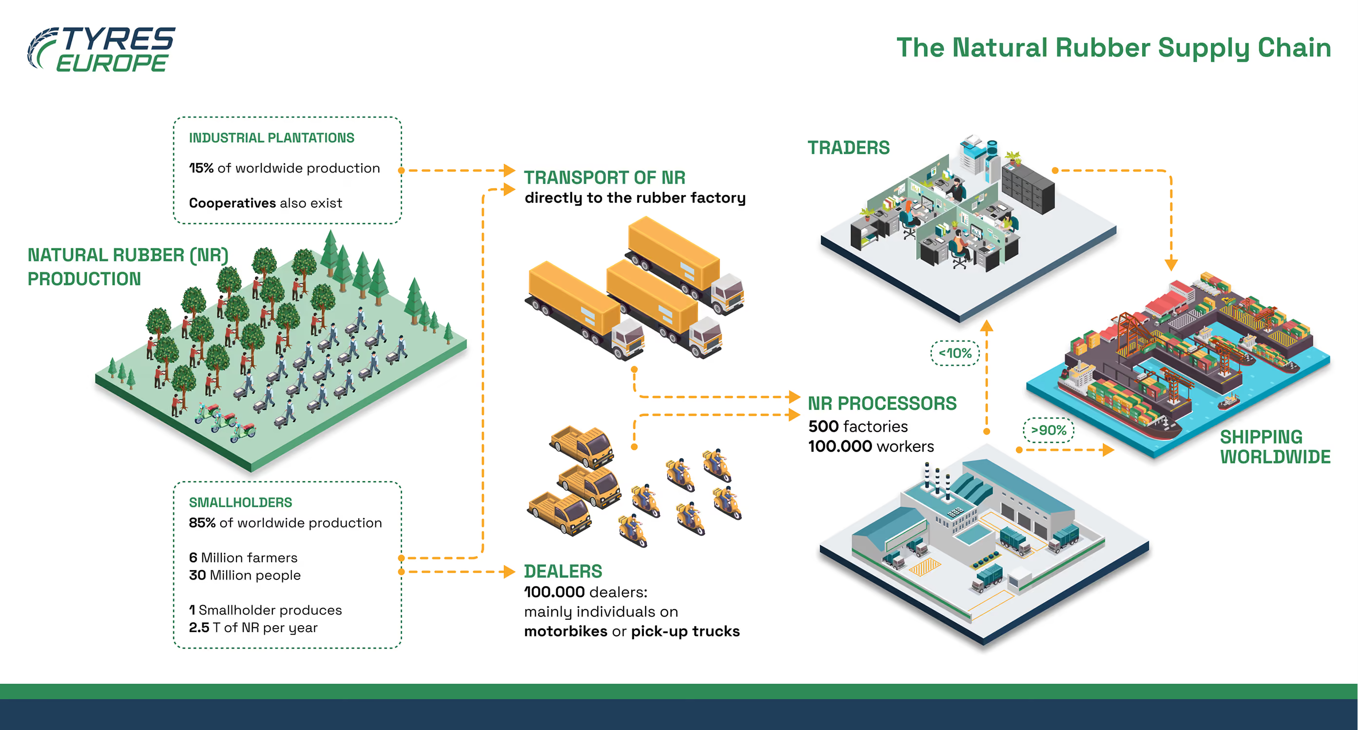
The argument is the whole reason it exists. Natural rubber doesn't come from vast corporate plantations. It comes from six million smallholders, and it reaches the world's tyre factories through roughly a hundred thousand dealers, mostly individuals on motorbikes and pick-up trucks. 15% industrial, 85% smallholder. Once you know that, you look at the entire supply chain in a different light.
Now notice what isn't on there. A supply chain like this could easily have carried forty figures: tonnages, prices, country breakdowns, export values, yields per hectare. It carries about eight. Somebody had to choose those eight before it reached the design stage and let the rest go.
And notice the motorbikes. "Mainly individuals on motorbikes or pick-up trucks" is not a statistic. It's a line that turns an abstract supply chain into something you can picture.
If you're sitting on a pile of your own data wondering what to do with it, that's the first step: decide what it says.
Is that a chart, an infographic, or a poster with numbers on it?
Worth being precise here, because these words get used interchangeably and it causes real trouble in briefs.
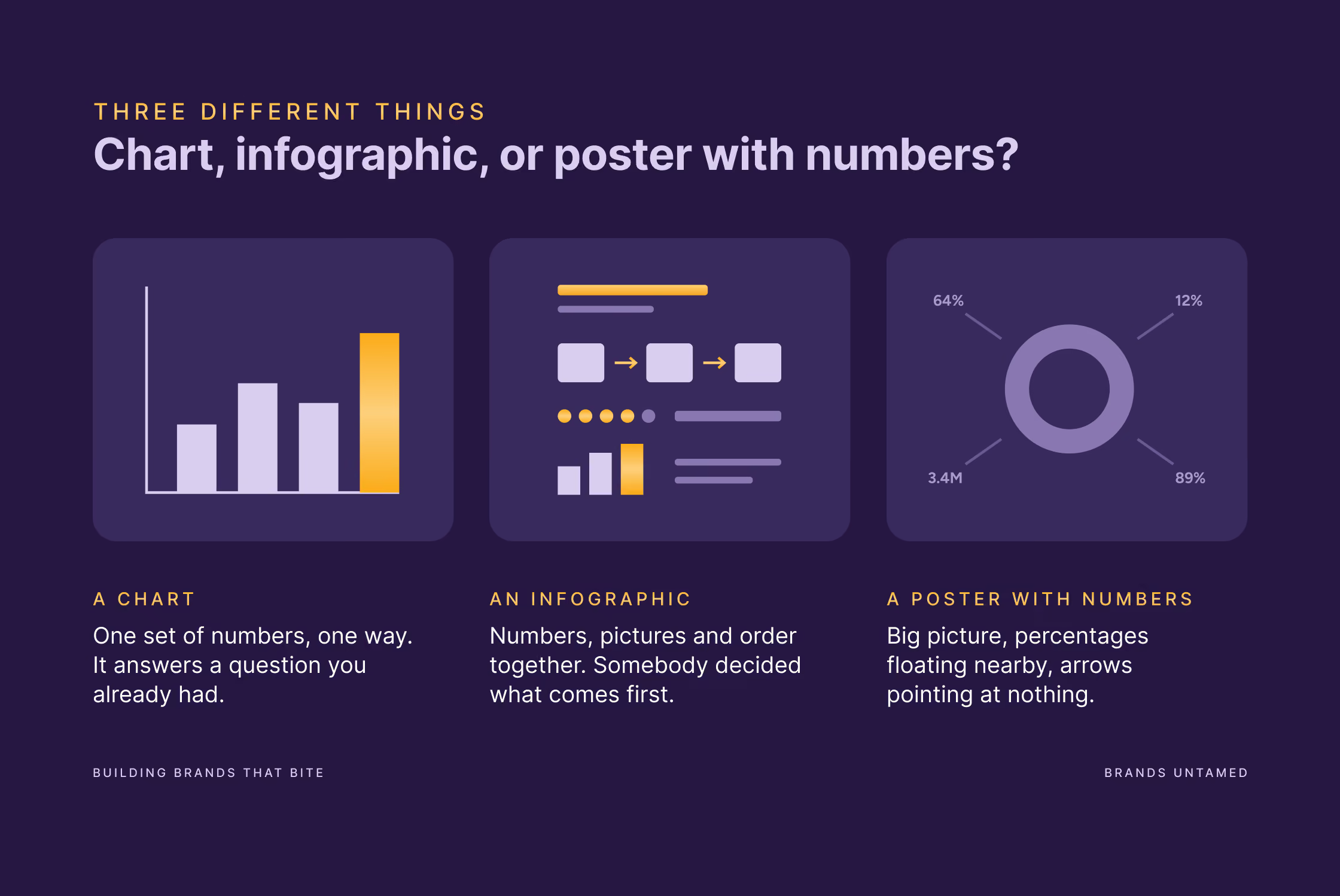
A chart shows one dataset in one way. Sales by quarter. It answers a question you already knew you had.
An infographic explains something a single chart can't. It puts numbers, illustration, sequence and words together, and somebody has decided what comes first, what comes last, and what the reader should be left with.
Then there's the third category, which is where most corporate output lands: an illustration with numbers arranged around it. Big central image, percentages floating nearby, arrows pointing at nothing in particular. Looks like an infographic, behaves like a poster.
The same confusion comes up with icons. Some are there to break up the page and make it easier on the eye, and that's a real job. A wall of text with no pictures in it is harder to read, and nobody wants their annual report to look like a tax return.
The problem is when that's all the icons are doing. If every single one is decoration, you haven't made an infographic but a list with pictures.
So a rough split: some of your icons can be there to make the page work visually. Most of them should be doing something else as well, like showing a quantity you can count, telling two things apart, or showing how something moves. On the rubber infographic, the motorbikes and pick-up trucks are the point being made about how the material moves.
Some pictures are more honest than others
There's a hierarchy in how accurately people read visual information. Roughly: we read position and length very accurately, angles less so, and areas badly. Volumes, worse again.
That has three practical consequences.
Bars beat pie charts for comparison. A pie is fine for one obvious split, like 85 and 15. Ask someone to compare five similar slices, or to compare across three pies, and you've handed them a puzzle.
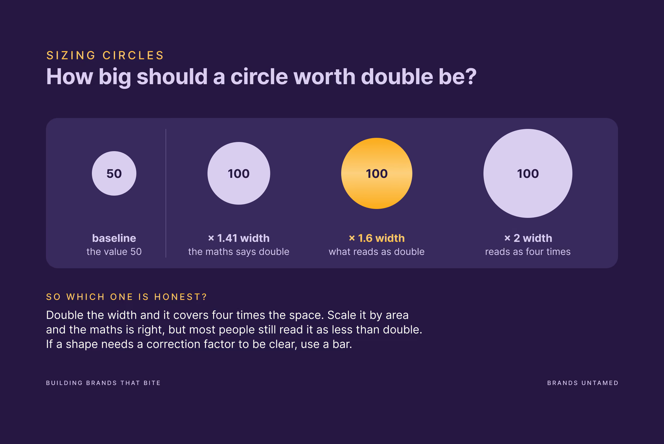
Circles are where good designers get caught. Say one value is double another. Draw the circle at double the width and it covers four times the space, so it reads as four times the value. Scale it properly by area and the maths is right, but most people will still read it as less than double, because we underestimate how much bigger a big circle is. Cartographers have a correction factor for this and have been arguing about it since the fifties. That should tell you something: if a shape needs a correction factor to tell the truth, it's the wrong shape for a comparison someone has to get right. Use circles for impression and scale. Use bars when the number matters.
Colour that means nothing is visual noise. Six bars in six brand colours, where the colours don't stand for anything. Colour is one of the strongest tools you have for grouping things and highlighting, and if you spend it on decoration it won't be there when you need it.
None of this is hard to learn. But it often gets skipped, because many infographics get made by picking a template instead of choosing how to show the numbers.
But clean isn't automatically better either
I personally like minimalism. A lot. But what I don’t take as a universal rule is that stripping everything back always makes a graphic better.
People remember illustrated charts better than plain ones, and they understand them just as well. The graphics you can still describe a month later are hardly ever the plain grey ones.
The difference that matters is whether the illustration is carrying the information or just sitting next to it. Figures you can count, a scene that shows a real process: those earn their place and help people remember. A background pattern bolted on for atmosphere competes with the message, and you lose nothing by deleting it.
So don't aim for minimal or maximal. Aim for everything on the page doing a job. Some of those jobs are emotional, and that's ok.
You can get the thinking right and still make something unreadable
I don't want to make this sound like it's all in the thinking, because plenty of well-thought-out infographics are still a nightmare to read.
The thinking decides what goes on the page. The design decides whether anyone can follow it. On a process graphic that means every arrow behaves the same way, every scene sits on the same plane, the labels are placed consistently, and the order you're meant to read it in is obvious. Get that right and people understand the structure before they've read a single word. The layout explains, and the text confirms.
Get it wrong and you get the version I see often: four different arrow styles that mean four different nothings, labels sometimes in boxes and sometimes floating, and a reader working out the sequence like a crossword.
Decide where it's going to be used before you design it
A report spread, a LinkedIn post and a slide in a policy meeting are three different reading situations. A graphic can be built to handle more than one of them, but only if you know that from the start.
Print and report spreads are read up close and at leisure. You can layer detail, use smaller type, and reward a second look.
Social feeds are swiped past. Text has to be readable at thumbnail size. A wide graphic built for an A4 spread and then posted straight to LinkedIn turns into an unreadable strip. The right move is to redraw one section of it as a standalone frame.
Presentations are read from three metres away by someone half-listening. Fewer elements, bigger type, one point per moment.
Adapting properly means redrawing, not resizing. Budget for that, or pick one and design for it.
And whatever it's for, it has to be readable. Pale grey type on white can look refined on a big monitor but disappears on a phone in daylight. The usual standard is a contrast ratio of at least 4.5:1 for normal text, and if you have to zoom in on your phone to read a number, so does everyone else. Colour on its own shouldn't carry meaning either, because roughly one in twenty people won't see the difference between your red and your green.
What's changed in 2026
Three things worth knowing.
Templates have made everything look the same. Millions of people pull from the same library, so the same layouts turn up everywhere. If you're an organisation whose whole position rests on being the credible voice in your sector, looking like everyone else costs you something. It's also why a brand system matters more than a logo, but that's another article.
AI-generated infographics have tells. The garbled text people used to laugh at is mostly gone, so the giveaways are subtler now. The clearest one: the picture doesn't match its own numbers. A bar labelled 60% that's barely longer than the one labelled 55%, or three circles that don't line up with the figures inside them. After that, everything on the page having the same visual weight, so nothing stands out and there's no reading order. And the big one, which is harder to point at but easy to feel: it looks like a design and doesn't make a point. There's no argument in it, because nobody had one.
Numbers locked inside a JPEG don't exist to AI answer engines. Almost nobody in design talks about this. If your best statistics only live inside an image, the models now summarising your industry can't reliably read them. Put the key figures in the text on the same page, write a real description instead of "infographic.png", and you get both: the graphic that gets shared and the numbers that get quoted.
That description isn't only for the machines. It's the same thing a screen reader reads out to someone who can't see the graphic at all, so one piece of writing covers both.
FAQ
How many data points is too many?
It depends on two things: whether each one supports the argument, and how much room you've got. Forty is fine on a full report spread if they all pull in the same direction. The same forty on a LinkedIn post is unreadable. And you need white space regardless, because a page with no breathing room in it doesn't get read, however good the content is.
Can't we just make it in Canva?
For something internal, possibly. For something carrying your organisation's credibility to members, journalists or policymakers, you're choosing between a template's decisions and your own.
Do infographics still work for SEO?
Not the way they did in 2014, when embeddable graphics were a link-building machine. Original data still earns links, recycled listicles in visual form don't. And publish the figures as text alongside the image.
What should I send a designer to get something good back?
The argument you want to make, the audience, where it will be published, and the source data. If you don't know the argument yet, say so. Working it out is part of the job, and it decides whether the rest is worth doing.
Two places it goes wrong
Some infographics go wrong before anyone opens the design software, because nobody decided what the data was for. Some others go wrong afterwards, because the design wasn't good enough to make that decision readable.
Get both right and you get what a good infographic is supposed to do: make a complicated thing suddenly obvious, and make your organisation look like it knows its own subject.
If you're heading into a rebrand with a pile of assets that all need redoing, read this first. It's a good moment to fix what your graphics are saying, not just how they look.
And if you've got a report, a campaign or a pile of data sitting in a spreadsheet and you'd rather not find out in week three that nobody decided what it says, get in touch. That first conversation is usually the useful one.