A Typography Style Guide that Works in Word, InDesign, Canva or LinkedIn


You create a clean PowerPoint template.
Clear hierarchy. Defined font sizes. Everything aligned.
Three months later:
Someone resized the title because “it didn’t fit”.
Someone manually bolded half a paragraph “to make it stand out”.
Someone used Calibri because “the brand font didn’t load”.
It still looks fine (sometimes).
But now the slide deck doesn’t quite match the annual report.
The report doesn’t quite match the website.
And the LinkedIn visuals feel like they belong to yet another version of the brand.
No one broke the brand. No one ignored the guidelines.
But small typography decisions were never defined across platforms.
That’s how inconsistency creeps in.
Typography isn’t often the headline issue.
But more often than you might think, it’s the reason content stops feeling aligned.
In this article, I’m not talking about picking better fonts.
I’m talking about defining them properly, so they behave the same way whenever someone from your team creates content.
What a typography style guide needs to cover
A typography style guide is not simply a list of fonts.
It’s a set of decisions that answers questions like:
- What do we do when our brand font is not installed in Word?
- What’s the default size and line spacing for body text in reports?
- What weight do we use for slide titles?
- Do headings use sentence case or title case?
- What happens when a heading wraps into two lines?
- How does this translate into social media visuals?
If those decisions aren’t made, your team will solve them on the fly.
And they will solve them slightly differently every time.
That’s how small inconsistencies start.
A good typography style guide prevents that.It doesn’t have to be long. But it does have to be specific.
1. Font stack
Most typography guides start with “choose two fonts”.
Ok, sounds easy.
But what happens when your custom brand font isn’t available?
Because at some point, someone will open your Microsoft Word template on a laptop that doesn’t have it installed.
Or export a PowerPoint without embedding fonts.
Or recreate a visual in Canva.
If your typography guide only says:
Primary font: X
Secondary font: Y
You haven’t defined them enough.
You need to define the full stack.
That means:
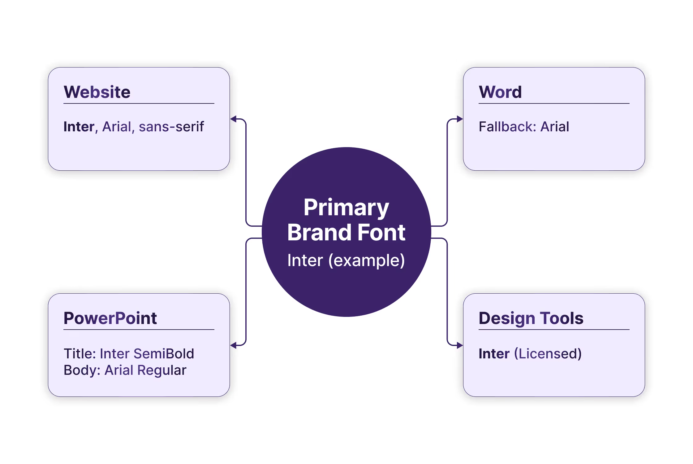
Website font
What’s used online and how it’s loaded.
Microsoft Word fallback
If your primary font isn’t available, what’s the approved alternative?
Not “whatever looks close”. One specific fallback font.
Microsoft PowerPoint mapping
Which font is set for titles? Which for body text?
Are you using the same weights as online, or simplified ones?
Design tools compatibility
Is your primary font available there?
If not, what’s the closest approved equivalent?
If you don’t define this, people will choose what’s easiest at that moment.
And that’s how Calibri sneaks in (no offense).
This doesn’t mean lowering your standards, but to accept that your brand doesn’t live in one controlled environment. It lives in documents, decks, editable templates, and social visuals.
Define the default once, make the fallback clear and make sure it’s written down so people can refer to that document every time they have an issue.

2. Hierarchy
Choosing fonts is step one.
Defining how they’re used is where consistency happens.
Hierarchy answers questions like:
- What’s the difference between a headline and a subheading?
- How much larger is an H1 than body text?
- When does something become a caption instead of a small copy?
- Are slide titles bold, semi-bold, or regular?
If this isn’t defined, people improvise.
Usually by making things bigger, bolder, louder.
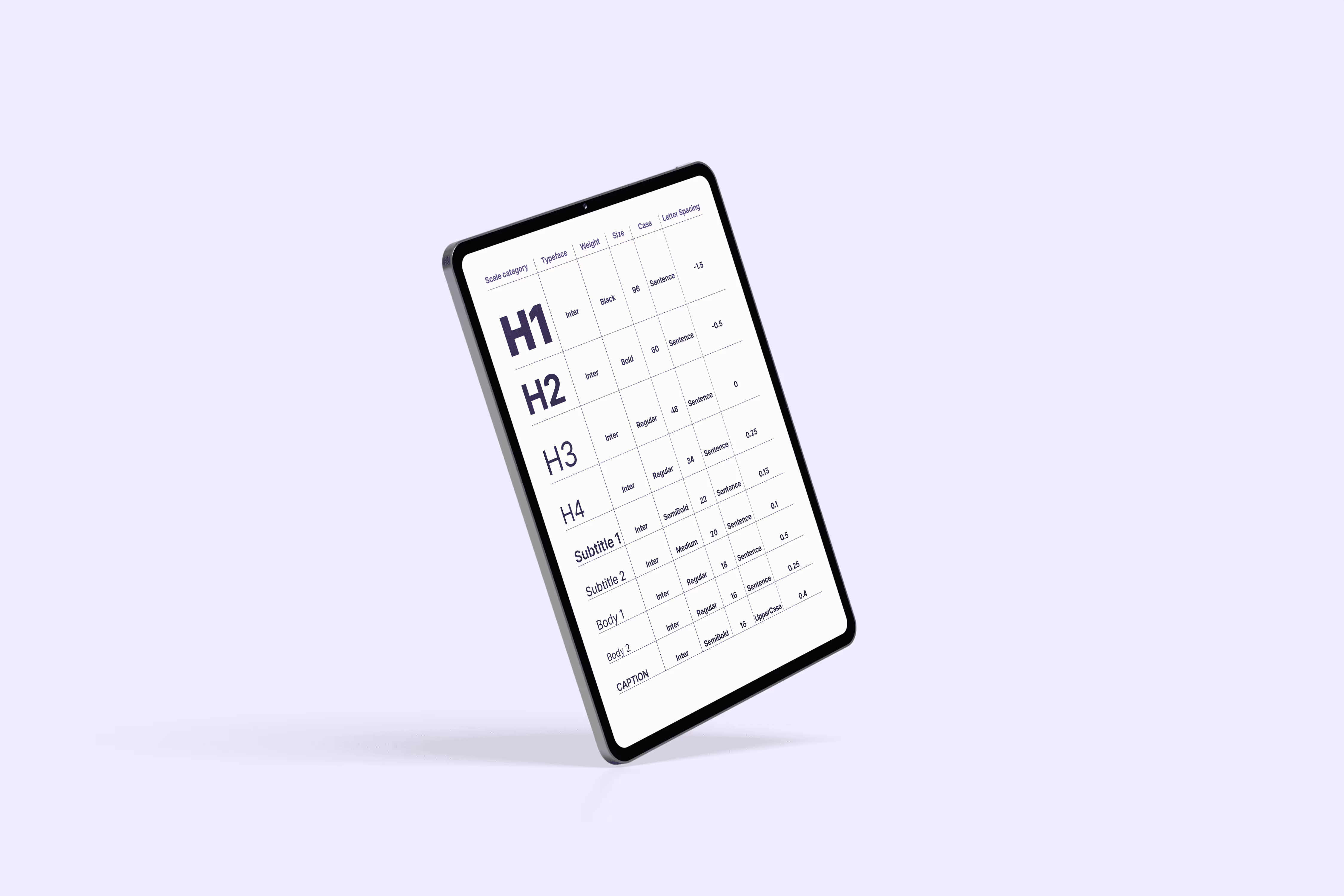
Start with a clear size logic
You don’t need a complex type scale, but you do need consistent relationships.
For example:
Body text: 11pt in Word
Heading 1: 18pt
Heading 2: 14pt
Caption: 9pt
The exact numbers matter less than the logic behind them.
If your website body text is 18px and your report body text is 11pt, that’s fine.
But the visual contrast between levels should feel similar.
Define weight rules
Decide things like:
- Which font weight is used for main headings?
- Which one will be used for subheadings?
- Is body text always a regular weight?
- Are highlights done in bold, or in colour?
Also define what not to do.
- Don’t use bold font weight to fake structure.
- Don’t mix semi-bold and bold randomly.
- Don’t use ultra-light weights in slides where they disappear on a projector.
Decide on case and line breaks
Are headings in sentence case or title case?
“Annual sustainability report 2026”
or
“Annual Sustainability Report 2026”
Pick one.
Also define how headings wrap.Avoid awkward one-word second lines when possible.Balance line breaks intentionally in reports and visuals.

3. Spacing & paragraph structure
Fonts and sizes get most of the attention.
Spacing is what makes text readable.
And in editable documents, spacing is where chaos often starts to appear.
If it’s not defined, people press Enter twice.
Or adjust spacing randomly until it “looks right”, which can mean different things to different people.
Line spacing (leading)
Start with a default.
For example:
Body text: 11pt
Line spacing: 1.2 or 1.5
You don’t need to lock it down rigidly.
But define the default so adjustments are intentional, not accidental.
Paragraph spacing
This is one of the biggest overlooked details.
Decide:
- Is space added before paragraphs, after paragraphs, or both?
- How much?
- Do headings have extra space above them?
- Do captions sit tighter to images than body text does?
Alignment
- Is body text left-aligned or justified?
- Are slide titles centred or left-aligned?
- Are captions aligned with images or with text margins?
Bullet and list formatting
Lists are common in reports and decks.
So define:
- Indentation level
- Spacing between bullet points
- Whether bullets use full sentences or fragments
- Whether the first word is capitalised
These details seem small, but across dozens of pages they influence how polished your content feels.
Table and footnote behaviour
Associations love tables. And footnotes.
- Is table text smaller than body text?
- Is it tighter?
- Are footnotes lighter, smaller, or both?
- What’s the minimum readable size?
Without these rules, tables become cramped and footnotes become unreadable.
4. Multi-language & accessibility
If your organisation works in more than one language, typography can get more complex very quickly.
English might fit perfectly.
German suddenly makes headings longer.
French adds accents and line breaks in different places.
Check character support first
Make sure your font supports all the languages you publish in.
That includes:
- Accents and diacritics
- Special quotation marks
- Currency symbols
- Non-breaking spaces where required
Plan for longer headings
Some languages expand. Others shrink.
- What happens when a heading wraps into three lines?
- Is there a maximum line length?
- Are headings allowed to scale down slightly, or not?
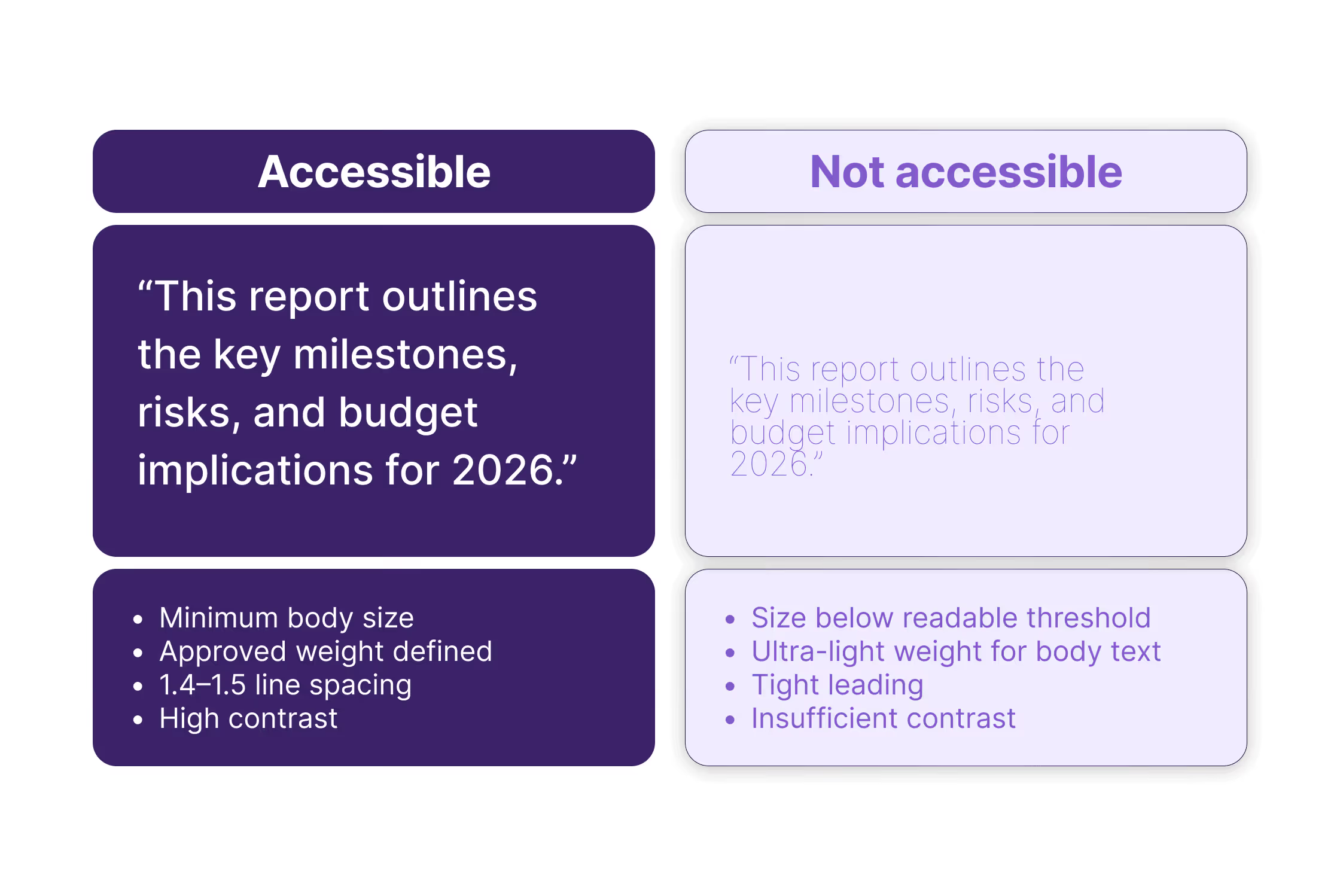
Set a minimum readable size
Accessibility isn’t just legal, it’s also practical.
Things like:
- Minimum body size in Word and reports
- Minimum size for slide content
- Smallest acceptable size for footnotes
Define contrast and weight rules
Light grey text might look elegant on screen, but disappear when printed or projected.
Ultra-light weights may work on a retina display. They don’t work in meeting rooms.
So define:
- A minimum contrast standard
- Which weights are acceptable for body text
- Whether colour alone is ever used to create hierarchy

5. Editable-proof rules
You can define beautiful typography rules but if your documents are editable, those rules need to survive handover. Something we also wrote about in this article.
Define styles, not just appearance
In Word and PowerPoint, formatting should live in styles.
That means:
- Body text linked to a defined style.
- Headings linked to heading styles.
- Spacing built into those styles.
Not:
- Manually bolding text
- Manually resizing headings
- Adding extra line breaks for spacing
Avoid “visual fixes”
You’ve probably seen this:
The heading doesn’t fit on one line.
So someone reduces the font size slightly. Or adds a manual line break, or stretches the text box.
It works in that one document.
But now that file behaves differently from the template.
Define:
- Whether headings are allowed to wrap
- Whether there’s a minimum size
- Whether scaling is ever acceptable
These small guardrails protect consistency.
Embed fonts and test exports
Especially in PowerPoint and PDFs.
If fonts aren’t embedded:
- Slides default to system fonts
- Spacing shifts
- Line breaks change
Your typography guide should include:
- When fonts must be embedded
- When PDFs should be exported instead of shared as editable files
- What to check before sending a deck externally
Accept imperfection, define boundaries
Editable documents will never be as controlled as a designed PDF. That’s fine. The goal isn’t perfection but rather predictability.
Define what must stay consistent and allow flexibility where it makes sense.
Typography shouldn’t break just because someone edited a sentence.
6. What to include in your typography style guide
If you strip everything back, your typography style guide should answer these questions clearly and unambiguously.
Font stack
- Primary brand font
- Approved fallbacks per environment
- Allowed weights
- Web font loading behaviour
Hierarchy
- Default body text size
- Heading levels and their sizes
- Weight rules per level
- Case rules for headings
- Letter spacing (tracking) rules
- Caption and footnote sizes
Spacing
- Line spacing (leading)
- Paragraph spacing
- Space before and after headings
- Alignment rules (left, centred, justified)
- Bullet and list formatting
- Table text size and spacing
- Footnote treatment
Multi-language & accessibility
- Confirmed language support
- Minimum readable size
- Minimum contrast standard
- Acceptable weights
- Rules for longer headings
Editable guardrails
- Styles must be used
- Fonts must be embedded when exporting
- No manual line breaks for layout fixes
- Defined behaviour for wrapped headings
It doesn’t have to be a 40-page document, but it should remove doubt.
Because every time someone asks, “What size should this be?” or “Can I just make this bold?”, that's a decision your style guide should have already answered.
If you’ve read this and realised your typography decisions aren’t fully defined, that’s normal. Most teams don’t define them until something breaks. If you’d like help turning this into a working system across your templates and platforms, have a look at how we work or get in touch.


