
Why Knowing the Design Principles Isn’t Enough
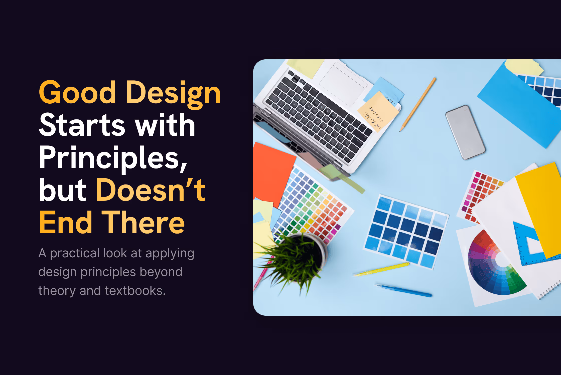
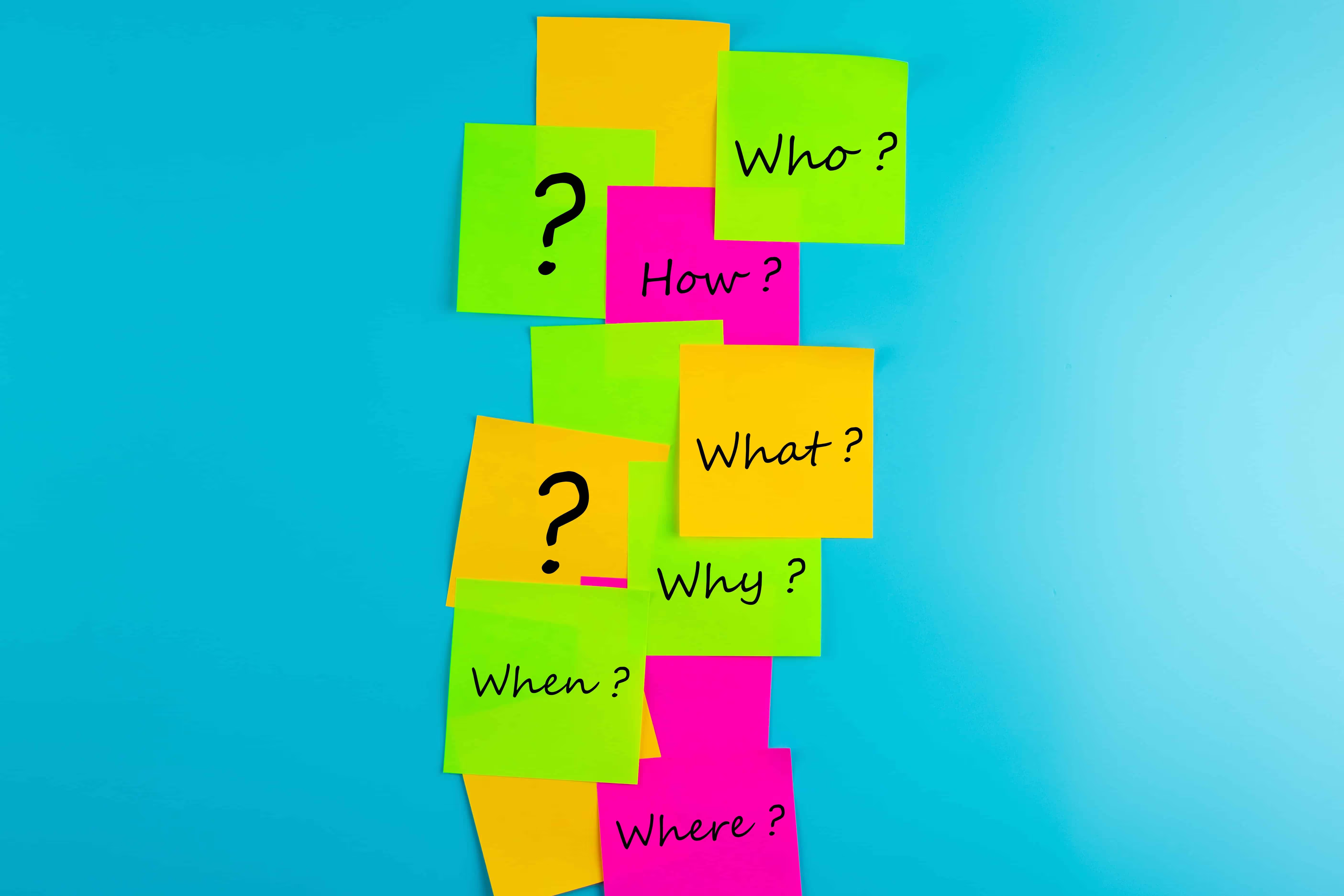
We’ve all heard about the "design principles".
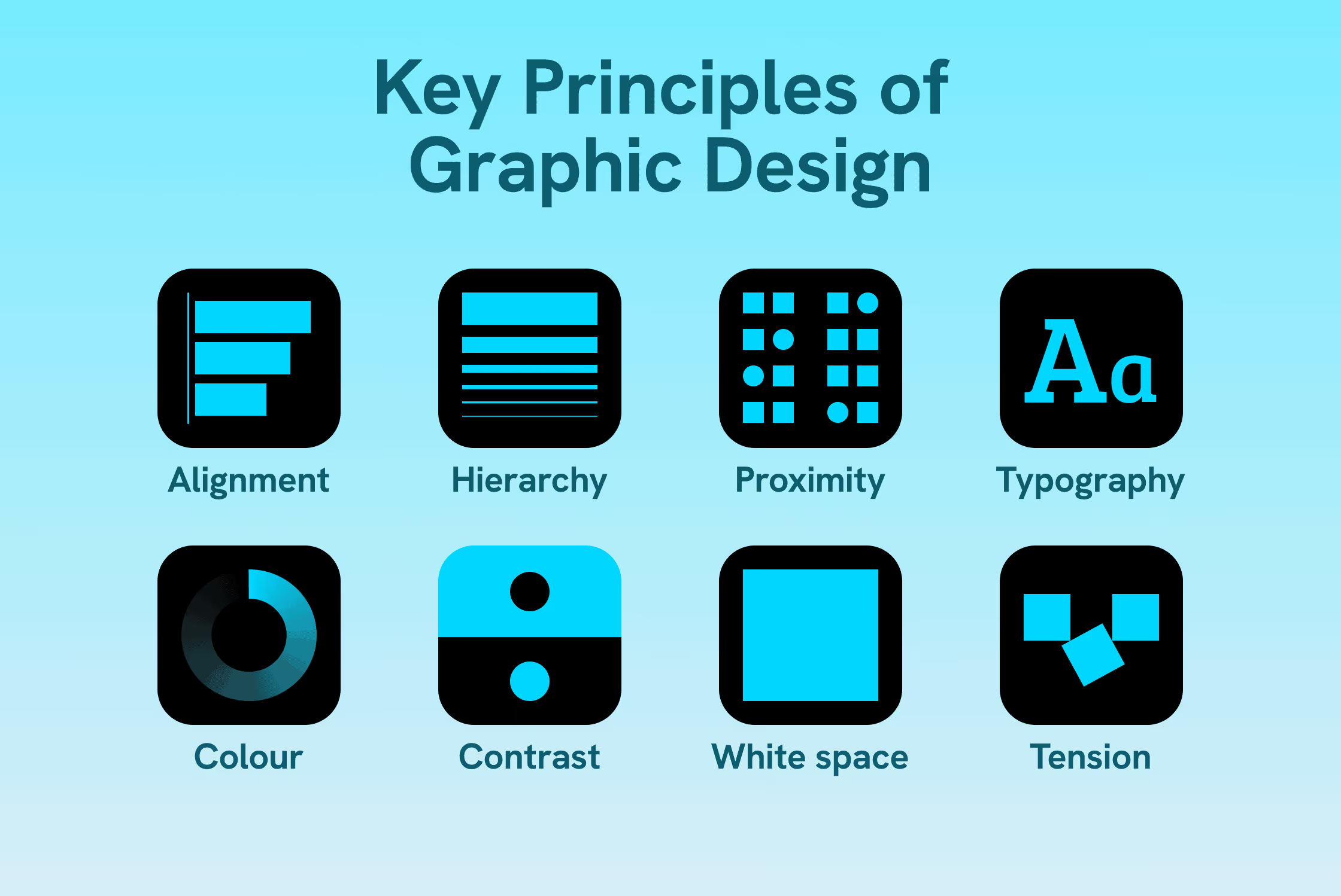
Hierarchy. Contrast. Alignment. Proximity. White space. Tension.
They’re not optional, and they’re not new.
If you’ve ever studied design, worked with a designer, or Googled “good design”, you’ve seen them explained a hundred times already. There’s no shortage of articles that list them and illustrate them with nice examples.
This isn’t another one of those.
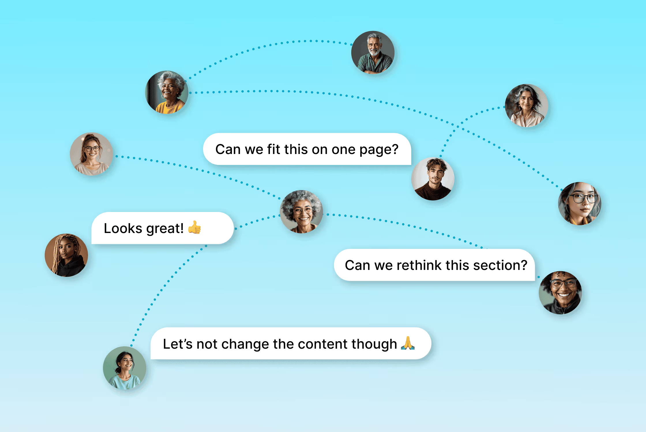
Most design problems don’t exist because someone forgot about hierarchy or contrast. They appear later. When the work leaves the clean, ideal setup and enters real life.
That is when feedback starts stacking up. When content changes after approval. When a layout has to work for more than one audience, format, or moment. When a file needs to be reused, updated, or touched by someone who didn't design it.
That's where design stops being theory and turns into decision-making under pressure.
Why knowing the principles isn’t enough
On paper, design principles are easy to agree with.
They’re clear. Logical. And in isolation, they work beautifully.
The problem is that real projects are not isolated. They're collaborative, rushed, and rarely final. Content grows. Stakeholders join late. Someone asks for “just one small addition” that quietly shifts the entire balance of the layout.
But you don’t find any of that in textbooks.
This is where knowing the principles stops being the hard part. The hard part is applying them when conditions aren’t ideal.
Hierarchy has to survive added content.
Consistency has to hold across formats.
Making things easy to follow has to work despite internal politics and last-minute decisions.
That’s also why design can look perfectly fine at first glance, but still feel exhausting to use. The rules are technically there, but they’re not doing enough work. They're not helping anyone decide what matters most.
Good design doesn’t drop the principles when things get complicated. It uses them to make priorities visible, even when conditions are far from ideal.
What good design actually does
Once you move past theory, design shows its real value.
Good design reduces friction. People understand what they’re looking at more quickly and don’t have to work as hard to decide what to do next because the layout guides attention.
It also makes decisions visible. Not just aesthetic ones, but strategic ones: What’s the main message, and what supports it. What’s background information. When those decisions are clear on the page or screen, a lot of discussion simply disappears. Meetings get shorter. Feedback becomes more focused. Content becomes easier to reuse because the logic is clear.
Visual quality still matters. Design should feel considered, confident, intentional. But the visual choices need to reinforce the decisions behind them, not distract from them.
When design works well, people rarely comment on it directly. They just understand faster, scroll less, and get where they need to go with less effort.
Where design really gets tested
Design is rarely tested in ideal conditions.
It gets tested during feedback rounds, when someone joins late with “a few thoughts”, or when content needs to be reused in a format it wasn’t designed for. Sometimes it’s as simple as a non-designer opening the file to make a small update.
This is often where things start to fall apart.
Layouts that only work with a very specific amount of text break quickly. Visual logic that lives only in the designer’s head disappears the moment someone else touches the work. Suddenly every change feels risky, and everything needs manual fixing.
Design that holds up under pressure is built with that reality in mind. Let’s be honest, designers don’t enjoy losing control. They don’t like other people touching the work. But the reality is that sometimes, people probably will.
What helps is making decisions explicit instead of implicit. Creating layouts that can absorb a bit more or a bit less content. Using structure and hierarchy that still make sense when something shifts. Designing in a way that someone else can follow, even if they don’t fully understand why every choice was made.
Why this is so hard to brief or explain
Nobody asks for “design that survives reality”.
Clients ask for something modern. Clear. Professional. On brand. All reasonable, but vague requests. They describe how the work should feel, not how it needs to function once it's in use.
That’s also why so many design conversations get stuck at the level of taste. Feedback becomes about colours, spacing, or whether something feels empty, instead of whether the work actually helps people do what they need to do.
In practice, bridging that gap usually starts with asking better questions. Less about style, more about use.
Questions like:
What needs to be easy here?
What will this be reused for?
What’s likely to change later?
Where do people usually get lost?
Those answers shape stronger design decisions than any moodboard ever could.
Design that looks good versus design that holds up
Design looking good is part of the job.
In an ideal world, design starts with final content, clear priorities, and shared expectations. That’s always the goal.
But design that only looks good in perfect conditions is fragile.
As soon as timelines get tight, content shifts slightly, or more people get involved, it starts to struggle. It needs constant fixing, and it doesn't scale.
Design that holds up behaves differently.
It keeps working when things are rushed. When compromises happen. When the file gets reused, adapted, or slightly misused. It doesn’t need to be redesigned from scratch every time something changes.
You usually notice the difference later. When the structure still makes sense after several updates. When the layout survives a new format. When someone else can touch the file without breaking its logic.
That’s where design proves its quality: When it keeps working after the project is finished.


We’ve all heard about the "design principles".
Hierarchy. Contrast. Alignment. Proximity. White space. Tension.
They’re not optional, and they’re not new.
If you’ve ever studied design, worked with a designer, or Googled “good design”, you’ve seen them explained a hundred times already. There’s no shortage of articles that list them and illustrate them with nice examples.
This isn’t another one of those.
Most design problems don’t exist because someone forgot about hierarchy or contrast. They appear later. When the work leaves the clean, ideal setup and enters real life.
That is when feedback starts stacking up. When content changes after approval. When a layout has to work for more than one audience, format, or moment. When a file needs to be reused, updated, or touched by someone who didn't design it.
That's where design stops being theory and turns into decision-making under pressure.
Why knowing the principles isn’t enough
On paper, design principles are easy to agree with.
They’re clear. Logical. And in isolation, they work beautifully.
The problem is that real projects are not isolated. They're collaborative, rushed, and rarely final. Content grows. Stakeholders join late. Someone asks for “just one small addition” that quietly shifts the entire balance of the layout.
But you don’t find any of that in textbooks.
This is where knowing the principles stops being the hard part. The hard part is applying them when conditions aren’t ideal.
Hierarchy has to survive added content.
Consistency has to hold across formats.
Making things easy to follow has to work despite internal politics and last-minute decisions.
That’s also why design can look perfectly fine at first glance, but still feel exhausting to use. The rules are technically there, but they’re not doing enough work. They're not helping anyone decide what matters most.
Good design doesn’t drop the principles when things get complicated. It uses them to make priorities visible, even when conditions are far from ideal.
What good design actually does
Once you move past theory, design shows its real value.
Good design reduces friction. People understand what they’re looking at more quickly and don’t have to work as hard to decide what to do next because the layout guides attention.
It also makes decisions visible. Not just aesthetic ones, but strategic ones: What’s the main message, and what supports it. What’s background information. When those decisions are clear on the page or screen, a lot of discussion simply disappears. Meetings get shorter. Feedback becomes more focused. Content becomes easier to reuse because the logic is clear.
Visual quality still matters. Design should feel considered, confident, intentional. But the visual choices need to reinforce the decisions behind them, not distract from them.
When design works well, people rarely comment on it directly. They just understand faster, scroll less, and get where they need to go with less effort.
Where design really gets tested
Design is rarely tested in ideal conditions.
It gets tested during feedback rounds, when someone joins late with “a few thoughts”, or when content needs to be reused in a format it wasn’t designed for. Sometimes it’s as simple as a non-designer opening the file to make a small update.
This is often where things start to fall apart.
Layouts that only work with a very specific amount of text break quickly. Visual logic that lives only in the designer’s head disappears the moment someone else touches the work. Suddenly every change feels risky, and everything needs manual fixing.
Design that holds up under pressure is built with that reality in mind. Let’s be honest, designers don’t enjoy losing control. They don’t like other people touching the work. But the reality is that sometimes, people probably will.
What helps is making decisions explicit instead of implicit. Creating layouts that can absorb a bit more or a bit less content. Using structure and hierarchy that still make sense when something shifts. Designing in a way that someone else can follow, even if they don’t fully understand why every choice was made.
Why this is so hard to brief or explain
Nobody asks for “design that survives reality”.
Clients ask for something modern. Clear. Professional. On brand. All reasonable, but vague requests. They describe how the work should feel, not how it needs to function once it's in use.
That’s also why so many design conversations get stuck at the level of taste. Feedback becomes about colours, spacing, or whether something feels empty, instead of whether the work actually helps people do what they need to do.
In practice, bridging that gap usually starts with asking better questions. Less about style, more about use.
Questions like:
What needs to be easy here?
What will this be reused for?
What’s likely to change later?
Where do people usually get lost?
Those answers shape stronger design decisions than any moodboard ever could.
Design that looks good versus design that holds up
Design looking good is part of the job.
In an ideal world, design starts with final content, clear priorities, and shared expectations. That’s always the goal.
But design that only looks good in perfect conditions is fragile.
As soon as timelines get tight, content shifts slightly, or more people get involved, it starts to struggle. It needs constant fixing, and it doesn't scale.
Design that holds up behaves differently.
It keeps working when things are rushed. When compromises happen. When the file gets reused, adapted, or slightly misused. It doesn’t need to be redesigned from scratch every time something changes.
You usually notice the difference later. When the structure still makes sense after several updates. When the layout survives a new format. When someone else can touch the file without breaking its logic.
That’s where design proves its quality: When it keeps working after the project is finished.


