

You can probably spot it now. The deck that's obviously the work of a prompt and a template: clean, competent, sensible fonts, a stock photo of a team pointing at a laptop, and not one memorable idea. If you want yours to stand out instead of blurring into all the others, the move in 2026 is to stop competing on “looking slick”. AI gave polish to everyone for free, so a good-looking deck alone no longer makes you stand out. Compete on the things a template can't generate: one clear argument, one idea per slide, ruthless cutting, and a few deliberate design choices. Your real brand colours, not the tool's theme. A proper type pairing. Honest imagery instead of stock filler. Charts built to make a single point. The tool makes it look fine. You make it look like you.
A few years ago, a decent-looking deck took skill, or money, or both. Now it takes a sentence. Type a prompt into Gamma, Canva, ChatGPT, Claude, Copilot inside PowerPoint, or Google Slides with Gemini, and a minute or two later you have something presentable. That's genuinely useful, and we'll come back to where it helps. It also means the floor rose for everyone at the same time. When every deck clears the same bar, clearing the bar is worth nothing.
The audience has started to notice, too. There's a Gamma look. There's a Canva look. And a very clear Claude look. Anyone who sits through a lot of presentations can spot the tool within a few slides, the way you can spot a website built from a stock template. And the giveaway is the tools' own marketing: a big part of the current sales pitch for AI slide-making is that it can read your fonts and colours so the output looks "human-made". When the software is selling you on not looking like software, the sameness has clearly become the thing to escape.
Where AI genuinely helps
Don’t get me wrong, we also use these tools. Most working designers do. Pretending otherwise would be daft, and it would undercut the actual point, which is about craft, not avoiding the tools altogether. Three things AI does well enough that we reach for it most weeks:
- It gets you off the blank page. A rough first structure in minutes is worth a lot when the hard part is starting. Hand a tool a messy brain-dump and it gives you a skeleton to react to, which beats staring at slide one.
- It turns long things into short things. Feed a forty-page report or a spreadsheet to a capable model and it pulls out a first narrative and drafts the slide copy and speaker notes. You'll rewrite most of it, but rewriting beats writing from scratch.
- It does the boring parts. Reformatting, resizing, applying one style across forty slides, fixing the one chart whose data changed without disturbing the other thirty-nine. Tedious work that machines should be doing.
Notice what's on that list, and what’s not. AI is excellent at the setup and the busy work. It isn't that great at deciding what your presentation argues, what to cut, or which two or three choices make it feel like a person made it. Those are still yours.
A deck is not a document
Most bad presentations share one root cause, and AI has made it worse: people build a document and call it a deck. They write paragraphs, shrink the font to fit, and read the slides aloud. The result fails twice. Too dense to take in anything while someone's talking, and too thin to stand on its own when they're not.
A deck and a report are different tools for different jobs. A report is read alone, in silence, at the reader's pace. It can carry detail, nuance, footnotes, the full argument. A slide is read in seconds, while a human is speaking, usually projected on a wall or shared on a call. It holds one idea. The speaker carries the rest.
AI tools blur this on purpose. Several of them produce a scrollable, text-heavy web page that sits somewhere between a document and a deck and serves neither especially well. Fine for sending a link nobody presents live. Wrong for standing up and talking to people.
If your job is the dense, read-alone version, we've written separately about what makes a report worth reading. For everything else, the test is simpler than it sounds: if a slide makes complete sense with nobody presenting it, you've written a document. If it falls apart without you talking over it, you're presenting.
The moves a tool can't make for you
Everything below is something a human decides and a template can't. Each one also happens to be the difference between a deck that looks authored and one that looks generated. Do these, and the “AI sameness” takes care of itself.
Start from the argument
Before you open any tool, finish this sentence: "If they remember one thing, it's ___." That's your spine. Every slide then either supports it, or gets cut. The clearest tell of an AI-built deck is that it has no spine: twelve competent slides, no point of view, nothing building toward anything. A deck with a real argument feels different immediately, before you've touched the design at all.
Put one idea on each slide
A slide is not a container for everything you know about the topic. It holds one idea, stated once, large enough to read from the back of the hall. Six bullet points means six slides, or it means one slide and five things to say out loud. Dense, evenly packed, bullet-heavy slides are the surest sign that a machine (or a bad presenter) filled the space and nobody edited it down. Whitespace is not wasted space. It's the difference between a slide people read and a slide people photograph so they can read it later.
Use your actual brand
Most tools now let you load your real brand guidelines, and you should: upload your logo, set the exact hex codes, choose your fonts. Claude Design, Canva and Gamma will all apply them for you, and most people don't even get this far. The default themes are shared by millions of users, which is exactly why they read as generic, so swapping in your own details is a real quick win.
It just isn't the whole job. Your colours on a generic layout is still a generic layout: the tool pours your brand into the same even, templated arrangements it gives everyone else. What stops you blending in is the judgement in how the brand gets used: a real type pairing instead of the house default, some restraint with the palette, the small deliberate choices a template makes on autopilot. We've put together a typography guide that travels across Word, Canva and the rest if you want a system to start from. Loading the assets takes ten minutes. Using them with judgement is something a tool can't do for you.
Be honest with imagery
One of the fastest tells of a generated deck is the imagery. A stock photo of nobody in particular, or an AI image that's almost right but has that faintly plastic, too-smooth look, sitting on a slide it doesn't quite match. Real beats generated nearly every time: your own photography, an actual screenshot of the actual product, a real chart, a real document. If you have nothing real and nothing true to show, show nothing. A clean slide with one strong line beats a slide decorated with an image that's fighting your message. Every picture should earn its place. If it can't, it goes.
Build charts to make a point
A chart is an argument, not a data dump. Before you make one, decide what it's meant to prove, strip everything that doesn't prove it, and label the conclusion directly. "Revenue up 40% since the rebrand", not "Figure 3: Quarterly Revenue". The tools are happy to generate a technically correct chart that presents numbers and argues nothing, which is worse than no chart at all because it costs attention. If a viewer can't tell what a chart is for within a couple of seconds, it's decoration with X and Y axes.
Give every slide a focal point
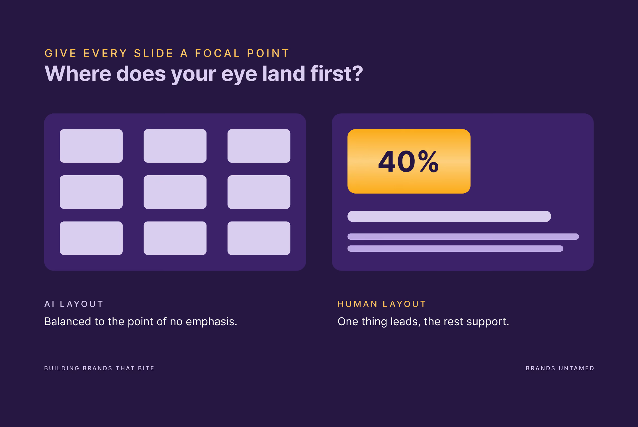
Look at a slide and ask where the eye lands first. If the answer is "nowhere in particular", you've got an AI layout: everything centred, evenly spaced, balanced to the point of having no emphasis at all. Real design has hierarchy. One thing is biggest, one thing is the hero, everything else supports it. Sometimes that means breaking the grid on purpose, setting the key number off-centre, letting one element dominate. Templates can't do this because they're built to be safe and even, and that’s precisely what makes them forgettable.
Vary the pace
A deck has rhythm, the same way a talk does. Forty slides of identical density is a flat line, and audiences check out of flat lines. Change the weight on purpose. A dense slide followed by a single word. A busy chart followed by one short sentence in large type. The contrast wakes people up and flags the moments you actually care about. AI-generated decks are metronomic, every slide carrying the same load, because the tool has no idea which of your points is the one to land. You do. Let the pacing show it.
Cut, then cut again
Most decks are too long, and almost none are too short. Once you've built it, take a hard pass with one question: what happens if I delete this slide? If the answer is "nothing", delete it. Then do it again. The discipline of cutting is the most human thing on this entire list, because every tool is biased toward generating more (more slides, more content, more space filled) and you are the only one in the process biased toward less. Generating is easy. Cutting is the hard part, and it's usually what separates a deck people remember from one they sit through and forget.

The part one person can't fix alone
Everything so far is about making one deck look like you made it on purpose. The harder problem, and the one that genuinely separates serious organisations from the rest, shows up at scale. One good deck is a person having a good day. Forty people across your organisation each making their own decks, in their own slightly different fonts and colours and layouts, is a brand slowly coming apart in public.
This is called brand drift, and it's where the AI tools both help and hurt. They make it easier than ever for anyone to produce a deck, which means more people producing more decks with less central control, each one tugging the brand a little further in its own direction. A team using AI without a system doesn't get consistency. It gets forty flavours of nearly-on-brand.
The answer is a system that makes the right choice, the automatic one. A proper branded master with your real colours, type and layouts built in, plus a small set of approved templates for the things you present often, so the fast tools start from something correct instead of a generic theme. Set it up once and every deck starts on-brand, whether it's built by hand, by Copilot inside PowerPoint, or by someone in a hurry the night before. (This is the same issue as knowing the design principles versus actually applying them, which we've written about before. A system turns judgement into something a whole team can use.)
That's a chunk of what we do. We’re a two-person senior studio, and we build brand systems meant to be used, not admired in a PDF and forgotten: presentation templates that hold up, brand assets teams can actually work with, and the unglamorous infrastructure that keeps forty decks looking like one company. If your organisation has outgrown the deck that makes it look smaller than it is, that's the kind of thing to talk to us about.
FAQ
Should I use AI to make my presentations at all?
Yes, for the right parts. Use it to get off the blank page, to turn long source material into a first draft, and to handle reformatting and tedious edits. Don't use it to decide what your presentation argues or to do the final design pass. The tools are a strong drafting and research layer and a weak thinking-and-craft layer. Treat them accordingly.
Which AI presentation tool is best?
It depends what you're doing, and the honest answer is that the tool matters far less than the choices you bring to it. The old split, where the chatbot wrote the words and you built the slides somewhere else, has mostly closed. Claude (through Claude Design, the PowerPoint add-in or Cowork) and ChatGPT can now turn out finished visual decks, and dedicated tools like Gamma are still usually quickest for a polished deck from a single prompt. They're all capable. What separates a deck that stands out from one that doesn't is the same whichever you open: a clear argument, your real brand used with some judgement, and a willing editor. Whatever you pick, the generic theme is the giveaway, so change it.
How do I make AI-generated slides look less generic?
Three quick wins. Replace the default theme with your real brand colours, logo and fonts. Replace stock and AI imagery with real photos, screenshots, or nothing. Cut the slide count by a third. Those three passes remove most of the tells in about twenty minutes.
How long should a presentation be?
Shorter than your instinct, almost always. There's no magic number, but if you're presenting live, fewer slides with one clear idea each will beat a longer deck. The real constraint is attention. When in doubt, cut.
PowerPoint, Keynote, Canva or Gamma?
All of them can produce good work, and all of them can produce generic work, because the tool isn't what makes it generic. PowerPoint and Keynote give you the most control for client-facing decks. Canva is strong for marketing-flavoured visuals. Gamma is fastest for a web-native draft you'll share as a link rather than present live. Pick for the job, then bring your own brand and your own editing.
How do we stop our team's decks from drifting off-brand?
Give them a proper branded master to start from, with your colours, type and core layouts built in, and a small set of approved slide templates for the things you present often. The goal is to make the on-brand choice the easy one, so people reach for the right starting point instead of building from a blank page or a generic theme each time. Without that, more tools and more speed just mean faster drift.