Somewhere in your organisation, right now, someone is building a slide. The deadline is in an hour, the brand font isn't installed on their laptop, and the brand guidelines are a long PDF in a folder they can't find. So they pick a font that looks close enough, choose a blue colour from the website by eye, and centre everything because centred feels safe.
Nobody in that story did anything wrong. The guidelines simply weren't written for that moment. Most brand guidelines describe what the brand looks like, when what people need is to know what to do once the designer has gone home. That difference decides what belongs in them, and what you can safely leave out.
The short answer
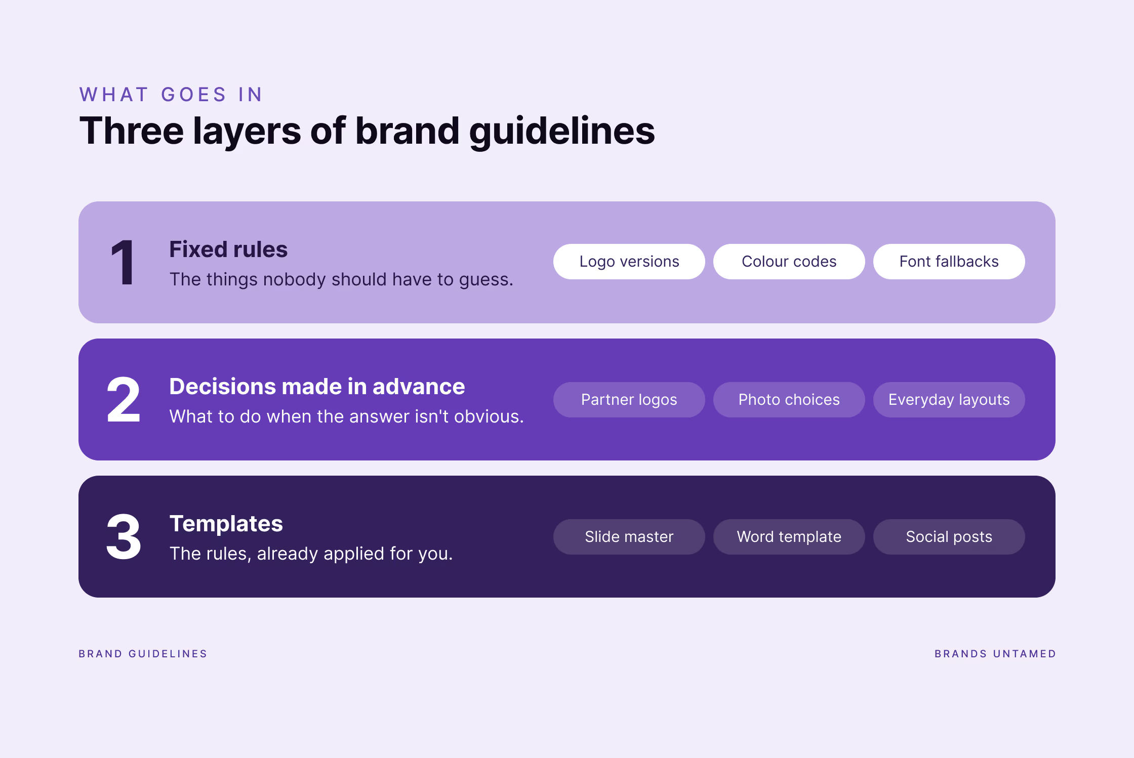
Brand guidelines should contain three things: the fixed rules (logo versions, colour codes, fonts and what to use when the brand font isn't available), the decisions people would otherwise make on the spot (logos next to partners, photos, the layout of everyday formats), and templates for the documents your team makes most often. Keep the whole thing short enough that anyone can find an answer in under a minute, and leave out what nobody will look up twice, like a long brand story or pages of logo misuse. Good guidelines are written for the non-designers who use the brand every day.
Why do brand guidelines get ignored?
Because they're usually written by designers and used by everyone else. The same few problems come up in almost every brand we're asked to look at:
- The font isn't there. The brand font is installed on the designer's computer and nowhere else, so Word and PowerPoint swap in Calibri or Arial without telling anyone.
- Colours get guessed. People pick colours by eye from a screenshot, or use the bright accent colour everywhere because it's the one that stands out.
- Colours get changed. Someone decides they don’t like the shade of blue and they pick a random new one.
- Old versions keep circulating. Someone finds a logo from three years ago in an email thread and uses it, because it was the first one they found.
- Alignment goes. Text gets centred, margins change from page to page, and nobody notices until two documents sit side by side.
- The guide doesn't cover the situation. It shows the logo on a white background, but not on a photo, next to a partner's logo, or at the size of a LinkedIn profile picture.
- Some people think it doesn't matter. Not everyone likes to admit it, but some people genuinely believe brand guidelines are optional.
That's what happens when many people, most of them not designers, use a brand under time pressure, in Word, PowerPoint and Canva rather than in a design software and expect it to work the same way. Good brand guidelines are built for exactly those people and those tools.
What are the fixed rules every brand guide needs?
The things nobody should have to guess: which logo file to use where, the exact colour codes, and which fonts to use, including what to use when the brand font isn't installed.
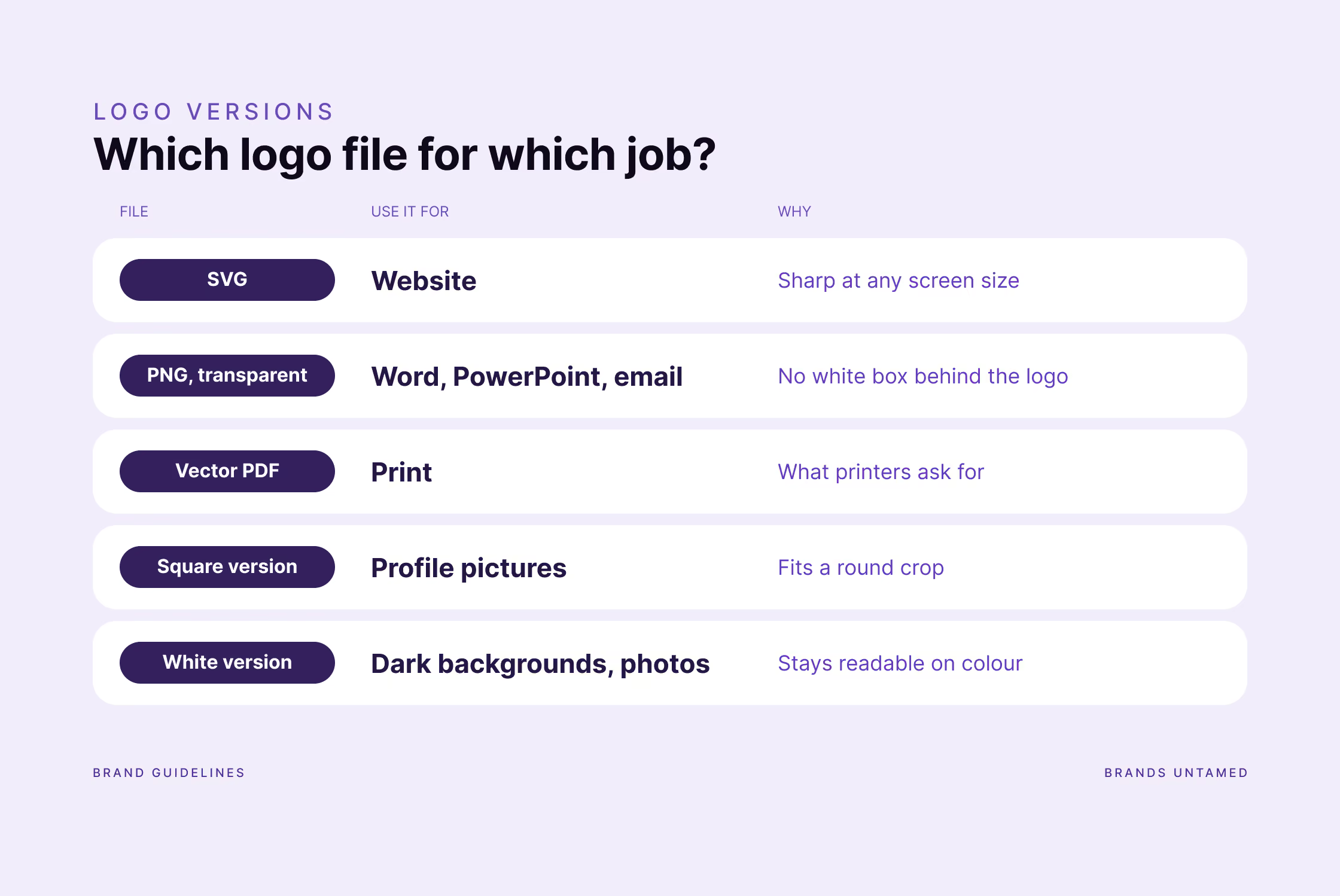
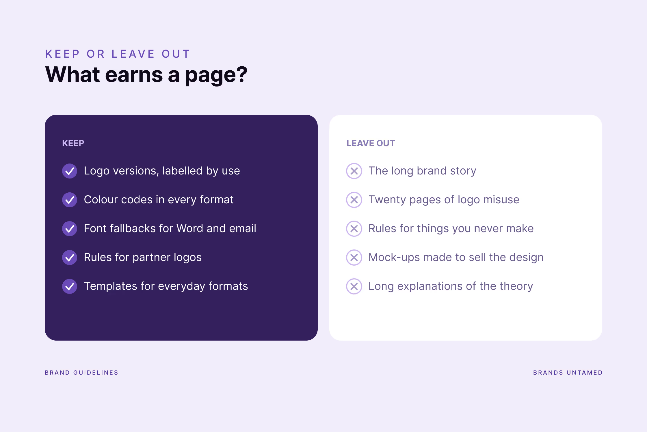
- Logo versions, labelled by use. Not just the logo, but which format for which job: SVG for the website, PNG with a transparent background for Word and PowerPoint, a version for dark backgrounds, a square version for social media profile pictures, and a vector file for print. Name the files so people can tell them apart without opening them.
- Clear space and minimum size. One rule for each, shown once.
- Colour codes in every format people need. HEX for websites and Canva, RGB for Office, CMYK and Pantone for print, plus any shades and tints you use. Say which colours are the main ones and which are accents, so the accent always stays an accent.
- Colour pairings that pass the contrast rules. Which text colour works on which background, checked for readability. Since the European Accessibility Act, this is no longer a “nice extra” for a lot of organisations.
- Fonts and their fallbacks. The brand font, plus the font to use in Word, Google Docs and email when the brand font isn't available. This one line prevents most of the Calibri problem. We wrote a whole typography guide that works in Word, InDesign, Canva and LinkedIn on exactly this.
- A small set of type sizes. Sizes for headings and body text in the formats you actually use, not a full scale for every situation you might one day face.
- A few examples of full deliverables like social media posts, posters or roll-ups so your team has something to start from.
- Graphic elements. Patterns, shapes, icons or other brand devices, and when to use them.
Which decisions should brand guidelines make in advance?
The ones people would otherwise make on the spot, under pressure, and differently every time. These are the pages most guidelines skip, and the ones people need most.
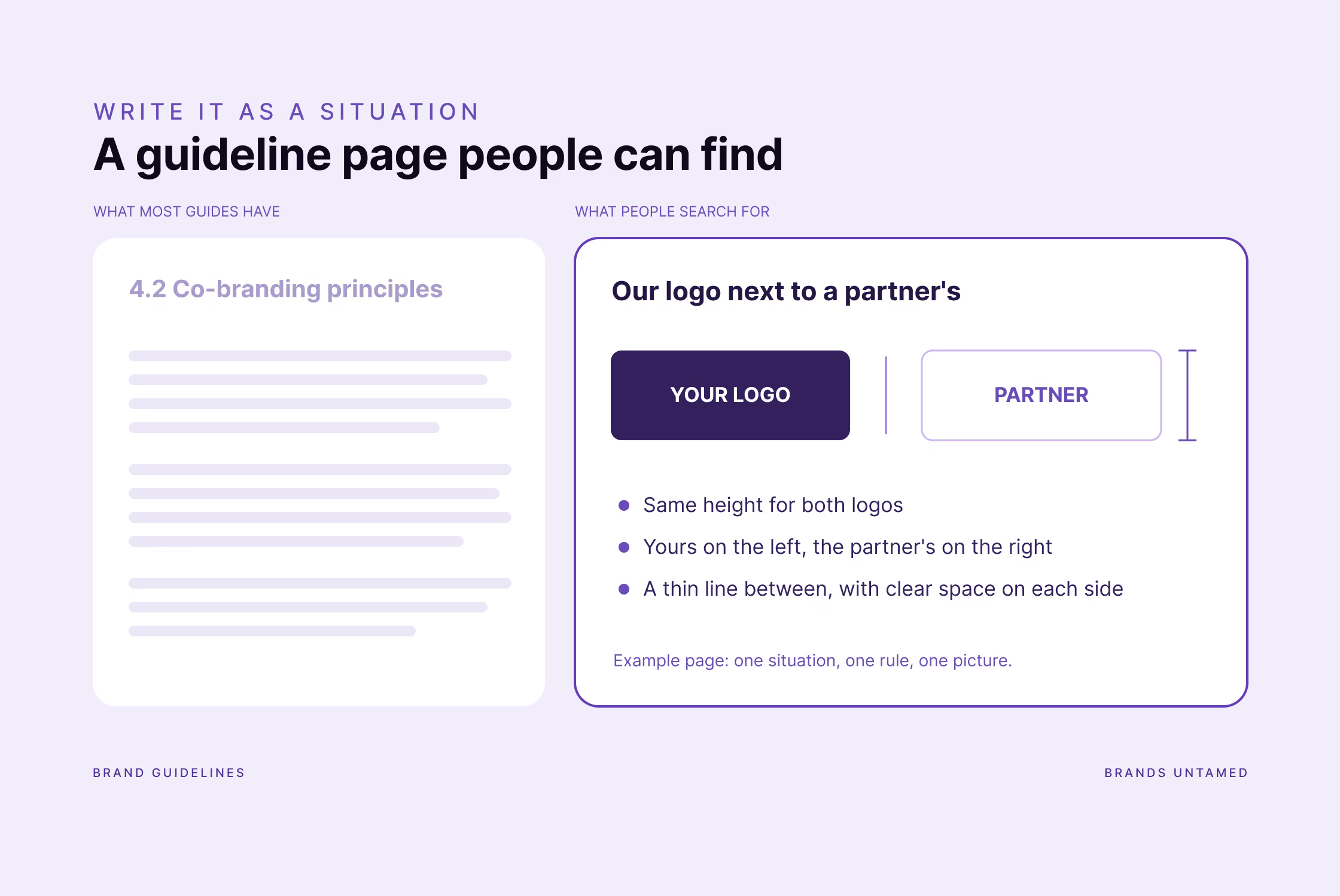
- Your logo next to someone else's. Partners, sponsors, members, funders: which logo comes first, how big each one is, and how much space between them. For associations with dozens of members, this question comes up every week.
- Photos and images. What a good photo looks like for your brand and what to avoid. Three or four real examples explain more than a paragraph of adjectives.
- Layout for the formats you make most. Margins, alignment and where the logo sits on a report page, a slide and a social post.
- How the brand sounds. A few principles for tone of voice, each with a short before-and-after example.
- Who to ask. One named person for the questions the guide doesn't answer. A name, not a department.
Write these as situations with an answer, because that's how people search for them. "Our logo next to a partner's" followed by the rule and one picture is easier to find, and to follow, than a chapter called "Co-branding principles".
Why are templates the most useful part of brand guidelines?
Because a template is a rule nobody can get wrong. The fonts, colours, margins and logo are already in place, so the person filling it in only has to think about what they want to say.
Start with the formats your team makes most often, which for most organisations means:
- A slide master in PowerPoint or Google Slides, with a handful of layouts that cover most slides. Our article on presentations that don't look like everyone else's goes deeper on what makes a deck work.
- A Word template for internal memos, letters or briefing notes, with the heading styles set up properly.
- Social media formats.
- An email signature, because it's the brand people see most often.
- Event formats such as a roll-up banner, name badges and a stage or video call background, if you run events.
- A newsletter design, if you send one.
Build templates in the tools your team actually works in, even if the designer prefers something else (we see you, Canva fans!). Lock what shouldn't move: a PowerPoint slide master and most design tools out there let you fix the logo, colours and fonts.
What should you leave out of brand guidelines?
Anything people won't look up twice. Every page you add makes the useful ones harder to find.
- The long brand story. Mission, vision and values belong in your strategy. In the guidelines, one short page is enough to explain the thinking behind the look.
- Pages of logo misuse. Four or five examples of a stretched, recoloured or rotated logo make the point. Twenty don't add anything.
- Rules for things you never make. If you don't wrap vans or print billboards, those pages can wait until you do.
- Long explanations of the theory. Why the blue was chosen is interesting once. The colour code is needed every week.
- Mock-ups made to sell the design. The tote bag and the billboard helped get the identity approved, but they don't help anyone make a social media post.
One exception is worth keeping: a single line of reasoning next to a rule. When people understand why the logo needs space around it, they make better calls in the situations the guide didn't foresee.
How long should brand guidelines be, and in what format?
As short as they can be while still answering the questions your team asks every week. The test is simple: can someone who has never seen the guide find the right logo file or colour code in under a minute?
We usually hand our guidelines over as a PDF, because that's what every team can open, search and forward. For larger teams, a shared web page or a Figma file that's updated in one place works better than a PDF that ends up copied into ten different folders.
Whatever the format, two things help more than the format itself:
- Put the guide where people work. Pin it on Teams or Slack, link it from the template folder, add it to the onboarding manual for new staff.
- Put a date on it. A version date on the cover tells people whether the copy they found is the current one.
FAQ
What's the difference between brand guidelines and a brand book?
In practice, people use both words for the same thing. When there is a difference, a brand book tends to tell the brand's story, while guidelines hold the practical rules. If you're unsure what your brand includes beyond the logo, our article on the difference between a logo, a brand identity and a brand system explains it.
Do small organisations need brand guidelines?
Yes, but a short version. A few pages with the logo versions, colour codes and fonts, plus two or three templates, is enough to keep a small team consistent.
Who should own the brand guidelines?
One named person, usually in communications or marketing. They answer questions, approve exceptions and keep the guide up to date.
How often should brand guidelines be updated?
Whenever something in the brand changes, and otherwise with a quick check once a year. Add new situations as people ask about them: every repeated question is a page the guide was missing.
Should tone of voice be part of brand guidelines?
Yes, at least the basics: a few principles and examples of how the brand does and doesn't sound. How you write is as recognisable as how you look.
Can we write our own brand guidelines?
You can document the basics yourself: logo versions, colour codes, fonts. The decisions and the templates are where a designer earns their fee, because that's where the brand has to hold up in situations nobody planned for.
If your brand guide lives in a folder nobody opens
Send us your current brand guidelines, and we'll tell you which three pages your team is missing. Or tell us which document your team makes most often, and we'll show you what a template for it would fix. Get in touch here.
Not ready for that? Say hello to Hans or Ralu on LinkedIn, where we write about the same things in shorter form.