How European Associations Can Repurpose One Report Across Social, Web and Print

Somewhere on your association's website there is a PDF that took six months to produce and got one LinkedIn post.
The report itself is probably fine. The problem is that publishing it got treated as the finish line, when it should have been the starting point.
By the time a publication clears member consultation, legal review, and the translation round, the team is exhausted. Sending the newsletter and posting the link feels like completing something. Then the next deadline arrives, and the report just sits there.
In Brussels, that is a real cost. The policymaker, journalist, or potential member you are trying to reach is being courted by a dozen organisations with well-resourced communications teams. One week of visibility is not enough. A strong publication already contains everything you need to communicate for months. The challenge is building a system around it before the energy runs out.
This is work we do for European associations, and the pattern repeats on almost every project: a strong report, and communications around it that stop at launch week.
Why one format is never enough for multiple audiences
European associations rarely write for one audience. A single report may need to reach members across twenty-plus countries, EU institutions, national governments, journalists, and potential new members. None of them need the same version of the same content.
A member in a national association wants to understand what the findings mean for their sector.
A policymaker needs a clear recommendation they can act on.
A journalist needs a specific angle they can write from.
A potential member needs to see that the association produces work worth belonging to.
A colleague at a partner organisation needs something they can share internally without translating the jargon.
That is five different jobs. A 60-page PDF does one of them reasonably well. For the others, you need different formats, different levels of detail, and different tones. That is not extra work invented for the sake of content. It is the actual job of communication.

Extract the right content before your energy runs out
The right moment to plan content around a report is not after it is published. It is in the final drafting phase, when the arguments are clear and the team still has some investment in the material.
A focused session of two hours, run separately from the approval process, can surface most of what you need.
The questions to work through are specific:
- Which finding would surprise even people who know this sector well?
- What would a member immediately forward to a colleague?
- What do policymakers most often get wrong about this topic, and does the report correct it?
- Which argument makes more sense as a visual than as a paragraph?
- Which quote could carry a campaign graphic on its own?
- Which section deserves a proper blogpost on your website?
- What could become a LinkedIn carousel?
- Where does the association have a clear position worth a short opinion piece?
There is a practical reason to do this early. A content plan agreed alongside the report sign-off gets approved as part of the same process, instead of becoming a second round of requests nobody has time for once the report is out.
Not every question will produce an asset. But working through them before publication means you arrive at launch week with a content plan rather than improvising from a document everyone is already tired of reading.
A single substantial report typically yields five to eight findings strong enough to stand on their own, three or four quotes worth pulling out, two or three ideas that work better as visuals than as text, and at least one or two misconceptions the report directly addresses.
The material is already there. Your job is to identify and reshape it in the right format for every platform and audience.
What each format requires
Most repurposing fails because the format is treated as a container rather than a deliberate communication choice.
A paragraph gets shortened.
A chart gets dropped into a slide.
A valuable finding gets posted on LinkedIn with "we are pleased to share our latest report."
That’s not what repurposing is at all. That’s just copy-pasting with (maybe) less text, and it produces content that feels uninteresting regardless of how strong the underlying research is.
Every format has a specific job, and if you treat them simply as interchangeable, even if the underlying material is solid, your content will not get the engagement and reach you want.
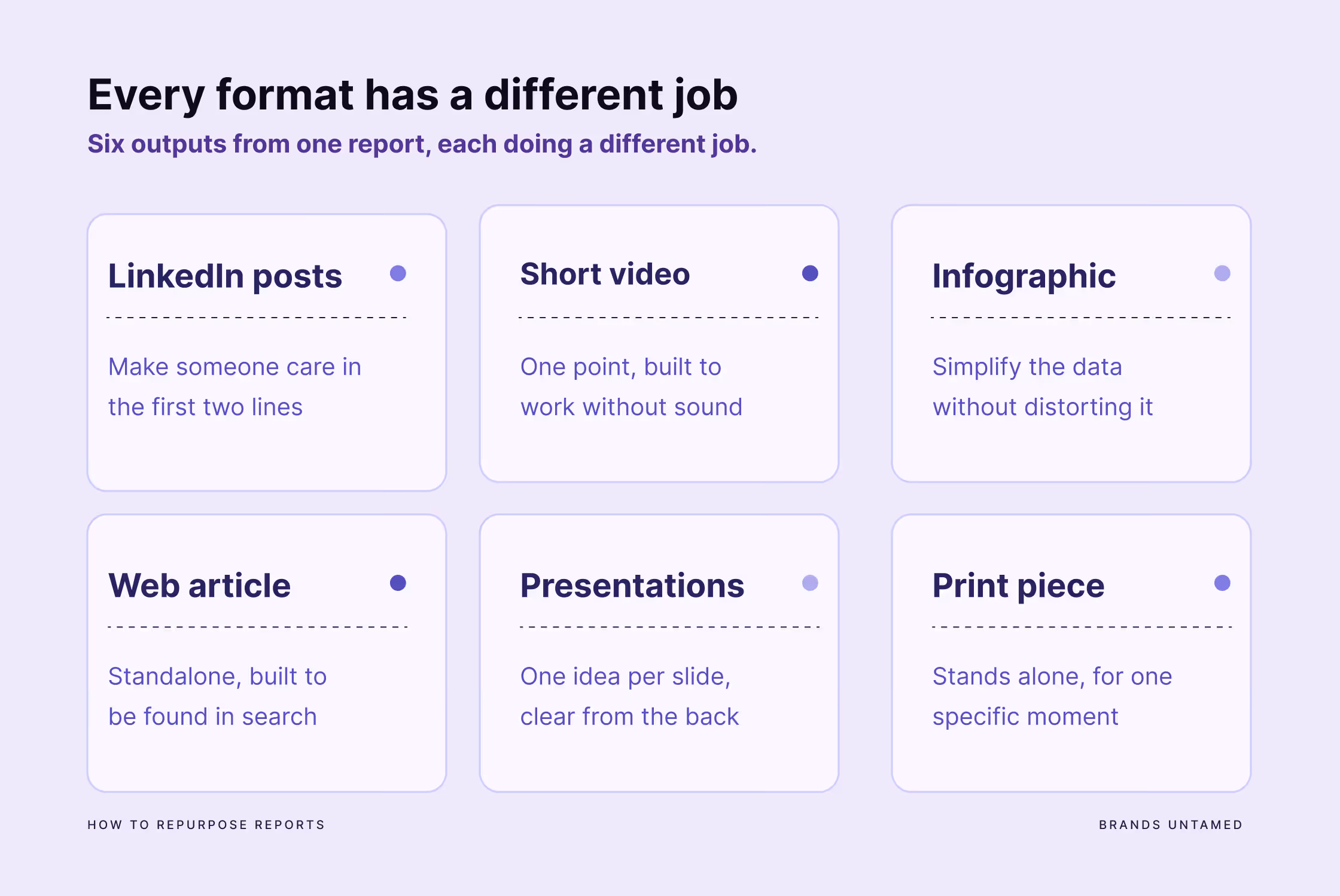
LinkedIn static posts
A LinkedIn post needs to make someone care in the first two lines, before they click "see more."
It is not the place to announce that a report exists.
LinkedIn is the place to surface one idea from the report that is specific, surprising, or genuinely useful to the person reading it. The post should give something away rather than tease a download. If the insight is good enough, people follow the link to read the rest. If it is just an announcement of how proud you are that you developed a 60-page document, they scroll past.
Short video
Video is the format most association communications teams plan to use and consistently deprioritise. That is a mistake, particularly on LinkedIn (or even Instagram, if your association is on there), where a short video from a credible subject expert currently reaches further than most text posts.
It does not need to be produced.
A 30-45 second clip of your secretary general or a policy lead covering one finding from the report, filmed on a phone with decent light, will outperform a polished announcement graphic most of the time.
The rules are simple: the first three seconds determine whether anyone watches the rest, it needs to work without sound so captions are not optional, and it should make one point only.
A video that tries to summarise a forty-page report in two minutes is not a video. It is a presentation nobody asked to watch.
Infographics
An infographic needs to simplify without distorting.
Your goal is not to make a complex table look prettier. Your goal is to pick one comparison, relationship, or progression in the entire report data that tells the clearest story, and remove everything that competes with it.
An infographic that tries to show everything will be cluttered, and nothing will stand out.
Here’s a useful test: can someone not involved in the report creation grasp the main point in five seconds without reading the caption? If not, it needs to be cut further.
Blog posts / Web articles
When you think of long form content, please don’t summarize your report and call it a day.
Blog articles are standalone pieces of content with their own structure, their own search value and enough substance to be useful to someone who has never seen the full publication.
It is also the format most likely to be cited by journalists, referenced by AI search tools, and found by someone searching for the topic six months after launch. A well-built article around a major publication is often worth more long-term than every social post around it combined.
Presentation slides
Association reports have a habit of becoming presentations.
A member meeting, a policy briefing, a side event, a board meeting - the report gets published and almost immediately someone needs to present the findings to a room.
That is a good thing. It means the work is being used. The problem is when the presentation is built by copying charts and paragraphs directly from the document into slides.
A presentation slide needs hierarchy. One clear idea per slide, with supporting information that stays secondary. The report may carry nuances and caveats that matter on paper. A slide in a meeting room needs its main point readable from the back row in three seconds. Those are not the same design brief, and trying to make one document serve both purposes produces something that works as neither.
Accompanying print pieces
In Brussels, print still has a job.
A one-page policy brief left on the table after a meeting with a DG official, a summary handout at a side event, a fact sheet a member can bring to a national government meeting: these are not relics. They are tools for a specific moment, and that moment requires a specific kind of document. They don’t need a background context or footnotes the reader has to hunt for. One argument, clearly stated, with a contact. Something a busy person can read in the two minutes before the meeting starts and still walk away with the main point.

Getting the right message to the right audience in the Brussels context
Brussels associations operate in one of the more demanding communication environments in Europe. The same publication may need to show credibility with a DG official, a national government representative, a trade press journalist, a member organisation in Bucharest or Dublin, a potential new member who has never heard of the association or even a potential new employee.
Each of them is receiving a lot of communications, on a lot of channels, from a lot of organisations. If you create generic content, you will be skipped.
The question to ask for each audience is not just "what do we want to tell them" but "what do they need to take away, and in what format will they actually receive it."
A policymaker briefing note and a member newsletter section can carry the same core argument but read completely differently. Getting that distinction right is what separates a repurposing strategy from a copy-paste job.
For associations with multi-country membership, the multilingual dimension is real. Even when English is the working language internally, a French or German post will reach a different segment of your community and carry more credibility in national policy conversations. This does not mean translating everything. It means deciding which assets are worth the investment before the budget and the deadline both disappear.
A four-week rollout
Most association communications teams are not large. The person planning the launch is often also writing the newsletter, preparing event materials, and fielding member enquiries. A content rollout that demands daily publishing across five platforms is not sustainable on your own and will eventually burn out your in-house resources.
A realistic rollout is sequenced:
Week 1: The launch priority is three things: a proper landing page or article rather than just a PDF link, the main LinkedIn post, and the member email. The landing page is something journalists, policymakers, and AI search tools can find and cite. It is more durable than five social posts and takes roughly the same effort to produce.
Week 2: Now your work shifts to explanation: one or two posts that unpack a specific finding in more depth, an infographic if one was prepared ahead of time, and a short blog post on the most substantive theme.
Week 3: Now you should move to audience-specific content, with posts framed for policymakers, members, and a broader public if the topic warrants it.
Week 4: Here’s when you will be extending the shelf life of your report, rather than repeating the launch. A post connecting the findings to a current policy moment, a re-share with a new angle, or event content if something is planned.
That is eight to ten assets from one publication over a month, with the original PDF still at the centre of all of it.

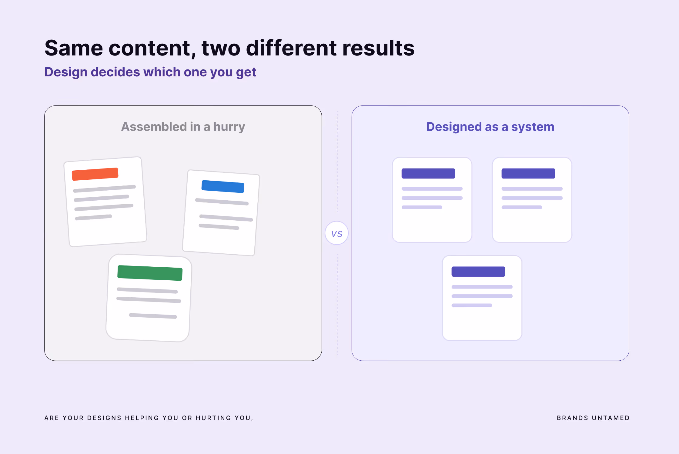
Why design determines whether any of this actually works
There is a pattern in association communications where design happens at the end. The copy is written, the messages are approved, the sign-off chain is complete, and then someone asks the team to “make it look good”.
It is assembled by whoever has a Canva account and thirty minutes before the deadline. Quote cards, social graphics, one-pagers: each one gets made when needed, by whoever is available, with no visual system connecting any of them. The result looks exactly like what it is. Placed next to the report itself, or next to the communications of a better-resourced organisation, it undermines the work rather than extending it.
For technical, policy-heavy, or multi-stakeholder topics, design is doing real communication work.
A well-designed infographic makes a relationship between two data points clear in a way that a paragraph cannot.
A visual hierarchy on a one-page briefing tells the reader what the argument is before they read a word.
A consistent visual system across LinkedIn content, event materials, and member publications signals that the organisation is credible and in control of its message, which matters when the audience includes people who judge you on exactly that.
In Brussels specifically, this credibility signal carries weight. An inconsistent or low-production visual presence suggests limited capacity, even when the policy thinking is excellent. The associations that communicate best in this environment are not necessarily the best resourced. They are the ones that treat design as a strategic choice rather than a production task.
Where AI tools help and where they do not
AI tools are extremely useful at the extraction and drafting stage.
A first draft of a LinkedIn post from a report section, an alternative framing for a finding, a FAQ adapted from a policy document, a more conversational version of an executive summary: all of this can move faster with the right prompts and a clear brief.
What AI tools cannot do is make the editorial judgments that determine whether the content is any good. They do not know which finding is politically sensitive in the Brussels context (unless you brief them). They do not know which quote your secretary general would never approve of. They do not know that the audience has seen twenty versions of this argument and needs a fresher angle. Without that judgment, AI-assisted content sounds like it was written by a committee in a room with no windows.
AI speeds up production. The editorial thinking still has to come from someone who knows the material, the audience, and the context.
FAQ
How many pieces of content can you create from one association report?
A single substantial report usually yields eight to ten distinct assets: a landing page or web article, a few audience-specific LinkedIn posts, an infographic, a short video, a policy brief, a member toolkit, and presentation slides. The material is almost always already there in the report.
When should you plan the content around a report?
Before publication, ideally during the final drafting phase. Planning the content alongside the report sign-off means the assets get approved in the same process, rather than becoming a separate round of requests after the team is already exhausted.
How long should a report content rollout take?
For a small communications team, a realistic rollout runs over four weeks: launch in week one, explanation in week two, audience-specific content in week three, and shelf-life extension in week four. Publishing everything in launch week tends to burn out the team and waste material.
What is the most valuable format to create from a report?
For long-term value, a well-structured web article or landing page. It has its own search value, can be cited by journalists and AI search tools, and is found by people searching the topic months after launch. A PDF on its own is far harder to find and reference.
How do you adapt one report for different audiences?
Start from what each audience needs to take away, not what you want to tell them. A policymaker needs a clear recommendation, a member needs sector relevance, a journalist needs an angle. The core argument stays the same while the format, tone, and level of detail change.
The questions to ask before your next report goes live
Before the final version is approved, work through these, while the material is still fresh:
- What is the one thing we most need people to understand?
- Which three audiences matter most, and what does each one actually need?
- Which findings can carry a post on their own?
- What would communicate better as a visual than as text?
- What format does each key message need to land properly?
- What will we still have to say about this in week four?
If the honest answer to that last question is "we will share the PDF again," the report will be fine. Your communications around it will not.
And six months of work deserve more than one week of moderate visibility.
At Brands Untamed, we work with European associations to build content strategies around major publications, so the research and policy work that takes months to produce actually reaches the people it needs to reach.
If you feel your next report deserves more than a PDF and a forgotten LinkedIn post, get in touch.


Somewhere on your association's website there is a PDF that took six months to produce and got one LinkedIn post.
The report itself is probably fine. The problem is that publishing it got treated as the finish line, when it should have been the starting point.
By the time a publication clears member consultation, legal review, and the translation round, the team is exhausted. Sending the newsletter and posting the link feels like completing something. Then the next deadline arrives, and the report just sits there.
In Brussels, that is a real cost. The policymaker, journalist, or potential member you are trying to reach is being courted by a dozen organisations with well-resourced communications teams. One week of visibility is not enough. A strong publication already contains everything you need to communicate for months. The challenge is building a system around it before the energy runs out.
This is work we do for European associations, and the pattern repeats on almost every project: a strong report, and communications around it that stop at launch week.
Why one format is never enough for multiple audiences
European associations rarely write for one audience. A single report may need to reach members across twenty-plus countries, EU institutions, national governments, journalists, and potential new members. None of them need the same version of the same content.
A member in a national association wants to understand what the findings mean for their sector.
A policymaker needs a clear recommendation they can act on.
A journalist needs a specific angle they can write from.
A potential member needs to see that the association produces work worth belonging to.
A colleague at a partner organisation needs something they can share internally without translating the jargon.
That is five different jobs. A 60-page PDF does one of them reasonably well. For the others, you need different formats, different levels of detail, and different tones. That is not extra work invented for the sake of content. It is the actual job of communication.
Extract the right content before your energy runs out
The right moment to plan content around a report is not after it is published. It is in the final drafting phase, when the arguments are clear and the team still has some investment in the material.
A focused session of two hours, run separately from the approval process, can surface most of what you need.
The questions to work through are specific:
- Which finding would surprise even people who know this sector well?
- What would a member immediately forward to a colleague?
- What do policymakers most often get wrong about this topic, and does the report correct it?
- Which argument makes more sense as a visual than as a paragraph?
- Which quote could carry a campaign graphic on its own?
- Which section deserves a proper blogpost on your website?
- What could become a LinkedIn carousel?
- Where does the association have a clear position worth a short opinion piece?
There is a practical reason to do this early. A content plan agreed alongside the report sign-off gets approved as part of the same process, instead of becoming a second round of requests nobody has time for once the report is out.
Not every question will produce an asset. But working through them before publication means you arrive at launch week with a content plan rather than improvising from a document everyone is already tired of reading.
A single substantial report typically yields five to eight findings strong enough to stand on their own, three or four quotes worth pulling out, two or three ideas that work better as visuals than as text, and at least one or two misconceptions the report directly addresses.
The material is already there. Your job is to identify and reshape it in the right format for every platform and audience.
What each format requires
Most repurposing fails because the format is treated as a container rather than a deliberate communication choice.
A paragraph gets shortened.
A chart gets dropped into a slide.
A valuable finding gets posted on LinkedIn with "we are pleased to share our latest report."
That’s not what repurposing is at all. That’s just copy-pasting with (maybe) less text, and it produces content that feels uninteresting regardless of how strong the underlying research is.
Every format has a specific job, and if you treat them simply as interchangeable, even if the underlying material is solid, your content will not get the engagement and reach you want.
LinkedIn static posts
A LinkedIn post needs to make someone care in the first two lines, before they click "see more."
It is not the place to announce that a report exists.
LinkedIn is the place to surface one idea from the report that is specific, surprising, or genuinely useful to the person reading it. The post should give something away rather than tease a download. If the insight is good enough, people follow the link to read the rest. If it is just an announcement of how proud you are that you developed a 60-page document, they scroll past.
Short video
Video is the format most association communications teams plan to use and consistently deprioritise. That is a mistake, particularly on LinkedIn (or even Instagram, if your association is on there), where a short video from a credible subject expert currently reaches further than most text posts.
It does not need to be produced.
A 30-45 second clip of your secretary general or a policy lead covering one finding from the report, filmed on a phone with decent light, will outperform a polished announcement graphic most of the time.
The rules are simple: the first three seconds determine whether anyone watches the rest, it needs to work without sound so captions are not optional, and it should make one point only.
A video that tries to summarise a forty-page report in two minutes is not a video. It is a presentation nobody asked to watch.
Infographics
An infographic needs to simplify without distorting.
Your goal is not to make a complex table look prettier. Your goal is to pick one comparison, relationship, or progression in the entire report data that tells the clearest story, and remove everything that competes with it.
An infographic that tries to show everything will be cluttered, and nothing will stand out.
Here’s a useful test: can someone not involved in the report creation grasp the main point in five seconds without reading the caption? If not, it needs to be cut further.
Blog posts / Web articles
When you think of long form content, please don’t summarize your report and call it a day.
Blog articles are standalone pieces of content with their own structure, their own search value and enough substance to be useful to someone who has never seen the full publication.
It is also the format most likely to be cited by journalists, referenced by AI search tools, and found by someone searching for the topic six months after launch. A well-built article around a major publication is often worth more long-term than every social post around it combined.
Presentation slides
Association reports have a habit of becoming presentations.
A member meeting, a policy briefing, a side event, a board meeting - the report gets published and almost immediately someone needs to present the findings to a room.
That is a good thing. It means the work is being used. The problem is when the presentation is built by copying charts and paragraphs directly from the document into slides.
A presentation slide needs hierarchy. One clear idea per slide, with supporting information that stays secondary. The report may carry nuances and caveats that matter on paper. A slide in a meeting room needs its main point readable from the back row in three seconds. Those are not the same design brief, and trying to make one document serve both purposes produces something that works as neither.
Accompanying print pieces
In Brussels, print still has a job.
A one-page policy brief left on the table after a meeting with a DG official, a summary handout at a side event, a fact sheet a member can bring to a national government meeting: these are not relics. They are tools for a specific moment, and that moment requires a specific kind of document. They don’t need a background context or footnotes the reader has to hunt for. One argument, clearly stated, with a contact. Something a busy person can read in the two minutes before the meeting starts and still walk away with the main point.
Getting the right message to the right audience in the Brussels context
Brussels associations operate in one of the more demanding communication environments in Europe. The same publication may need to show credibility with a DG official, a national government representative, a trade press journalist, a member organisation in Bucharest or Dublin, a potential new member who has never heard of the association or even a potential new employee.
Each of them is receiving a lot of communications, on a lot of channels, from a lot of organisations. If you create generic content, you will be skipped.
The question to ask for each audience is not just "what do we want to tell them" but "what do they need to take away, and in what format will they actually receive it."
A policymaker briefing note and a member newsletter section can carry the same core argument but read completely differently. Getting that distinction right is what separates a repurposing strategy from a copy-paste job.
For associations with multi-country membership, the multilingual dimension is real. Even when English is the working language internally, a French or German post will reach a different segment of your community and carry more credibility in national policy conversations. This does not mean translating everything. It means deciding which assets are worth the investment before the budget and the deadline both disappear.
A four-week rollout
Most association communications teams are not large. The person planning the launch is often also writing the newsletter, preparing event materials, and fielding member enquiries. A content rollout that demands daily publishing across five platforms is not sustainable on your own and will eventually burn out your in-house resources.
A realistic rollout is sequenced:
Week 1: The launch priority is three things: a proper landing page or article rather than just a PDF link, the main LinkedIn post, and the member email. The landing page is something journalists, policymakers, and AI search tools can find and cite. It is more durable than five social posts and takes roughly the same effort to produce.
Week 2: Now your work shifts to explanation: one or two posts that unpack a specific finding in more depth, an infographic if one was prepared ahead of time, and a short blog post on the most substantive theme.
Week 3: Now you should move to audience-specific content, with posts framed for policymakers, members, and a broader public if the topic warrants it.
Week 4: Here’s when you will be extending the shelf life of your report, rather than repeating the launch. A post connecting the findings to a current policy moment, a re-share with a new angle, or event content if something is planned.
That is eight to ten assets from one publication over a month, with the original PDF still at the centre of all of it.
Why design determines whether any of this actually works
There is a pattern in association communications where design happens at the end. The copy is written, the messages are approved, the sign-off chain is complete, and then someone asks the team to “make it look good”.
It is assembled by whoever has a Canva account and thirty minutes before the deadline. Quote cards, social graphics, one-pagers: each one gets made when needed, by whoever is available, with no visual system connecting any of them. The result looks exactly like what it is. Placed next to the report itself, or next to the communications of a better-resourced organisation, it undermines the work rather than extending it.
For technical, policy-heavy, or multi-stakeholder topics, design is doing real communication work.
A well-designed infographic makes a relationship between two data points clear in a way that a paragraph cannot.
A visual hierarchy on a one-page briefing tells the reader what the argument is before they read a word.
A consistent visual system across LinkedIn content, event materials, and member publications signals that the organisation is credible and in control of its message, which matters when the audience includes people who judge you on exactly that.
In Brussels specifically, this credibility signal carries weight. An inconsistent or low-production visual presence suggests limited capacity, even when the policy thinking is excellent. The associations that communicate best in this environment are not necessarily the best resourced. They are the ones that treat design as a strategic choice rather than a production task.
Where AI tools help and where they do not
AI tools are extremely useful at the extraction and drafting stage.
A first draft of a LinkedIn post from a report section, an alternative framing for a finding, a FAQ adapted from a policy document, a more conversational version of an executive summary: all of this can move faster with the right prompts and a clear brief.
What AI tools cannot do is make the editorial judgments that determine whether the content is any good. They do not know which finding is politically sensitive in the Brussels context (unless you brief them). They do not know which quote your secretary general would never approve of. They do not know that the audience has seen twenty versions of this argument and needs a fresher angle. Without that judgment, AI-assisted content sounds like it was written by a committee in a room with no windows.
AI speeds up production. The editorial thinking still has to come from someone who knows the material, the audience, and the context.
FAQ
How many pieces of content can you create from one association report?
A single substantial report usually yields eight to ten distinct assets: a landing page or web article, a few audience-specific LinkedIn posts, an infographic, a short video, a policy brief, a member toolkit, and presentation slides. The material is almost always already there in the report.
When should you plan the content around a report?
Before publication, ideally during the final drafting phase. Planning the content alongside the report sign-off means the assets get approved in the same process, rather than becoming a separate round of requests after the team is already exhausted.
How long should a report content rollout take?
For a small communications team, a realistic rollout runs over four weeks: launch in week one, explanation in week two, audience-specific content in week three, and shelf-life extension in week four. Publishing everything in launch week tends to burn out the team and waste material.
What is the most valuable format to create from a report?
For long-term value, a well-structured web article or landing page. It has its own search value, can be cited by journalists and AI search tools, and is found by people searching the topic months after launch. A PDF on its own is far harder to find and reference.
How do you adapt one report for different audiences?
Start from what each audience needs to take away, not what you want to tell them. A policymaker needs a clear recommendation, a member needs sector relevance, a journalist needs an angle. The core argument stays the same while the format, tone, and level of detail change.
The questions to ask before your next report goes live
Before the final version is approved, work through these, while the material is still fresh:
- What is the one thing we most need people to understand?
- Which three audiences matter most, and what does each one actually need?
- Which findings can carry a post on their own?
- What would communicate better as a visual than as text?
- What format does each key message need to land properly?
- What will we still have to say about this in week four?
If the honest answer to that last question is "we will share the PDF again," the report will be fine. Your communications around it will not.
And six months of work deserve more than one week of moderate visibility.
At Brands Untamed, we work with European associations to build content strategies around major publications, so the research and policy work that takes months to produce actually reaches the people it needs to reach.
If you feel your next report deserves more than a PDF and a forgotten LinkedIn post, get in touch.