Instagram, Kia, Jaguar: How Do You Tell a Bad Rebrand From an Unfamiliar One?


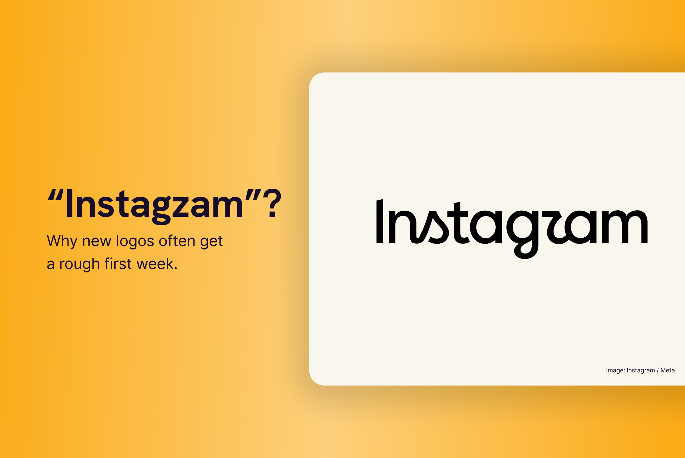
Instagram launched a new wordmark last week and, right on cue, the internet lost its mind. Half of it is reading "Instagzam". The other half is defending the type designers. And a small third group is wondering why anyone cares this much about the shape of an "r".
It didn’t surprise me. If you've ever been on the inside of a logo change, however small, you know the first week tells you almost nothing about whether the change was any good. But it did make me want to write down why. So this article isn't a verdict on the wordmark. It's about the pattern behind the noise, why it repeats itself with every high-profile rebrand, and (more usefully) what you should take from it if you're an association, a founder or a brand about to change your own logo.
The short answer: most new logos get a rough first week because often people are reacting to the loss of something familiar, not to the design. Whether a rebrand was actually good only becomes clear once you look at the problem it was solving, the system it sits in, and where it stands three months later. And if you're launching your own refresh, the first week is something you plan for.
What actually happened (in case you were busy doing real work)
On August 13, Instagram's head, Adam Mosseri, announced a new wordmark, the first major wordmark change in ten years. It's still a script, but straightened out: bolder, simpler, with the flourishes concentrated on the "s", the "g" and the "r". Meta calls it an evolution, not a rebrand, and says the team explored hundreds of directions, from all-caps to camera concepts, before coming back to script.
The wordmark is the visible part. Underneath it, there's a wider system: an updated Instagram Sans, a new handwriting typeface called Instagram Pen, a monospace face called Instagram Mono, refreshed motion and layout, and a gradient that stays but gets used more sparingly. The camera icon is untouched.
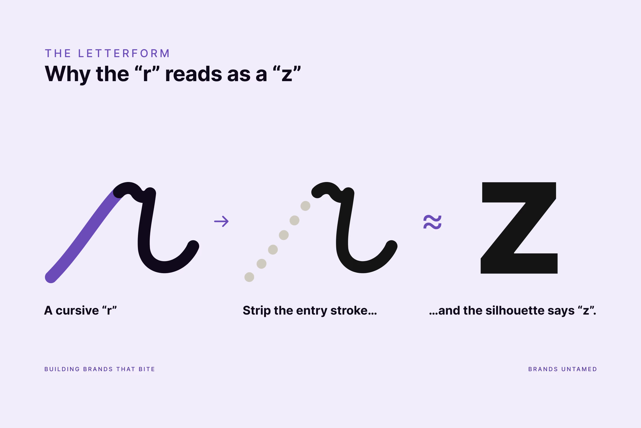
And yes, the "r" reads as a "z" to a lot of people. There's even a decent typographic explanation for it: the new "r" is a stylised take on a cursive "r", with the upward entry stroke stripped away. What's left is just the peak and the shoulder, and on its own that silhouette can be seen as a "z". Add a sail-shaped "s" nobody under thirty has met (plenty of schools dropped cursive years ago), and you have a meme within hours.
None of that tells you whether it's good.
Why a new logo gets a rough first week
Because the logo is the front door, and nobody sees the house.
When a rebrand hits the news, the public conversation goes straight to the mark: the font, the colours, "could I have drawn this myself". Fair enough. It's the most visible, tangible asset. But it's the tip of a strategic iceberg most people will never see: the fragmented brand architecture, the digital scaling problems, the shift in audience or business direction. I've written before about what a rebrand really takes to get right, and the short version is that a good one is a business decision anchored by design, not a beauty contest.
Because familiarity feels like quality.
We mistake "I know this" for "this is good". A wordmark you've looked at every day for a decade has earned a place in your brain that has nothing to do with its letterforms. Change it, and the discomfort is real. It's just not a design opinion.
Because outrage is free and context isn't.
Nobody posting "worst rebrand ever" has sat through the stakeholder rounds, seen the hundred directions that were killed, or knows what problem the brief was trying to solve. And the internet rewards a hot take about a logo far more than it rewards a considered one about a brand system.
Instagram, of all companies, knows this. In 2016 it replaced its retro camera icon with the gradient one, and the reaction was brutal: the New York Times called it "the great Instagram logo freakout". That gradient is now the one thing they didn't dare touch.
Three ways the story ends
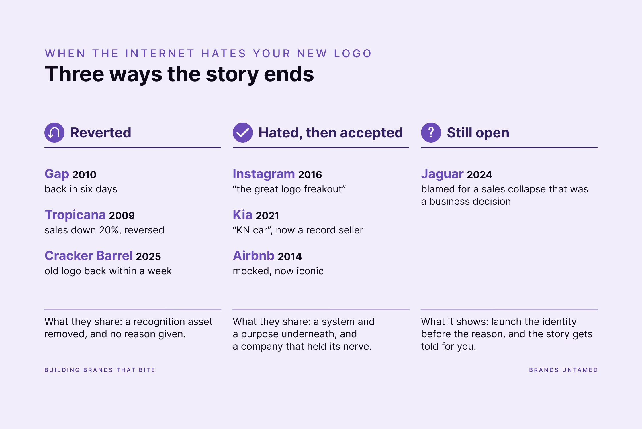
If you look at the famous "bad rebrands" people bring up whenever this happens, they don't all end the same way. They generally end in one of three ways.
1. Reverted
Gap, 2010. New logo on 6 October, old logo back on the 12th. Six days.
Tropicana, 2009. Took the orange-with-a-straw off the carton, replaced it with a glass of juice. Sales fell roughly 20% in two months, and Tropicana reverted to the old packaging.
Cracker Barrel, 2025. Dropped the man on the barrel from its logo and put him back within a week, though that one was as much a political pile-on as a design debate, which is its own lesson: the noise isn't always about the design at all.
What these share: each one removed a recognition asset (the blue box, the orange, the old man) and gave people no reason for it. Nothing underneath. Just a new front door on the same house, and the neighbours noticed.
2. Hated, then accepted
Instagram, 2016. See above.
Kia, 2021. The new logo was so widely misread that "KN car" became a real search term. Five years on, the design has bedded in and Kia is selling more cars in the US than ever. The logo wasn't the point; the repositioning behind it was, and the cars backed it up.
Airbnb, 2014. The "Bélo" was mocked mercilessly for a while. It's now one of the most recognisable travel marks in the world.
What these share: they looked odd on day one, but there was a system and a purpose behind them, and the company held its nerve while people caught up.
3. Still open, and being judged for the wrong thing
Jaguar, 2024. Everyone remembers the pink film with no cars, and everyone quotes the sales collapse: 49 cars sold in Europe in April 2025, against nearly 2,000 the year before. What fewer people mention is that Jaguar had stopped making gas-powered cars. Every model was wound down ahead of an all-electric relaunch, so there was almost nothing to sell. That's a business decision, not a logo.
Whether it works will be decided by the cars arriving this year, not by the wordmark. But it's the best recent example of a rebrand being tried in public for a decision made in a boardroom.
How to judge a rebrand (including the one you're about to launch)
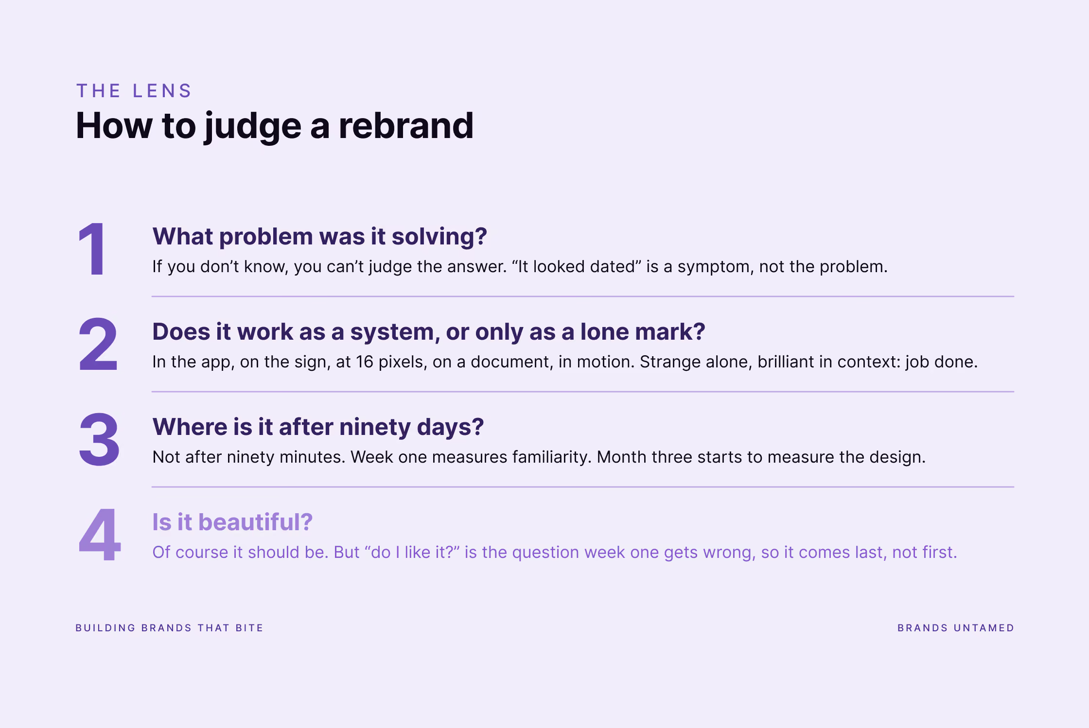
Here's the lens I use, whether it's Instagram's or a client's. Three questions:
- What problem was it solving? If you don't know, you can't judge the answer. "It looked dated" is a symptom; the problem is usually about audience, architecture, or where the brand needs to work in five years.
- Does it work as a system, or only as a lone mark on a white background? Look at it in the app, on the sign, at 16 pixels, on a document, in motion. A logo that looks strange in isolation and brilliant in context has done its job.
- Where is it after ninety days? Not after ninety minutes. First-week reactions measure familiarity. Three-month reactions start to measure the design.
You'll notice "is it beautiful?" isn't on the list. Not because I don't care (I care about a well-drawn letterform more than is probably healthy), but because good craft is the bare minimum. Of course it should be well made; that's the job. But "do I like it?" is exactly the question the first week gets wrong, which is why it comes last, not first.
Run Instagram's wordmark through those three questions. The problem: a decade-old mark that no longer matched a completely rebuilt product, and a family of apps that needed to feel related. The system: three typefaces, refreshed motion and layout, a lighter gradient. Ninety days: ask me in November.
When the critics are right
Let me be fair to the "Instagzam" crowd, because there’s a real point buried in the jokes: legibility.
For Instagram it barely matters. Three billion people already know the name, and the wordmark almost never appears without context. When you're that recognised, you can afford a bit of ambiguity, even play with it.
You probably can't. If you're a European association that most people meet once a year at a conference, or a founder whose name isn't a household one, your logo has to be read correctly by someone who has never seen it before, at a glance, on a badge or a slide. Ambiguity is a luxury of the very famous. Everyone else needs clarity first and cleverness second. That's not a smaller ambition; it's just a different brief.
What we do in the first week of a client's new identity
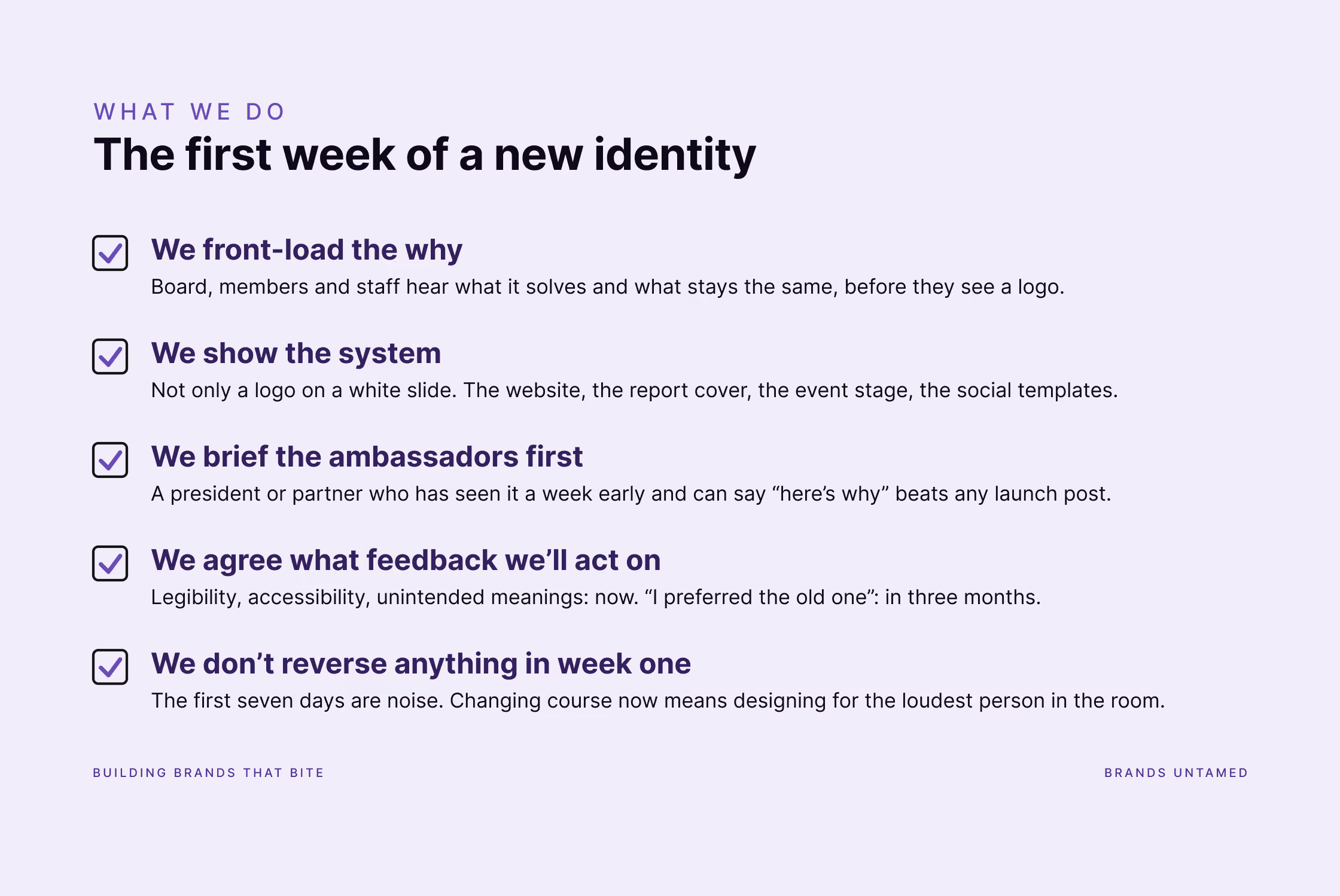
Since I don't have a boardroom at Meta to report from, here's what we do at Brands Untamed when a client's refresh goes live and the first reactions come in.
We front-load the why
Before anyone sees the logo, the people who matter (board, members, key clients, staff) hear what problem it solves and what stays the same. People accept change they understand.
We show the system, not the mark
The reveal is never a logo on a white slide. It's the website, the report cover, the event stage, the social templates. Context does most of the persuading.
We brief the ambassadors first
A president, a partner, a founder who has seen it a week early and can confidently say "here's why we did it" is worth more than any launch post.
We agree in advance what feedback we'll act on
Legibility problems, accessibility issues, cultural misreadings: yes, immediately. But those get checked in advance. Feedback that says "I preferred the old one": noted, and revisited in three months, not three days.
We don't reverse anything in week one
The first seven days are noise. Changing course inside them means designing for the loudest person in the room, and there’s ALWAYS one.
FAQ
Is Instagram's new logo a rebrand or a refresh?
A refresh, and Meta explicitly calls it an evolution. The camera icon, the name and the gradient all stay; the wordmark, typefaces, motion and layout have been updated. A full rebrand changes strategy, positioning and often the name. This changes execution.
Why does the new Instagram logo look like "Instagzam"?
Because the new "r" is a stylised cursive "r" with the upward entry stroke removed. What remains is the peak and the diagonal shoulder, and that silhouette on its own can read as a "z". If you learned joined-up handwriting you can still recognise the "r" underneath; if you didn't (many schools have dropped cursive), "z" is the closest letter you know. Context does the rest: people reading the word see an "r", people looking at the letter see a "z".
How long does it take people to get used to a new logo?
In our experience the first week is almost a pure reaction to change; genuine opinions about the design start to form after a few weeks and settle within about three months, provided the new identity is applied consistently everywhere. Inconsistent rollouts drag it out.
Should I worry if people dislike my new logo at launch?
Only if the criticism is about legibility, accessibility or an unintended meaning. If it's "the old one was better", give it three months and keep applying the new identity consistently. And remember why it got approved: months of strategy and dozens of iterations went into it before it reached anyone's feed. Trust that process over a week of random comments.
Maybe the noise is the point
One last thought. A wordmark that changed after ten years and got a shrug would have been a wasted decade. Instead, a change to the shape of one letter has millions of people staring closely at Instagram's logo for the first time in years. Whether by design or by luck, that's attention. And attention, as every one of you managing a brand knows, is expensive.
Whether it's a good wordmark? Ask me in November. Whether the reaction was predictable? Entirely. Plan for it.
And if you're staring down a refresh of your own and would rather not learn all this in public: planning that first week is part of how we work. Say hello.