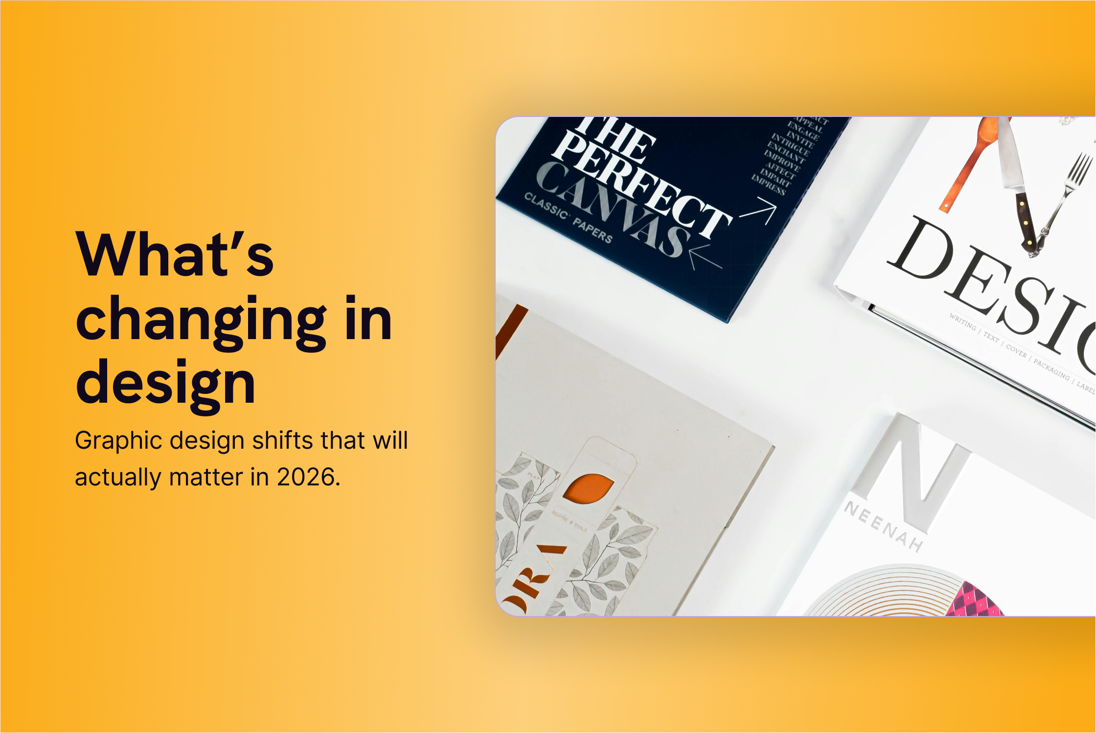
8 Graphic Design Trends for 2026 You Should Know
Every year, the same articles show up.
Lists of trends, big words, beautiful visuals. And somehow, after reading them, you still don’t know what to actually do with your brand.
We wanted to take a different approach.
The following trends aren’t predictions. They’re things we’re already seeing in client projects, content systems, and social media. Some are visual shifts. Others are more about how design is used and organised.
One important note upfront:
You don’t need to follow all of them. In fact, you probably shouldn't.
But understanding them helps you make better decisions about what fits your brand, and what doesn’t.
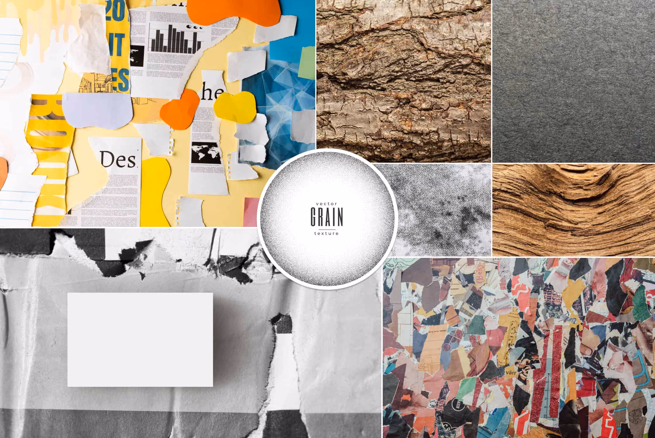
1. Design that feels more human, less polished
What it is
A lot of design looks perfect right now. And that’s exactly the problem.
When everything is perfectly aligned, perfectly smooth, and perfectly generated, it starts to feel interchangeable. Human touches stand out again.
This shows up as subtle texture, slightly imperfect layouts, collage elements, or visuals that feel assembled rather than manufactured.
Why it matters in 2026
What people respond to now is intention. Effort. Signs that someone actually made choices instead of pressing “export”. Human details help brands feel more real, trustworthy, and easier to remember.
How to apply it
On social:
- Add subtle grain or texture to flat visuals
- Use imperfect crops or collage-style compositions
- Let things breathe instead of snapping everything to a perfect grid
In brand materials:
- Introduce texture in templates (slides, reports, PDFs)
- Mix clean layouts with one imperfect visual element
- Avoid over-smoothing everything “because brand guidelines”
The goal isn’t to be “messy”, but recognisable.
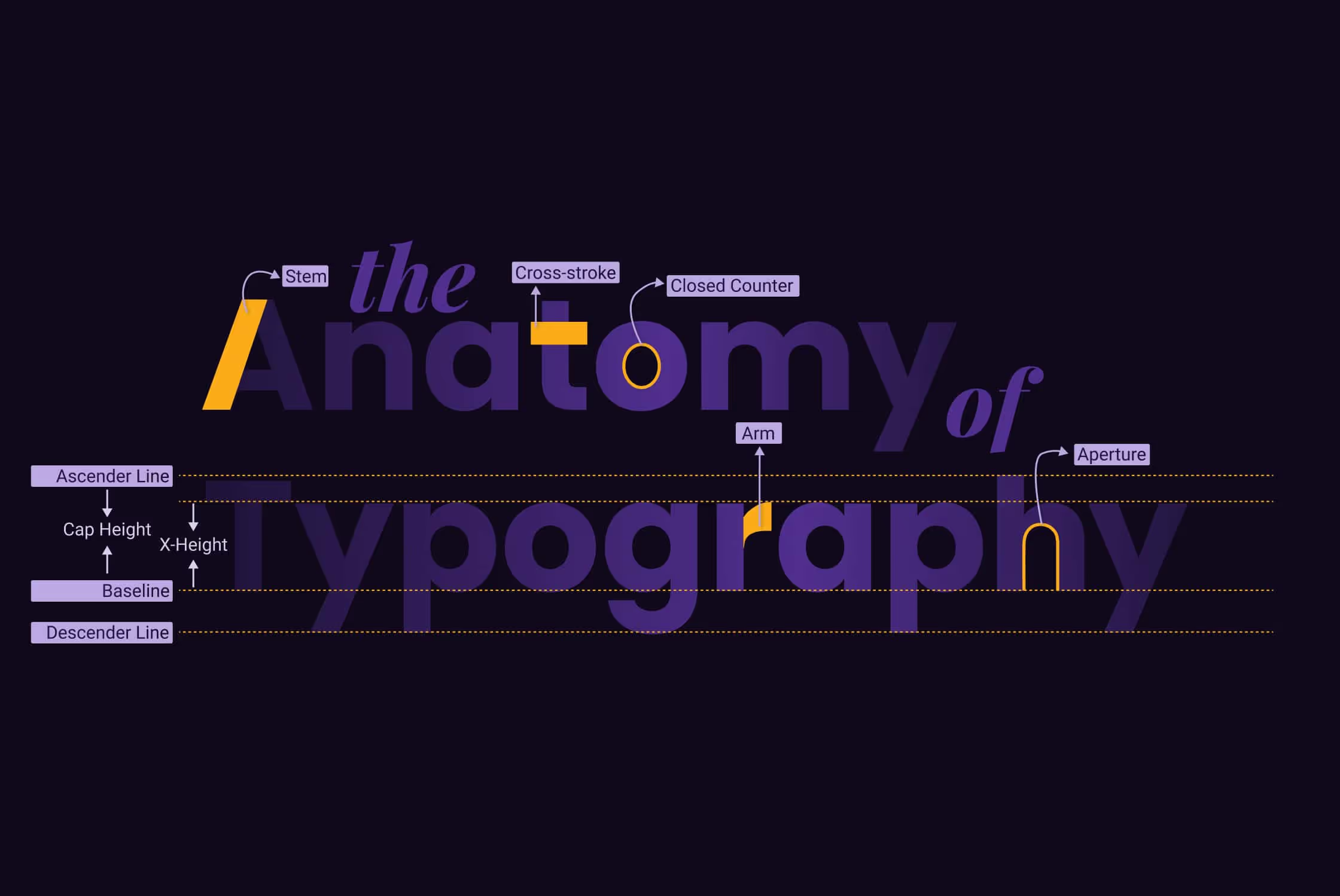
2. Expressive typography as the main visual
What it is
Type stops being the supporting actor and becomes the visual itself. Oversized headlines, expressive type pairings, playful alignment, and text-led compositions.
Why it matters
People scan before they read. Strong typography communicates before images even load.
How to apply it
On social:
- Build posts where the message is the design
- Use bold type-led slides in carousels
- Let text overlap imagery instead of sitting politely underneath
In brand materials:
- Strong headline systems in presentations
- Clear typographic hierarchy in reports
- Consistent type usage that signals brand voice, not just legibility
If your message is strong, your design doesn’t need to shout.
3. Visuals with texture, depth, and material feel
What it is
Flat design had a long run. In 2026, it’s often combined with depth.
Shadows, layers, subtle 3D, paper-like textures. Not as decoration, but to guide the eye and create contrast.
Why it matters
Flat-on-flat visuals disappear fast in crowded feeds.
How to apply it
On social:
- Add depth through shadows or layering
- Combine flat colour with one tactile element
- Use motion now and then, to enhance material feel
In brand materials:
- Use texture to separate sections in long documents
- Create depth in slide decks instead of endless white pages
- Add subtle realism to icons or illustrations
Depth helps people understand where to look.
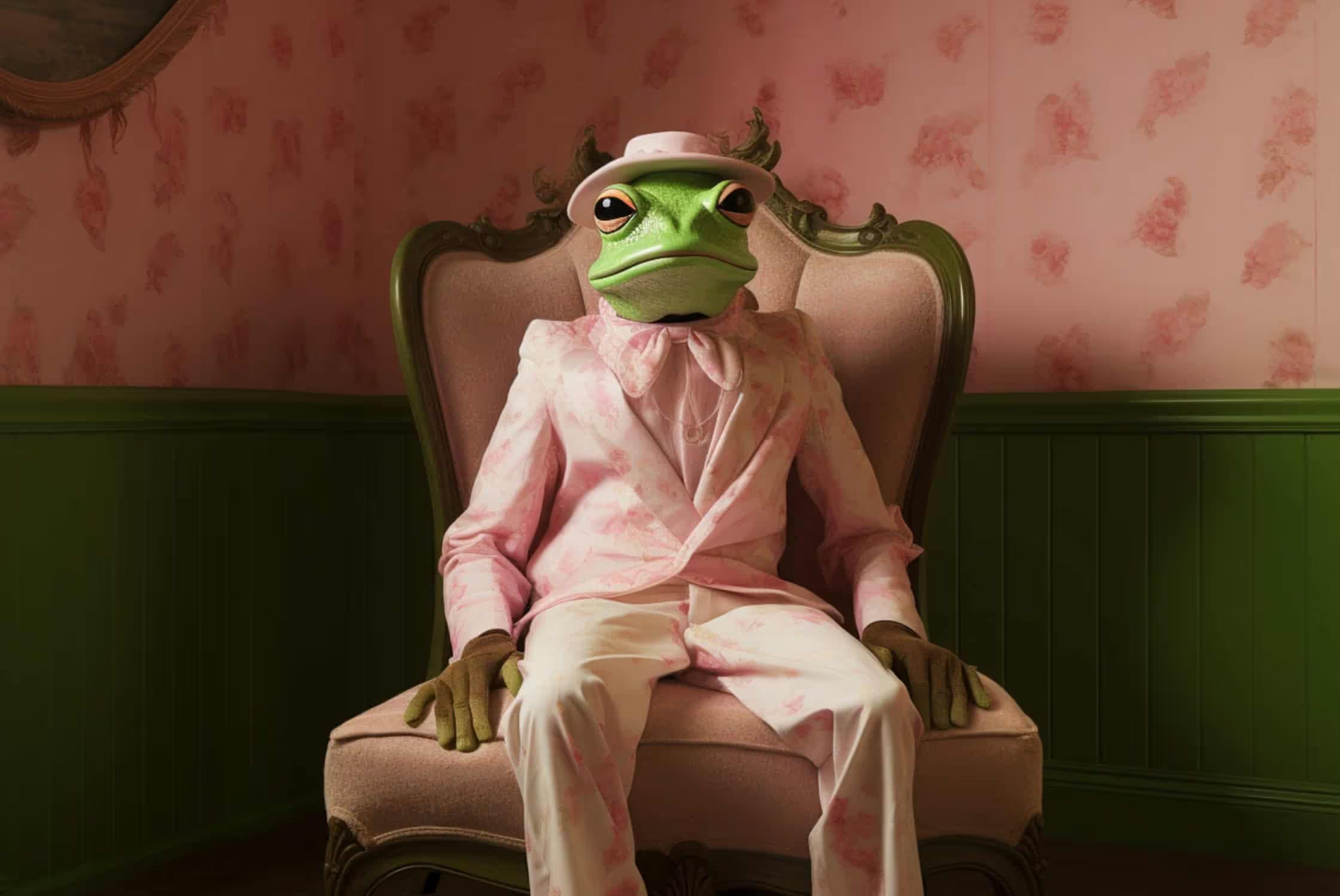
4. Playful and slightly surreal imagery
What it is
We’re seeing more brands allow a bit of weirdness back in (yay!).
Unexpected combinations. Visual metaphors that aren’t literal. Imagery that feels playful, without being childish.
Used well, this creates memorability.
Why it matters
Surprise stops the scroll. Safe visuals do not.
How to apply it
On social:
- Use one surreal visual to hook attention
- Combine realistic elements with one unexpected twist
- Not every post, but the right moments
In brand materials:
- Use surreal visuals for campaign covers or openers
- Avoid using this everywhere, it works best as an accent
- Never use surreal visuals without a clear message
If the visual is strange, the message has to be clear.
5. More local, more specific brand expression
What it is
Generic design feels safe. It also gets forgotten.
More brands are leaning into local references, cultural cues, and specific context. Especially in B2B.
Why it matters
The internet is homogenised. Specificity creates trust and memorability.
How to apply it
On social:
- Reference local context, language, or visual cues
- Show real environments instead of generic stock
- Lean into regional tone instead of neutral corporate voice
In brand materials:
- Reflect audience context in visuals and examples
- Avoid “international corporate” defaults
- Use references your audience actually recognises
Specificity builds trust faster than polish.
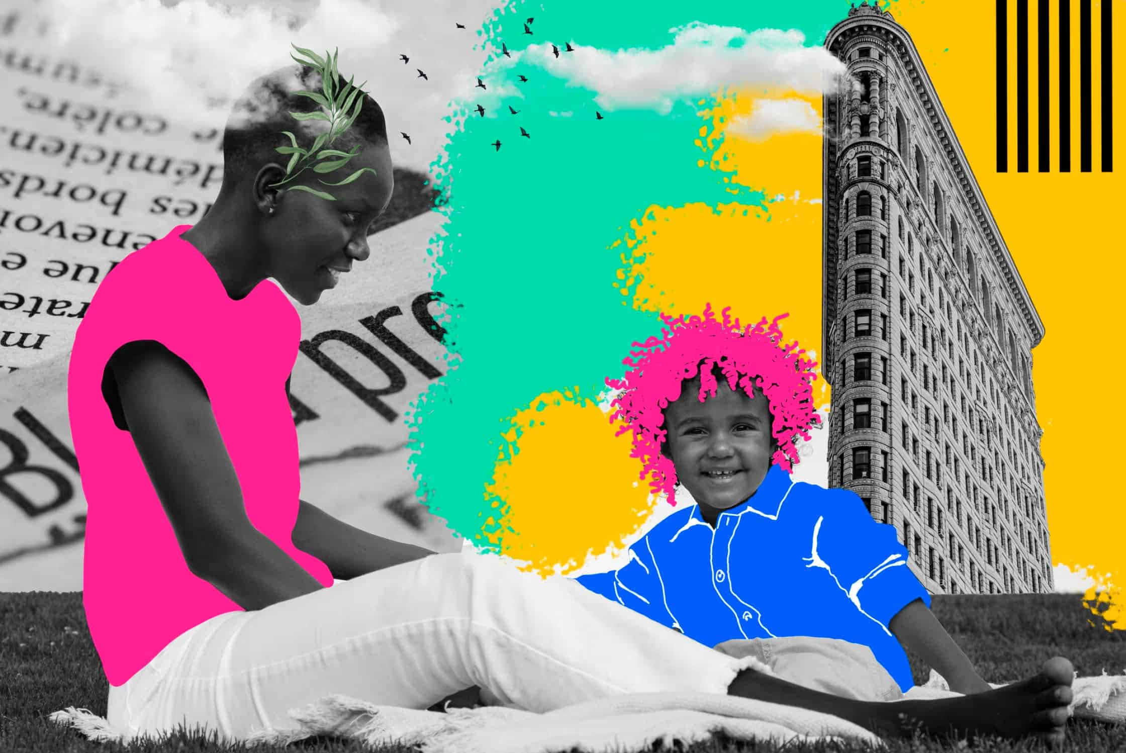
6. Collage and layered composition
What it is
Instead of designing one perfect visual at a time, more brands are building systems that allow variation without starting from scratch every time.
Assembled visuals made from multiple photos, text, shapes, illustrations, and textures layered together.
Why it matters
It creates variety without requiring constant new content production.
How to apply it
On social:
- Reuse one photo across multiple collage variations
- Build flexible templates that allow quick swaps
- Layer text, visuals, and shapes instead of single-image posts
In brand materials:
- Modular layouts for reports and factsheets
- Flexible visual systems that scale across formats
- Easier content reuse across months, not weeks
This is where design starts supporting strategy.
7. Calmer design in a very loud internet
What it is
Not everything needs to compete for attention in the same way.
We’re seeing a shift towards calmer layouts, clearer hierarchy, and more space, especially for brands that want to signal confidence.
Why it matters
Overstimulated audiences appreciate brands that feel calm and confident.
How to apply it
On social:
- Fewer elements per post
- Clear focal point per slide
- Stop trying to say everything at once
In brand materials:
- Shorter slides with clearer messages
- Strong structure over decoration
- Design that helps people follow along
Calm design often stands out more than loud design.
8. AI as a tool, not a shortcut
What it is
AI is part of the workflow now. That part is not a trend anymore.
What matters is how it’s used.
Why it matters
The brands that stand out are not the ones using AI the most, but the ones editing, selecting, and refining the best.
How to apply it
On social:
- Use AI visuals intentionally, not randomly
- Maintain visual consistency across posts
- Edit aggressively instead of posting first drafts
In brand materials:
- Speed up concept exploration
- Strategy first, tools second
- Humans still deciding what stays and what goes
Taste matters more than tools.

How to use trends without losing your brand
Trends are useful when they help you make better decisions.
They’re useless when they turn into a checklist.
If there’s one takeaway for 2026, it’s this: pick a few directions that fit your brand, apply them consistently, and ignore the rest.
That’s how design stays relevant without chasing everything.


Every year, the same articles show up.
Lists of trends, big words, beautiful visuals. And somehow, after reading them, you still don’t know what to actually do with your brand.
We wanted to take a different approach.
The following trends aren’t predictions. They’re things we’re already seeing in client projects, content systems, and social media. Some are visual shifts. Others are more about how design is used and organised.
One important note upfront:
You don’t need to follow all of them. In fact, you probably shouldn't.
But understanding them helps you make better decisions about what fits your brand, and what doesn’t.
1. Design that feels more human, less polished
What it is
A lot of design looks perfect right now. And that’s exactly the problem.
When everything is perfectly aligned, perfectly smooth, and perfectly generated, it starts to feel interchangeable. Human touches stand out again.
This shows up as subtle texture, slightly imperfect layouts, collage elements, or visuals that feel assembled rather than manufactured.
Why it matters in 2026
What people respond to now is intention. Effort. Signs that someone actually made choices instead of pressing “export”. Human details help brands feel more real, trustworthy, and easier to remember.
How to apply it
On social:
- Add subtle grain or texture to flat visuals
- Use imperfect crops or collage-style compositions
- Let things breathe instead of snapping everything to a perfect grid
In brand materials:
- Introduce texture in templates (slides, reports, PDFs)
- Mix clean layouts with one imperfect visual element
- Avoid over-smoothing everything “because brand guidelines”
The goal isn’t to be “messy”, but recognisable.
2. Expressive typography as the main visual
What it is
Type stops being the supporting actor and becomes the visual itself. Oversized headlines, expressive type pairings, playful alignment, and text-led compositions.
Why it matters
People scan before they read. Strong typography communicates before images even load.
How to apply it
On social:
- Build posts where the message is the design
- Use bold type-led slides in carousels
- Let text overlap imagery instead of sitting politely underneath
In brand materials:
- Strong headline systems in presentations
- Clear typographic hierarchy in reports
- Consistent type usage that signals brand voice, not just legibility
If your message is strong, your design doesn’t need to shout.
3. Visuals with texture, depth, and material feel
What it is
Flat design had a long run. In 2026, it’s often combined with depth.
Shadows, layers, subtle 3D, paper-like textures. Not as decoration, but to guide the eye and create contrast.
Why it matters
Flat-on-flat visuals disappear fast in crowded feeds.
How to apply it
On social:
- Add depth through shadows or layering
- Combine flat colour with one tactile element
- Use motion now and then, to enhance material feel
In brand materials:
- Use texture to separate sections in long documents
- Create depth in slide decks instead of endless white pages
- Add subtle realism to icons or illustrations
Depth helps people understand where to look.
4. Playful and slightly surreal imagery
What it is
We’re seeing more brands allow a bit of weirdness back in (yay!).
Unexpected combinations. Visual metaphors that aren’t literal. Imagery that feels playful, without being childish.
Used well, this creates memorability.
Why it matters
Surprise stops the scroll. Safe visuals do not.
How to apply it
On social:
- Use one surreal visual to hook attention
- Combine realistic elements with one unexpected twist
- Not every post, but the right moments
In brand materials:
- Use surreal visuals for campaign covers or openers
- Avoid using this everywhere, it works best as an accent
- Never use surreal visuals without a clear message
If the visual is strange, the message has to be clear.
5. More local, more specific brand expression
What it is
Generic design feels safe. It also gets forgotten.
More brands are leaning into local references, cultural cues, and specific context. Especially in B2B.
Why it matters
The internet is homogenised. Specificity creates trust and memorability.
How to apply it
On social:
- Reference local context, language, or visual cues
- Show real environments instead of generic stock
- Lean into regional tone instead of neutral corporate voice
In brand materials:
- Reflect audience context in visuals and examples
- Avoid “international corporate” defaults
- Use references your audience actually recognises
Specificity builds trust faster than polish.
6. Collage and layered composition
What it is
Instead of designing one perfect visual at a time, more brands are building systems that allow variation without starting from scratch every time.
Assembled visuals made from multiple photos, text, shapes, illustrations, and textures layered together.
Why it matters
It creates variety without requiring constant new content production.
How to apply it
On social:
- Reuse one photo across multiple collage variations
- Build flexible templates that allow quick swaps
- Layer text, visuals, and shapes instead of single-image posts
In brand materials:
- Modular layouts for reports and factsheets
- Flexible visual systems that scale across formats
- Easier content reuse across months, not weeks
This is where design starts supporting strategy.
7. Calmer design in a very loud internet
What it is
Not everything needs to compete for attention in the same way.
We’re seeing a shift towards calmer layouts, clearer hierarchy, and more space, especially for brands that want to signal confidence.
Why it matters
Overstimulated audiences appreciate brands that feel calm and confident.
How to apply it
On social:
- Fewer elements per post
- Clear focal point per slide
- Stop trying to say everything at once
In brand materials:
- Shorter slides with clearer messages
- Strong structure over decoration
- Design that helps people follow along
Calm design often stands out more than loud design.
8. AI as a tool, not a shortcut
What it is
AI is part of the workflow now. That part is not a trend anymore.
What matters is how it’s used.
Why it matters
The brands that stand out are not the ones using AI the most, but the ones editing, selecting, and refining the best.
How to apply it
On social:
- Use AI visuals intentionally, not randomly
- Maintain visual consistency across posts
- Edit aggressively instead of posting first drafts
In brand materials:
- Speed up concept exploration
- Strategy first, tools second
- Humans still deciding what stays and what goes
Taste matters more than tools.
How to use trends without losing your brand
Trends are useful when they help you make better decisions.
They’re useless when they turn into a checklist.
If there’s one takeaway for 2026, it’s this: pick a few directions that fit your brand, apply them consistently, and ignore the rest.
That’s how design stays relevant without chasing everything.