The Smart Way to Pick Your Brand Colour Palette
Just like your logo, or your company’s name, your brand colours are an essential part of your identity. They instantly convey your brand’s personality, perhaps the industry you belong to, and even how your audience feels about you.
But with so many hues to choose from, how do you pick the perfect palette that’s aligned with your brand’s voice?
At Brands Untamed, we understand that choosing colours isn’t just about aesthetics – it’s about connecting with your audience on an emotional and cultural level. In this guide, we’ll break down everything you need to know about colours and their associations to help you craft a palette that represents your company as a whole.
Colours Evoke Emotions.
Every colour carries unique psychological associations, shaping how your brand is perceived. These associations have been studied and confirmed time and time again through surveys, cultural studies, and even brain science. Below are the typical emotions and qualities connected to various colours:
- Red: Passion, power, energy, excitement, love
- Orange: Warmth, enthusiasm, adventure
- Yellow: Happiness, optimism, sunshine, prosperity
- Green: Growth, harmony, nature, balance
- Teal: Calm, tranquillity, clarity
- Blue: Trust, dependability, professionalism
- Pink: Youth, creativity, playfulness
- Purple: Luxury, innovation, wisdom
An effective brand identity goes beyond aesthetics—it makes people feel something. Your brand colours can be one of the most effective ways to establish that emotional connection, influencing how customers feel when they engage with your brand.
For example, brands that want to exude fun, high-energy vibes often use bright or neon colours. Just think of SugarBear or Nalu Belgium – brands where the colours align with the lively, dynamic energy of their identity.

On the other hand, if your brand is more aligned with calmness and serenity, like wellness or lifestyle brands, softer, gentler tones work well. Brands like NUFace and ARMRA create peaceful, grounding experiences using these softer colour schemes.

How Different Cultures View Colours.
While colours evoke universal emotions, they can carry different meanings depending on cultural contexts. History, politics and religion shape culture and impact how people perceive colours.
Here are some examples of how cultural interpretations of colours differ:
- White is often associated with purity and perfection in Western cultures, while in many Eastern cultures, it symbolises death and mourning.
- Red is considered lucky in Chinese culture, while in South Africa, it can represent mourning.
Understanding these nuances helps you create a colour palette that resonates not only emotionally but culturally, ensuring you don’t alienate or confuse your audience.
The Science of Colour: Using Colour Theory to Your Advantage.
Ready to pick your palette? Let’s dig into colour theory to help you navigate your options. By understanding the relationships between different colours, you can create a strong, cohesive colour palette for your brand.
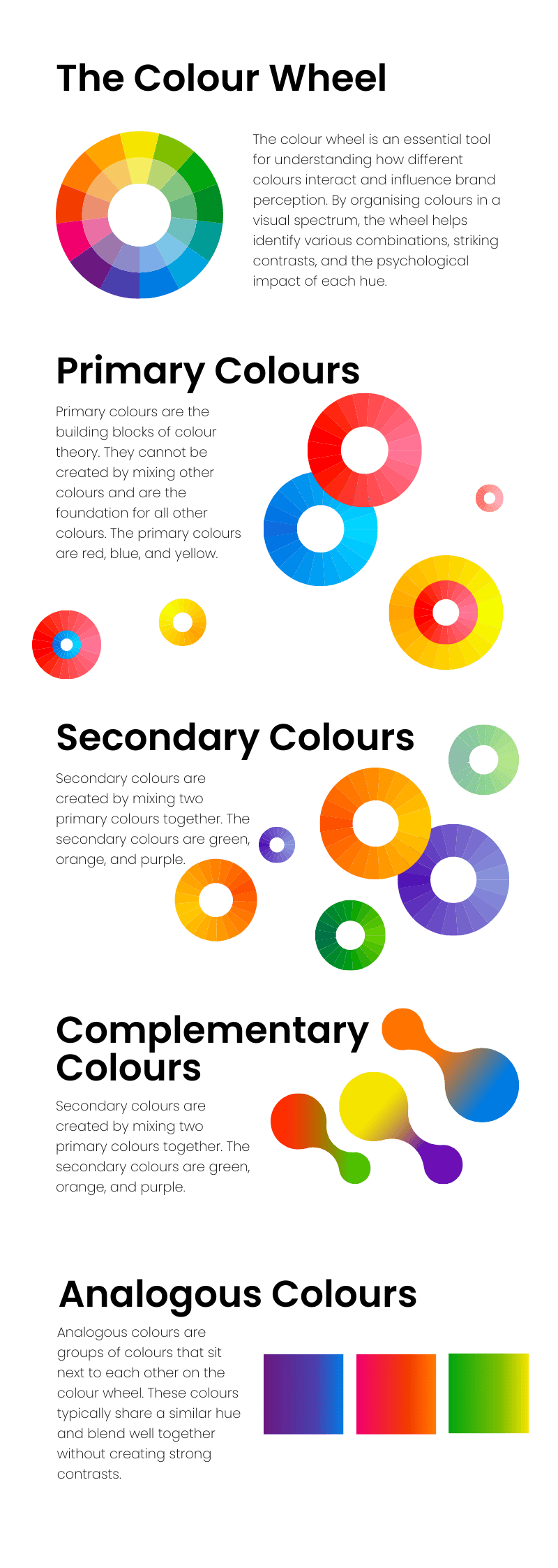
The colour wheel is an essential tool for understanding how different colours interact and influence brand perception. By organising colours in a visual spectrum, the wheel helps identify various combinations, striking contrasts, and the psychological impact of each hue.
Here are the key types of colour combinations to consider:
Core colour: Focus on one primary brand colour paired with a few neutral tones. Many leading tech companies rely on a single distinctive colour to define their brand identity. Netflix, Spotify, and Bolt, for instance, each use a bold, dominant colour supported by neutrals (or black & white) to create a striking, effective, and memorable brand image.

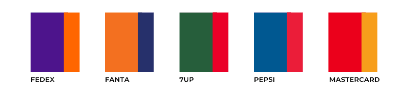
Complementary colours: These colours are positioned opposite each other on the colour wheel, such as blue and orange or red and green. They produce a vibrant, high-contrast look, often used in the food and beverage industry.
Analogue colours: Found next to each other on the colour wheel, like red, orange, and yellow, these colours create a harmonious and cohesive appearance.
Triadic colours: This method uses three colours evenly spaced around the wheel to create dynamic and eye-catching palettes.
Monochromatic colours: This scheme uses varying shades and tints of a single colour, creating a simple, sophisticated, and harmonious palette. Brands like PayPal and Shopify utilise monochromatic palettes to achieve a streamlined and cohesive appearance.
Accent colours: To add extra impact, introduce a contrasting accent colour that complements your core brand colour, giving your visuals a bold and dynamic touch.
How to Differentiate Your Brand Through Colour.
Now that you know how to build a strong palette, it’s time to think about differentiation. What are your competitors doing? And how can you set yourself apart while still fitting into your industry?
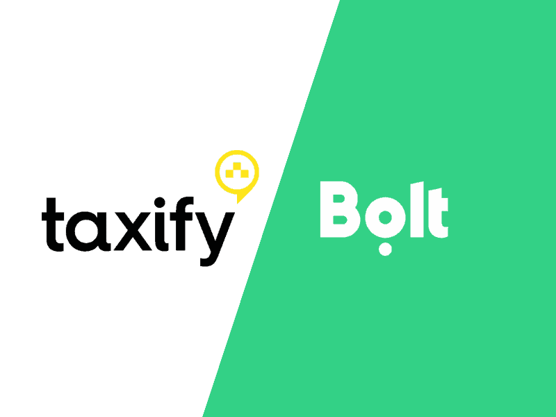
Bolt is a great example of a brand that broke away from its competitor’s aesthetic to stand out. Where Uber used a sleek black and white palette, Bolt decided to break away from its previous name and colour, and chose a vibrant and unexpected colour, to carve out a unique place for themselves and became instantly recognisable.
Pro tip: create a mood board with your top 10 competitors’ logos and colour schemes to see industry trends at a glance. This will give you a clear picture of how your brand can stand out while remaining relevant to your market.
Aligning Your Colour Palette with Your Brand Personality.
When picking colours, always ask: “What would my brand look like if it were a person?” Would it be bubbly and fun, or sleek and professional? These attributes should directly influence your colour choices.
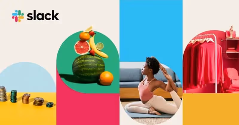
For instance, corporate software firms used to lean towards traditional, conservative palettes. But Slack decided to go against the grain by using a bright and inviting colour palette. This created a sense of accessibility, which stands out in a traditionally stiff industry.
Tip: Take some time to write down five adjectives that describe your brand’s personality and use these as a reference when choosing colours. They’ll help you keep your colour palette in line with your brand values and audience expectations.
How to Create Your Colour Palette.
Now that you understand how colours impact perception, it’s time to hone in on some actual colour ideas! Here’s some tips on how to start:
- Build mood boards – look up brand identities you like on Instagram and Behance and get inspired.
- Use Brand Colours Generators – Apps like Coolors offer free Colour generators.
- Get inspired – Look around you and get inspired by nature. Use Coolors to grab colour palettes from your favourite snapshots!
- Experiment – Don’t be afraid to try our different palettes and colour combinations.
How to Use Your Brand Colours.
Once you’ve picked your brand colours, consistency is key. Your brand colours should show up in all your business touch points—both online and offline. From your website to your social media graphics, business cards, packaging, and merchandise—your colours should be synonymous with your brand.
Major brands like Starbucks and IKEA use their iconic colours everywhere, creating a seamless brand experience that feels instantly recognisable no matter where you encounter them. By doing the same, you strengthen your brand’s identity and help your audience create an emotional connection with your business.
Essential Colour Terminology.
- Hue: Variations of primary colours (red, yellow, blue) that can be combined to create all other colours.
- Shade: Darkening a colour by adding black. The depth of the shade depends on the amount of black added.
- Tint: Lightening a colour by adding white.
- Saturation (Tone): Adjusting a colour’s intensity by adding both black and white, altering its overall vibrancy.
- HSL: A colour model used in web design representing Hue, Saturation, and Lightness.
- CMYK & PMS: Colour codes used for printing. CMYK stands for Cyan, Magenta, Yellow, and Key (Black), while PMS refers to the Pantone Matching System, widely used in both offset and digital printing.
- RGB & HEX: Colour codes used in digital design. RGB stands for Red, Green, and Blue, and HEX represents colours using the hexadecimal numeral system, commonly applied in web and screen designs.
Understanding these key terms will ensure precise communication and foster a more efficient design process when developing your brand’s visual identity.
Final Thoughts.
Selecting your brand colours is one of the most crucial steps in building your brand identity. With so much emotion and meaning tied to colours, the choices you make can have a lasting impact on how your audience perceives and interacts with your brand.
Our advice? Don’t just follow trends. Your brand’s colour palette should reflect your unique personality, values, and industry positioning. Have fun with the process, experiment with different combinations, and remember that your colours are a powerful tool to communicate who you are as a brand.


Just like your logo, or your company’s name, your brand colours are an essential part of your identity. They instantly convey your brand’s personality, perhaps the industry you belong to, and even how your audience feels about you.
But with so many hues to choose from, how do you pick the perfect palette that’s aligned with your brand’s voice?
At Brands Untamed, we understand that choosing colours isn’t just about aesthetics – it’s about connecting with your audience on an emotional and cultural level. In this guide, we’ll break down everything you need to know about colours and their associations to help you craft a palette that represents your company as a whole.
Colours Evoke Emotions.
Every colour carries unique psychological associations, shaping how your brand is perceived. These associations have been studied and confirmed time and time again through surveys, cultural studies, and even brain science. Below are the typical emotions and qualities connected to various colours:
- Red: Passion, power, energy, excitement, love
- Orange: Warmth, enthusiasm, adventure
- Yellow: Happiness, optimism, sunshine, prosperity
- Green: Growth, harmony, nature, balance
- Teal: Calm, tranquillity, clarity
- Blue: Trust, dependability, professionalism
- Pink: Youth, creativity, playfulness
- Purple: Luxury, innovation, wisdom
An effective brand identity goes beyond aesthetics—it makes people feel something. Your brand colours can be one of the most effective ways to establish that emotional connection, influencing how customers feel when they engage with your brand.
For example, brands that want to exude fun, high-energy vibes often use bright or neon colours. Just think of SugarBear or Nalu Belgium – brands where the colours align with the lively, dynamic energy of their identity.
On the other hand, if your brand is more aligned with calmness and serenity, like wellness or lifestyle brands, softer, gentler tones work well. Brands like NUFace and ARMRA create peaceful, grounding experiences using these softer colour schemes.
How Different Cultures View Colours.
While colours evoke universal emotions, they can carry different meanings depending on cultural contexts. History, politics and religion shape culture and impact how people perceive colours.
Here are some examples of how cultural interpretations of colours differ:
- White is often associated with purity and perfection in Western cultures, while in many Eastern cultures, it symbolises death and mourning.
- Red is considered lucky in Chinese culture, while in South Africa, it can represent mourning.
Understanding these nuances helps you create a colour palette that resonates not only emotionally but culturally, ensuring you don’t alienate or confuse your audience.
The Science of Colour: Using Colour Theory to Your Advantage.
Ready to pick your palette? Let’s dig into colour theory to help you navigate your options. By understanding the relationships between different colours, you can create a strong, cohesive colour palette for your brand.
The colour wheel is an essential tool for understanding how different colours interact and influence brand perception. By organising colours in a visual spectrum, the wheel helps identify various combinations, striking contrasts, and the psychological impact of each hue.
Here are the key types of colour combinations to consider:
Core colour: Focus on one primary brand colour paired with a few neutral tones. Many leading tech companies rely on a single distinctive colour to define their brand identity. Netflix, Spotify, and Bolt, for instance, each use a bold, dominant colour supported by neutrals (or black & white) to create a striking, effective, and memorable brand image.
Complementary colours: These colours are positioned opposite each other on the colour wheel, such as blue and orange or red and green. They produce a vibrant, high-contrast look, often used in the food and beverage industry.
Analogue colours: Found next to each other on the colour wheel, like red, orange, and yellow, these colours create a harmonious and cohesive appearance.
Triadic colours: This method uses three colours evenly spaced around the wheel to create dynamic and eye-catching palettes.
Monochromatic colours: This scheme uses varying shades and tints of a single colour, creating a simple, sophisticated, and harmonious palette. Brands like PayPal and Shopify utilise monochromatic palettes to achieve a streamlined and cohesive appearance.
Accent colours: To add extra impact, introduce a contrasting accent colour that complements your core brand colour, giving your visuals a bold and dynamic touch.
How to Differentiate Your Brand Through Colour.
Now that you know how to build a strong palette, it’s time to think about differentiation. What are your competitors doing? And how can you set yourself apart while still fitting into your industry?
Bolt is a great example of a brand that broke away from its competitor’s aesthetic to stand out. Where Uber used a sleek black and white palette, Bolt decided to break away from its previous name and colour, and chose a vibrant and unexpected colour, to carve out a unique place for themselves and became instantly recognisable.
Pro tip: create a mood board with your top 10 competitors’ logos and colour schemes to see industry trends at a glance. This will give you a clear picture of how your brand can stand out while remaining relevant to your market.
Aligning Your Colour Palette with Your Brand Personality.
When picking colours, always ask: “What would my brand look like if it were a person?” Would it be bubbly and fun, or sleek and professional? These attributes should directly influence your colour choices.
For instance, corporate software firms used to lean towards traditional, conservative palettes. But Slack decided to go against the grain by using a bright and inviting colour palette. This created a sense of accessibility, which stands out in a traditionally stiff industry.
Tip: Take some time to write down five adjectives that describe your brand’s personality and use these as a reference when choosing colours. They’ll help you keep your colour palette in line with your brand values and audience expectations.
How to Create Your Colour Palette.
Now that you understand how colours impact perception, it’s time to hone in on some actual colour ideas! Here’s some tips on how to start:
- Build mood boards – look up brand identities you like on Instagram and Behance and get inspired.
- Use Brand Colours Generators – Apps like Coolors offer free Colour generators.
- Get inspired – Look around you and get inspired by nature. Use Coolors to grab colour palettes from your favourite snapshots!
- Experiment – Don’t be afraid to try our different palettes and colour combinations.
How to Use Your Brand Colours.
Once you’ve picked your brand colours, consistency is key. Your brand colours should show up in all your business touch points—both online and offline. From your website to your social media graphics, business cards, packaging, and merchandise—your colours should be synonymous with your brand.
Major brands like Starbucks and IKEA use their iconic colours everywhere, creating a seamless brand experience that feels instantly recognisable no matter where you encounter them. By doing the same, you strengthen your brand’s identity and help your audience create an emotional connection with your business.
Essential Colour Terminology.
- Hue: Variations of primary colours (red, yellow, blue) that can be combined to create all other colours.
- Shade: Darkening a colour by adding black. The depth of the shade depends on the amount of black added.
- Tint: Lightening a colour by adding white.
- Saturation (Tone): Adjusting a colour’s intensity by adding both black and white, altering its overall vibrancy.
- HSL: A colour model used in web design representing Hue, Saturation, and Lightness.
- CMYK & PMS: Colour codes used for printing. CMYK stands for Cyan, Magenta, Yellow, and Key (Black), while PMS refers to the Pantone Matching System, widely used in both offset and digital printing.
- RGB & HEX: Colour codes used in digital design. RGB stands for Red, Green, and Blue, and HEX represents colours using the hexadecimal numeral system, commonly applied in web and screen designs.
Understanding these key terms will ensure precise communication and foster a more efficient design process when developing your brand’s visual identity.
Final Thoughts.
Selecting your brand colours is one of the most crucial steps in building your brand identity. With so much emotion and meaning tied to colours, the choices you make can have a lasting impact on how your audience perceives and interacts with your brand.
Our advice? Don’t just follow trends. Your brand’s colour palette should reflect your unique personality, values, and industry positioning. Have fun with the process, experiment with different combinations, and remember that your colours are a powerful tool to communicate who you are as a brand.